- Income inequality levels refer to income measured before income taxes and after operations related to pension and unemployment insurance systems. This means that the income inequality levels reported in this appendix are mostly cash redistribution transfers. For a discussion of other income concepts used in this report, readers can refer to Chapters 1 and 2, which show that factoring in all redistribution does not significantly alter the relative positions of countries.
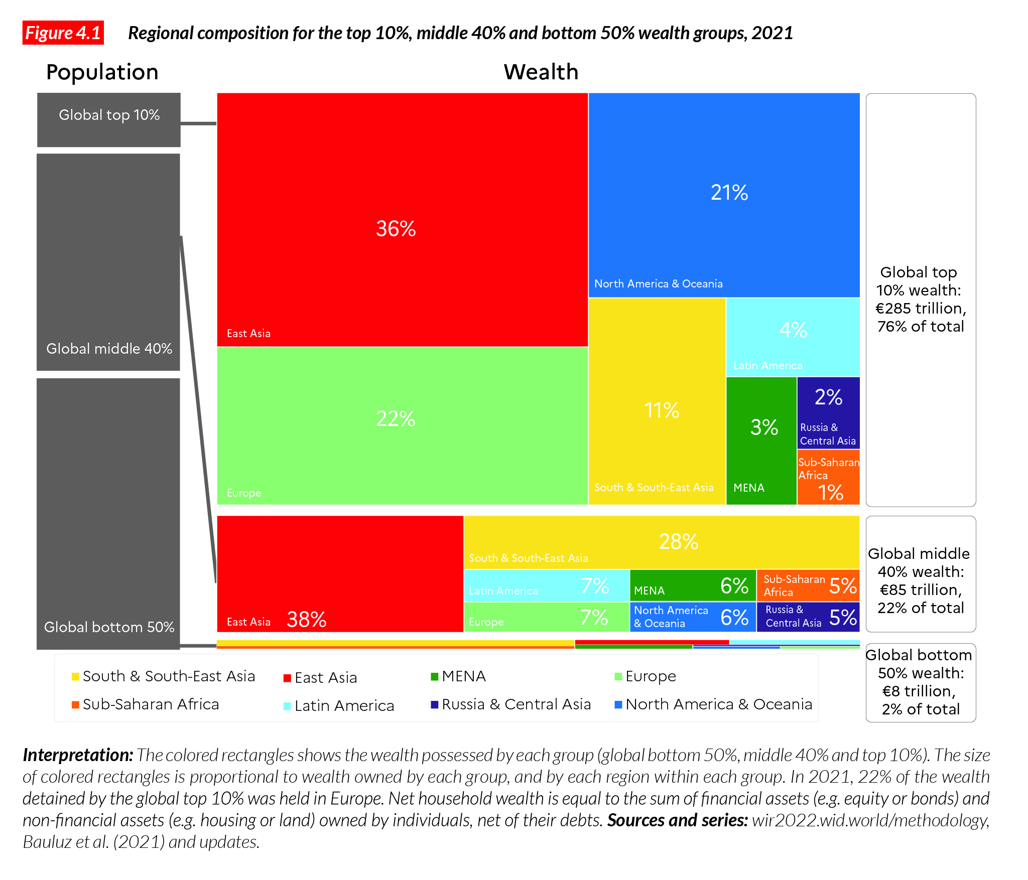
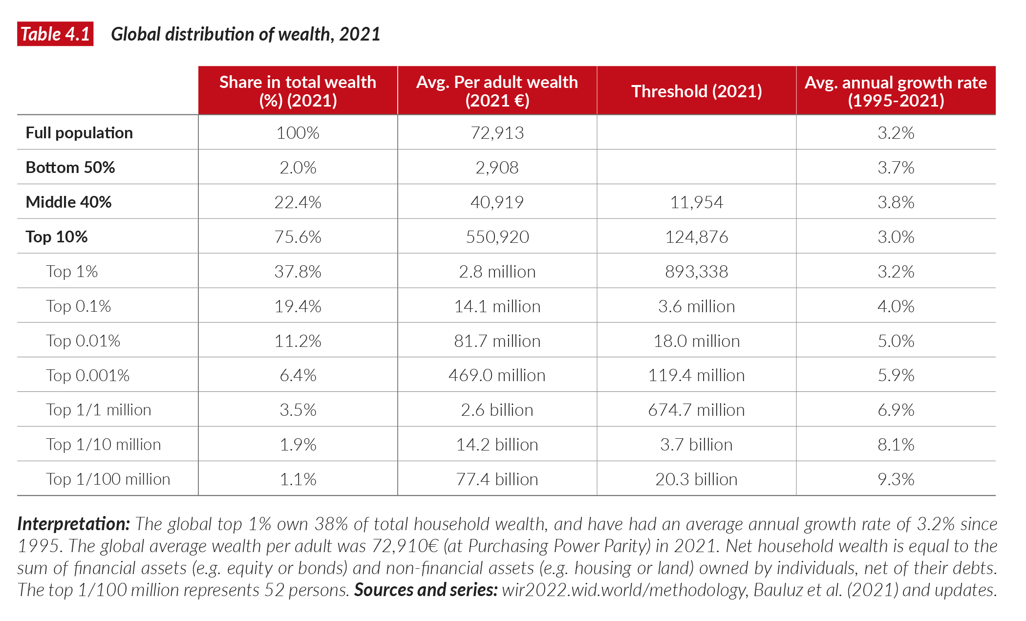
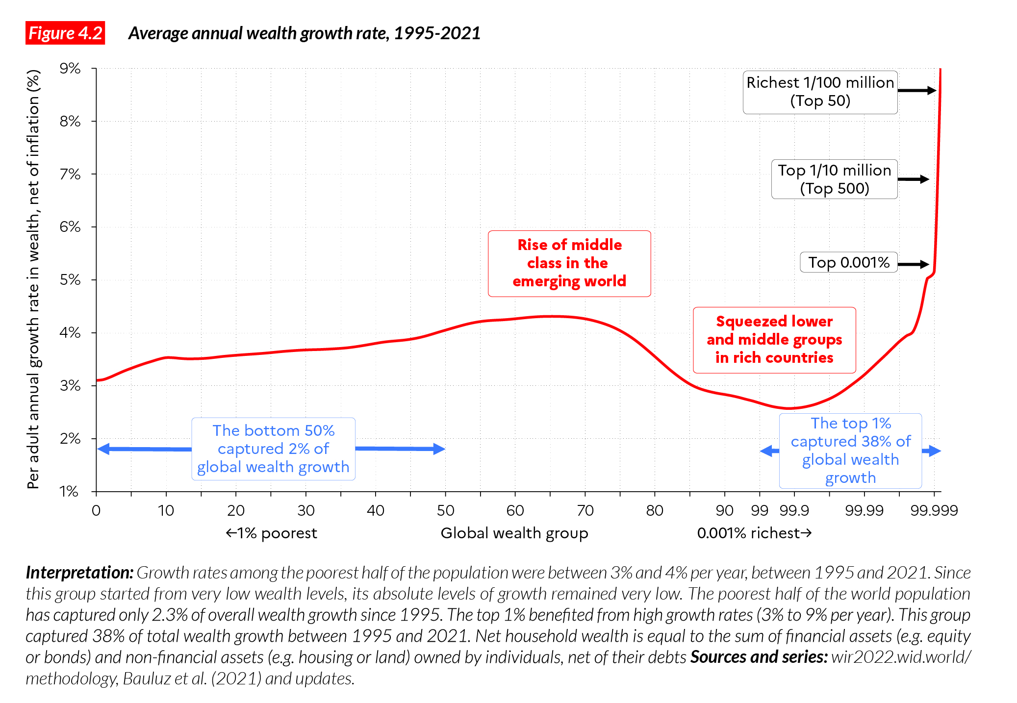
- When referring to wealth inequality below, we report net household wealth. Net household wealth is equal to the sum of financial assets (e.g. equity or bonds) and non-financial assets (e.g. housing or land) owned by individuals, net of their debts. Total household wealth adds up to the total wealth of the non-profit sector (e.g. foundations, universities) and total public wealth (the wealth owned by the government) to make total national wealth.
- The bottom 50% share is the share of income/wealth accruing to the bottom 50% of the population, i.e. that part of the population whose income/wealth lies below the median.
- The middle 40% share is the share of income/wealth accruing to the middle 40% of the population, i.e. the population whose income/wealth lies above the median and below the top 10% income threshold.
- The top 10% share is the share of income/wealth accruing to the 10% highest incomes/wealth in the country.
- The top 10% to bottom 50% average income gap is the ratio between the income shares of the top 10% and the bottom 50%. It measures the average income difference between the poorest half and the highest earners within a population. The higher the ratio, the higher the inequality.
- In this appendix, we use Purchasing Power Parity (PPP) to compare incomes and wealth levels across the world. Measuring income and wealth at purchasing power parities makes it possible to account for cost-of-living differences across countries (see Chapter 1 for an explanation of these concepts). Values are also converted into local currencies.
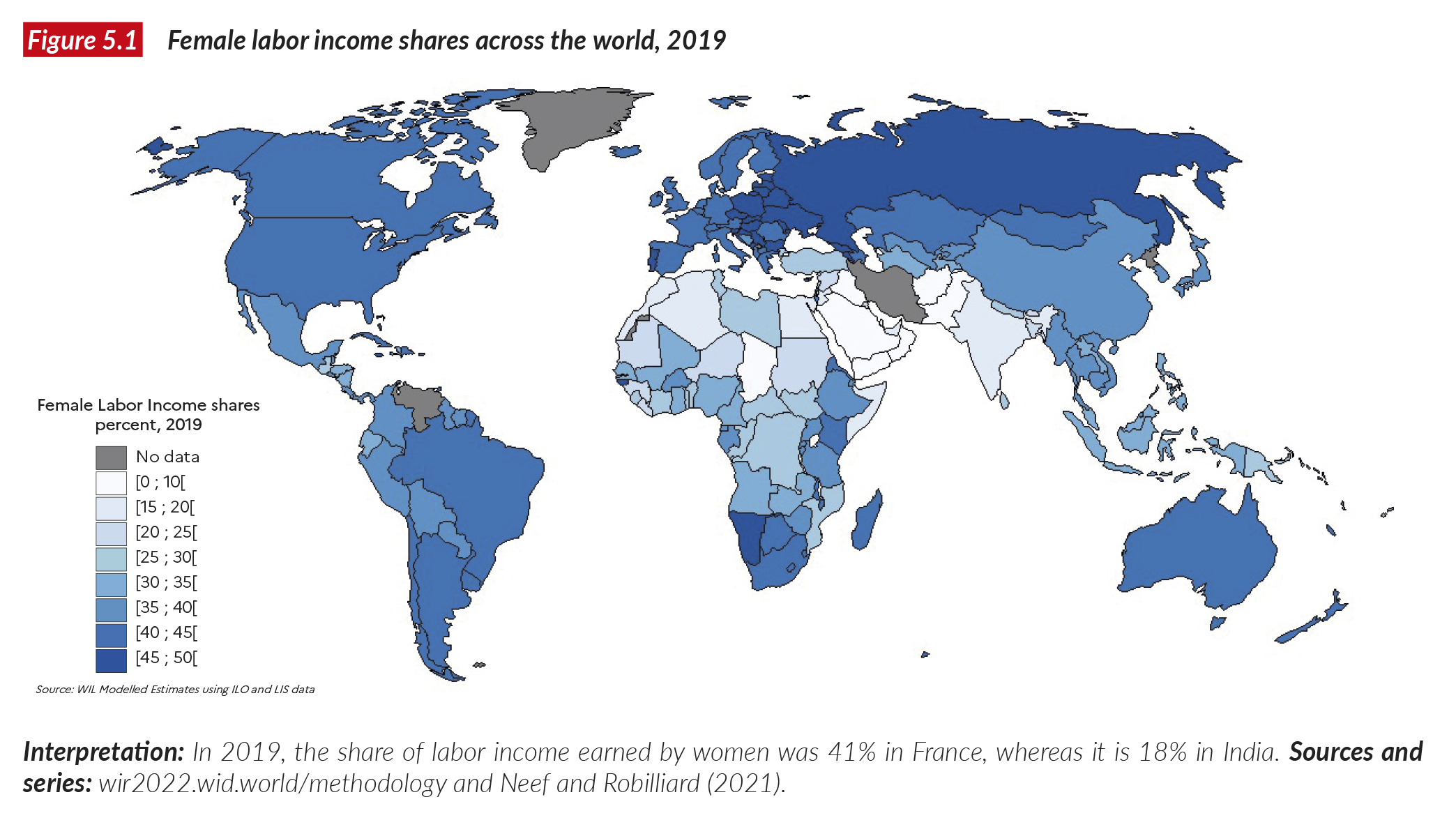
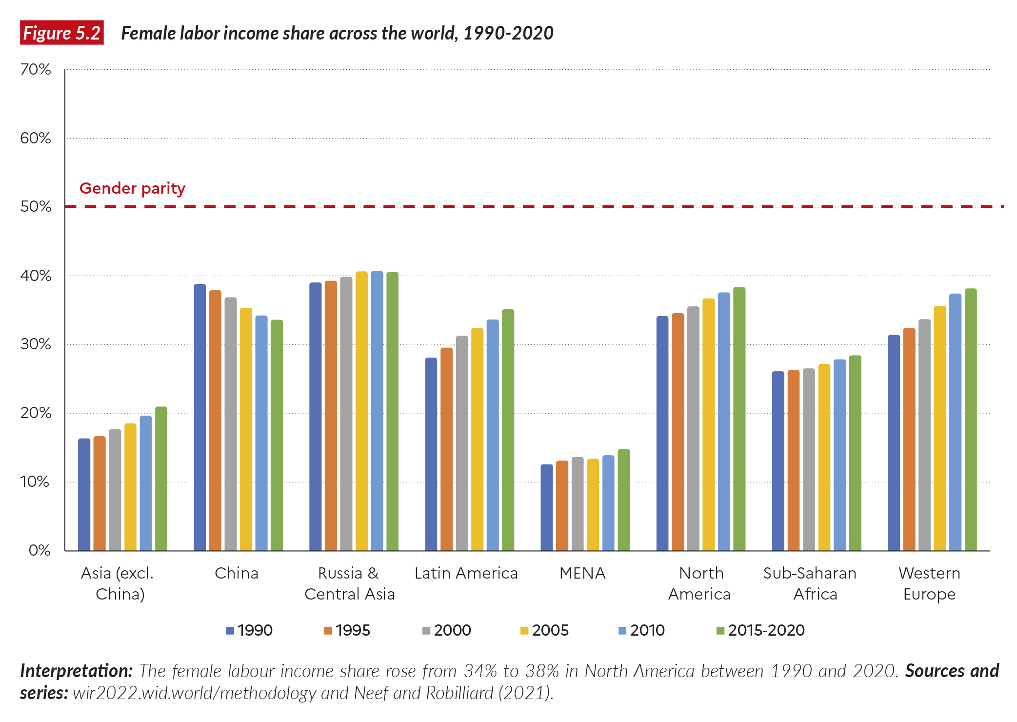
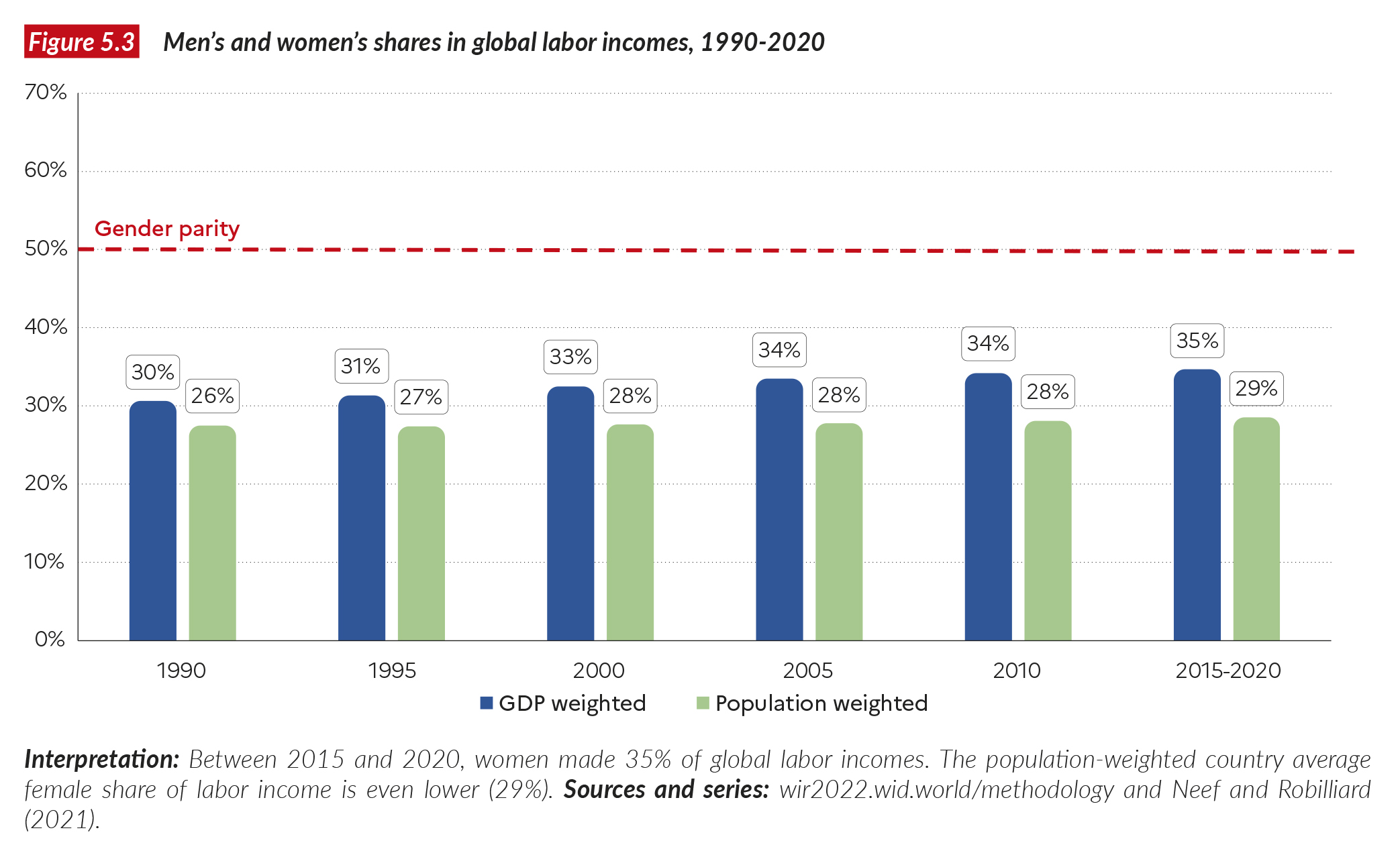
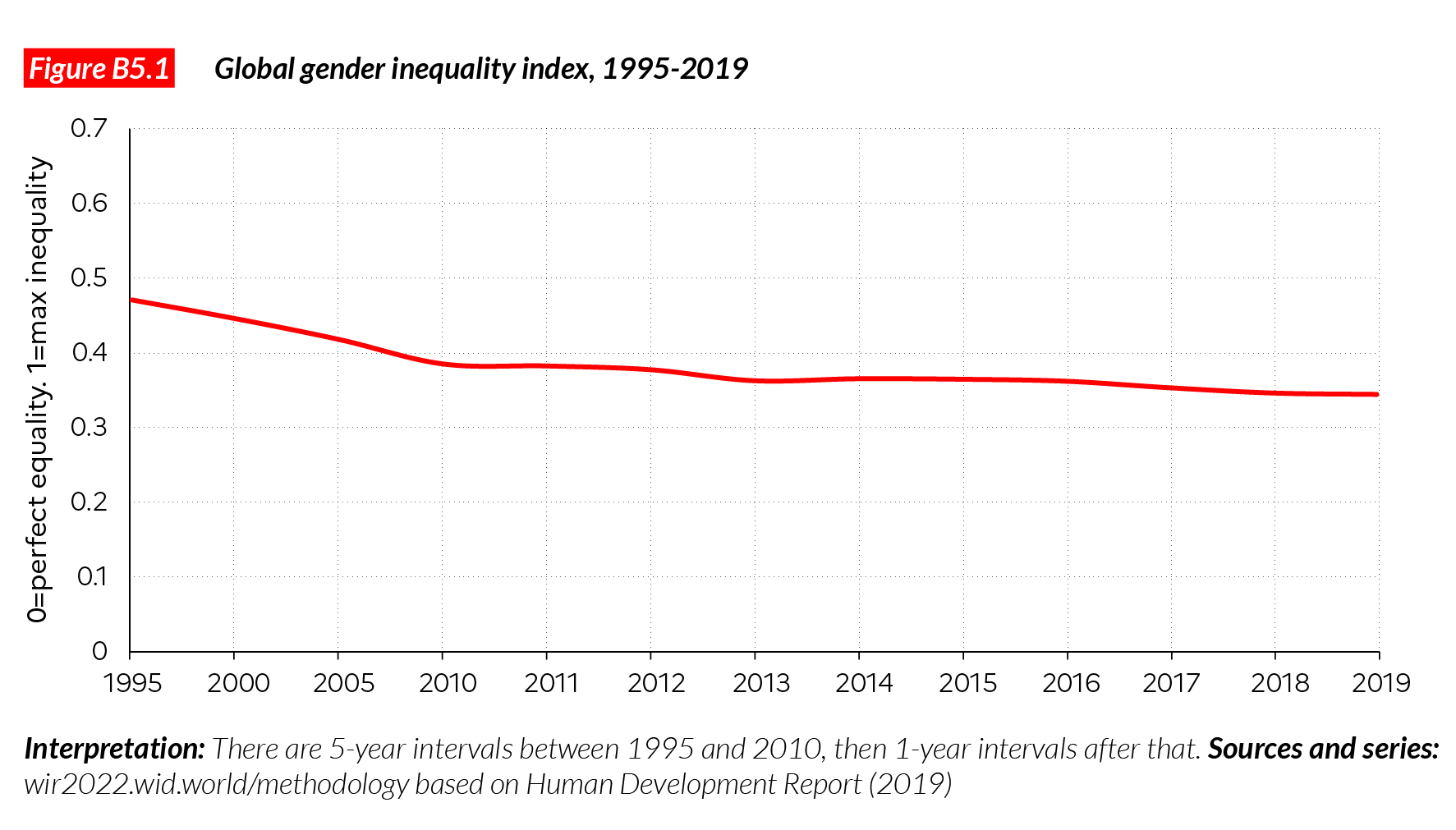
- The female labor income share refers to the share of total labor income earned by women. If earnings were distributed equally between males and females then the indicator would be 50%. A ratio of 0% would mean that women have no labor income. The higher the ratio between 0% and 50%, the closer to gender equality.
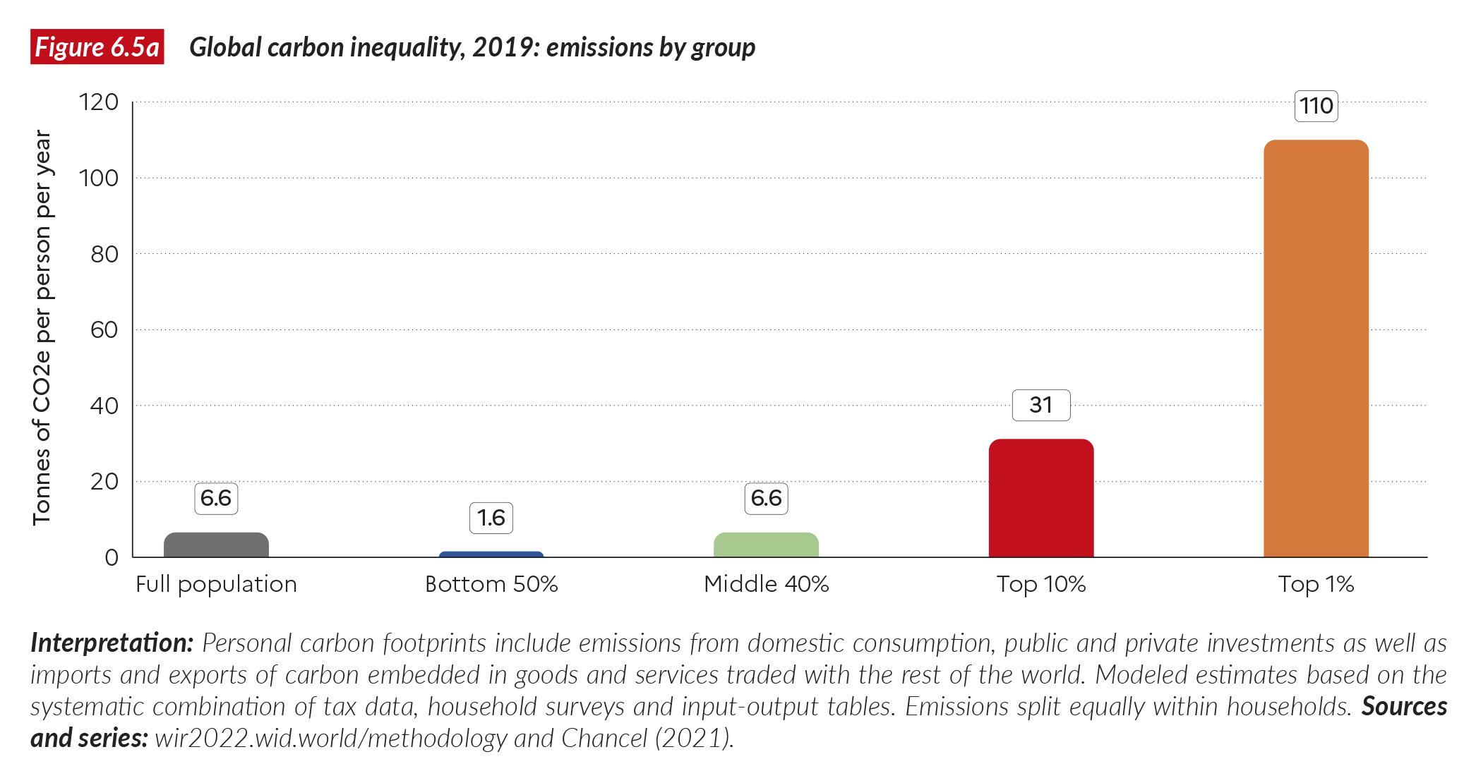
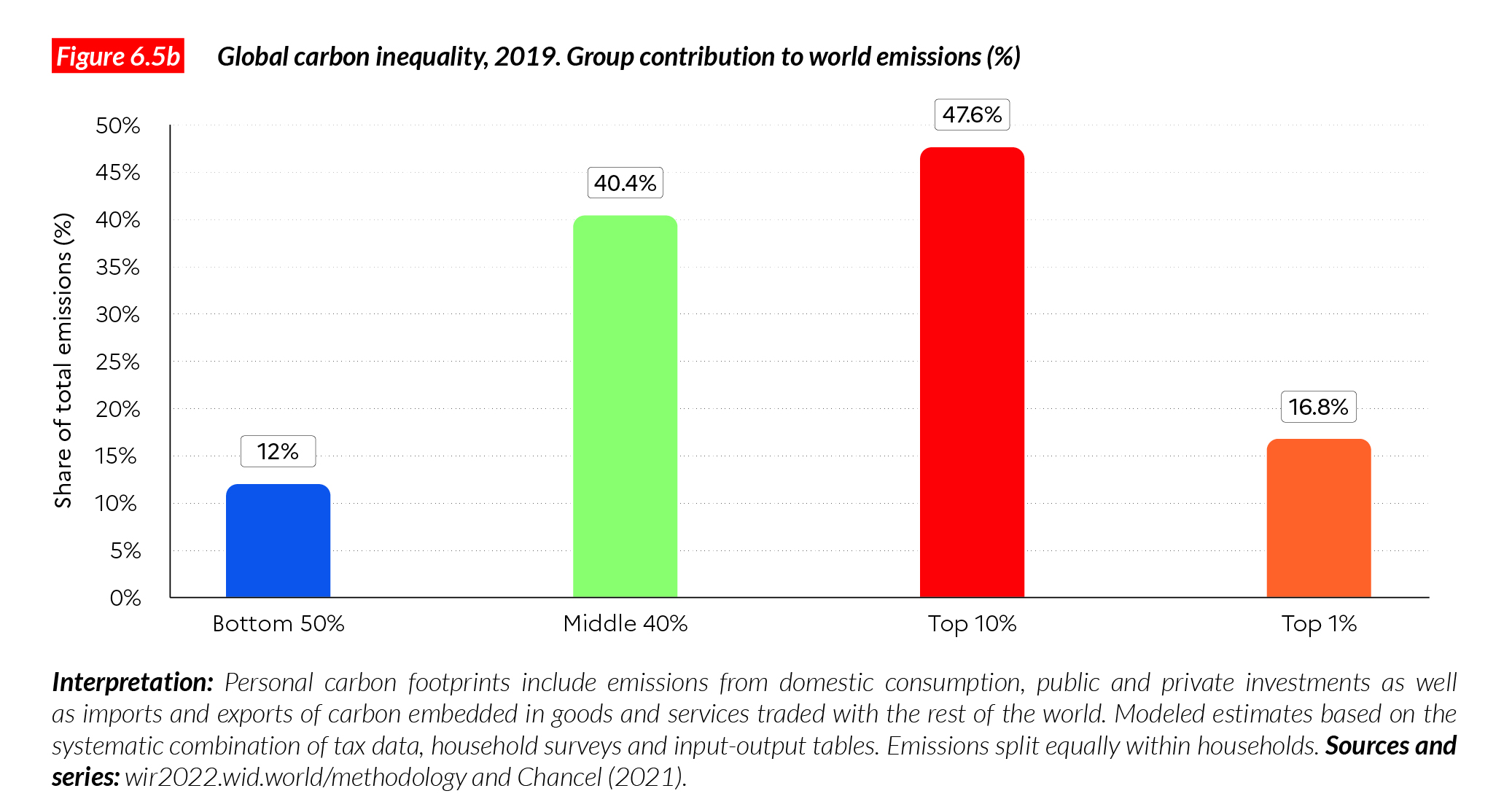
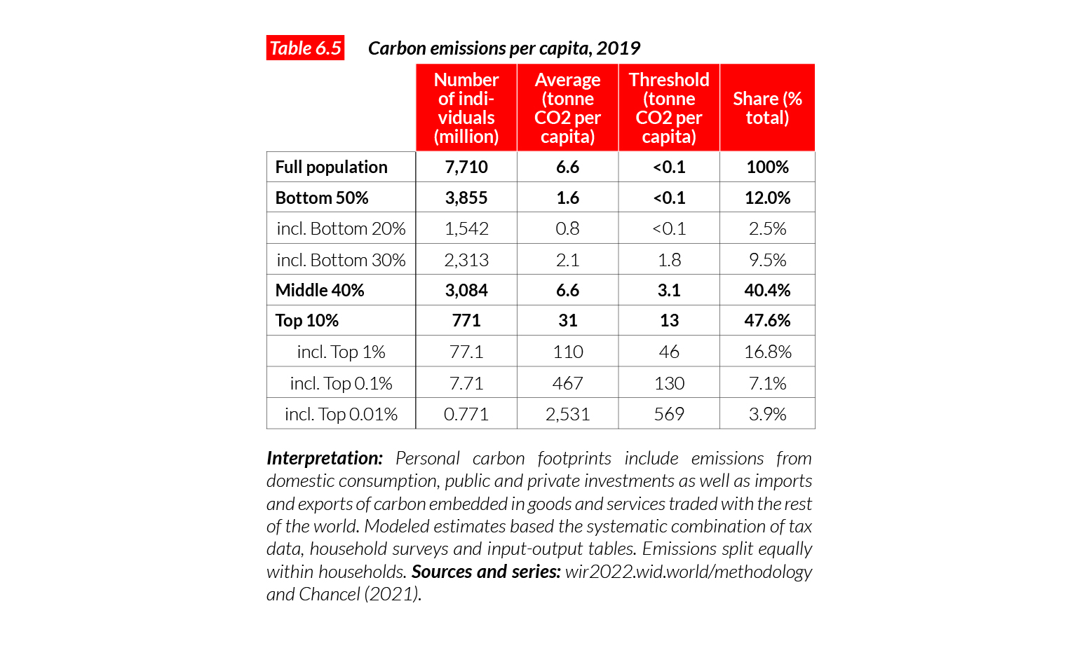
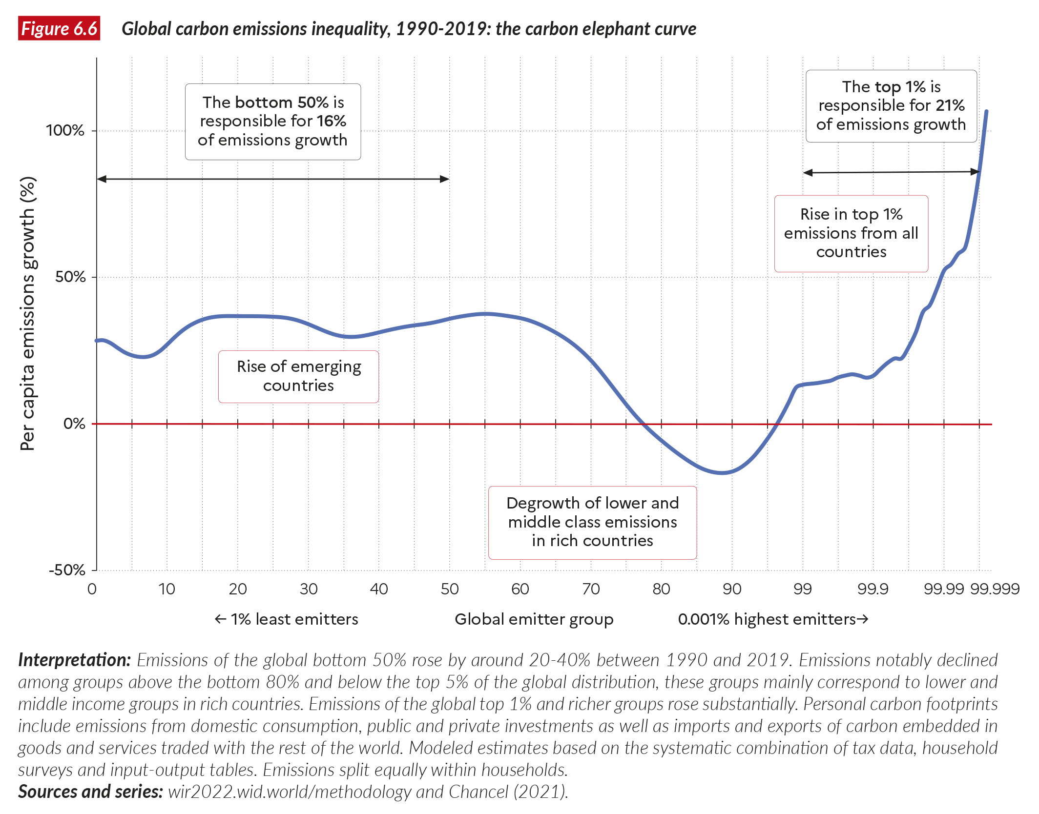
- Personal GHG footprint refers to the annual greenhouse gas emissions of the average individual. Footprints take into account all emissions, those stemming from direct energy use (e.g. fuel burnt by a car) as well as indirect energy use (CO2 emitted to produce the goods and services to sustain a lifestyle). Estimates also take into account imports and exports of carbon embedded in goods and services imported or exported to other countries.
- Personal GHG footprints are expressed in CO2-equivalent (or CO2e). This unit includes greenhouse gas emissions from carbon dioxide (CO2) as well as from other greenhouse gases such methane (CH4) and nitrogen oxides (NOx).
- For each country in this appendix, we report on Inequality data transparency. This index produced by the World Inequality Lab in partnership with the United Nations Development Program, measures the level of availability and quality of economic inequality data. The index ranges from 0 to 20.
Keep up to date
Each country page displays a QR code. You can flash this code with your phone to access more data about a country and to check recent updates. The country data presented on these pages reflect the best of our knowledge as of late 2021. Our project is collaborative and cumulative: as soon as we access better inequality data about a country, the data is published online on the World Inequality Database. Using QR codes is a way to have the latest information at hand and to check on other inequality indicators than those presented in this summary.

Algeria
Pop. 44,617,000 (2021)
Income inequality in Algeria today
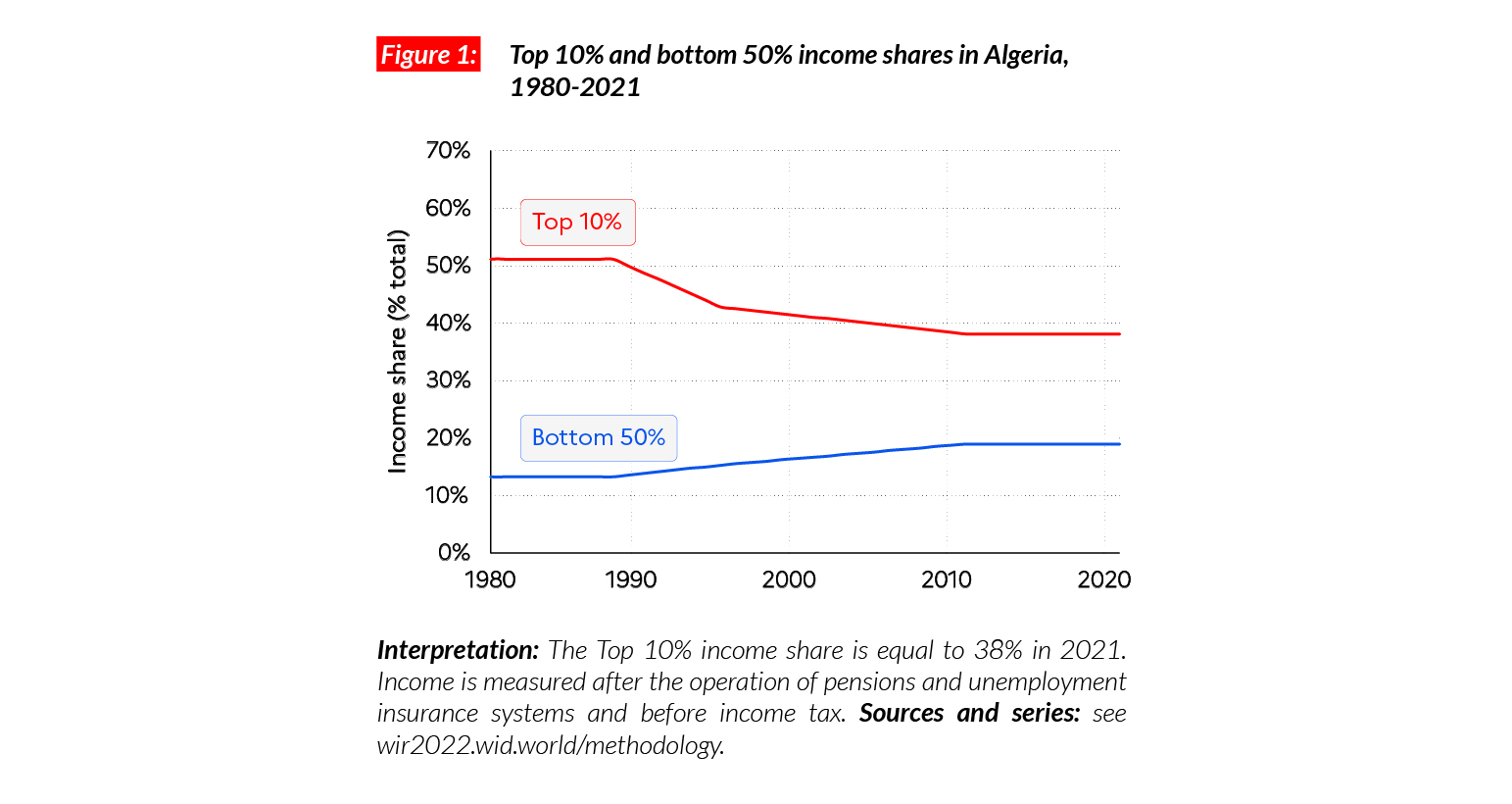
The average national income per adult in Algeria is equal to €PPP11,630 (DZD666,620).* This puts the average income in Algeria at a similar level as in Indonesia (€PPP11,700) and above neighboring Morocco (€PPP7,800). The top 10% of Algerians make on average €PPP44,300 (DZD2,538,490), 10 times more than the bottom 50% of the population (€PPP4,400 or DZD253,540). The top 10% captures 38% of national income whereas the bottom 50% captures 19% of it. While the bottom 50% income share is relatively high by historical standards (see below), the bottom 50% incomes have stagnated for almost 15 years at very low levels, fueling concerns about redistribution and social justice in the country.
*1 PPP = $PPP 1.4 = DZD 57.3

Income inequality in the long run
Income inequality data for Algeria is scarce: the country’s transparency index is 1/20, one of the lowest in the world. Available data based on top incomes suggests, however, that current inequality levels are lower than a century ago. Between 1900 and 1940, the top 10% income share was very probably higher than 60% and then declined to 50% after independence in 1962. The top 10% income share shrank in the 1990s, in the context of the civil war (1991-2002), which led to a general decline in average living standards.
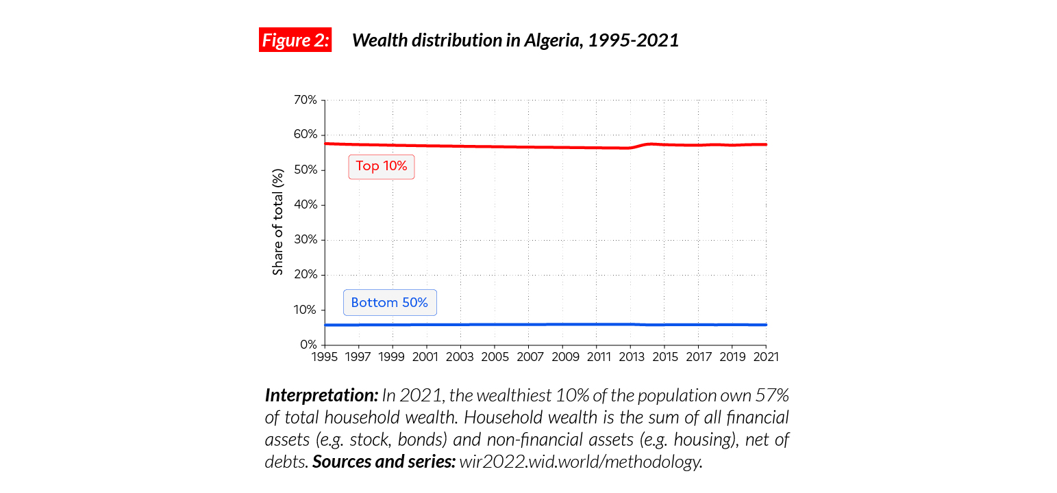
Wealth inequality in Algeria
Average household wealth in Algeria is equal to €PPP19,100 (DZD1,096,530), similar to Morocco and about 10 times lower than in Western European countries. The top 10% own 57% of total wealth (they own on average €PPP109,000 or DZD6,286,360) whereas the bottom 50% own less than 6% of the total (they own on average less than €PPP2,300 or DZD129,150). Available data suggests that the past decade showed no clear sign of a reduction in wealth inequality.
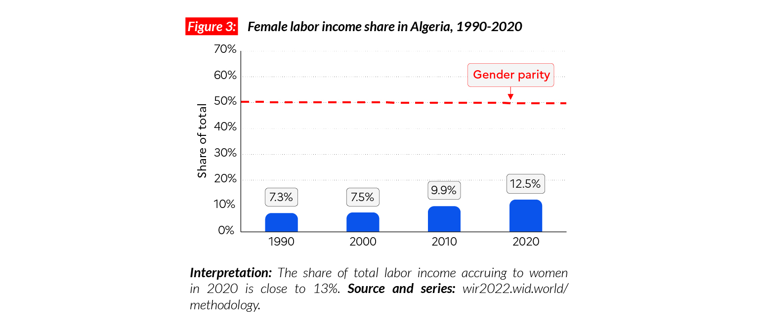
Gender inequality
Algeria stands out as one of the countries with the lowest female share of total labor incomes, where only 12.5% of labor incomes accrue to women. The share is similar to that in Morocco (14%), lower than in Nigeria (28%) and significantly lower than in Latin America (35%), North America (38%) and Europe (38%-40%).
Carbon inequality
Average greenhouse gas emissions in Algeria are
3.2 tCO2e/capita. This level is similar in other North African countries and South Asian countries such as Indonesia, and slightly above the level in sub- Saharan Africa (2 tonnes). The top 10% emit over nine tonnes on average, whereas the bottom 50% emit fewer than two tonnes. Average emissions have declined over the past 20 years in the context of a drop in average incomes.

Argentina
Pop. 45,606,000 (2021)
Income inequality in Argentina
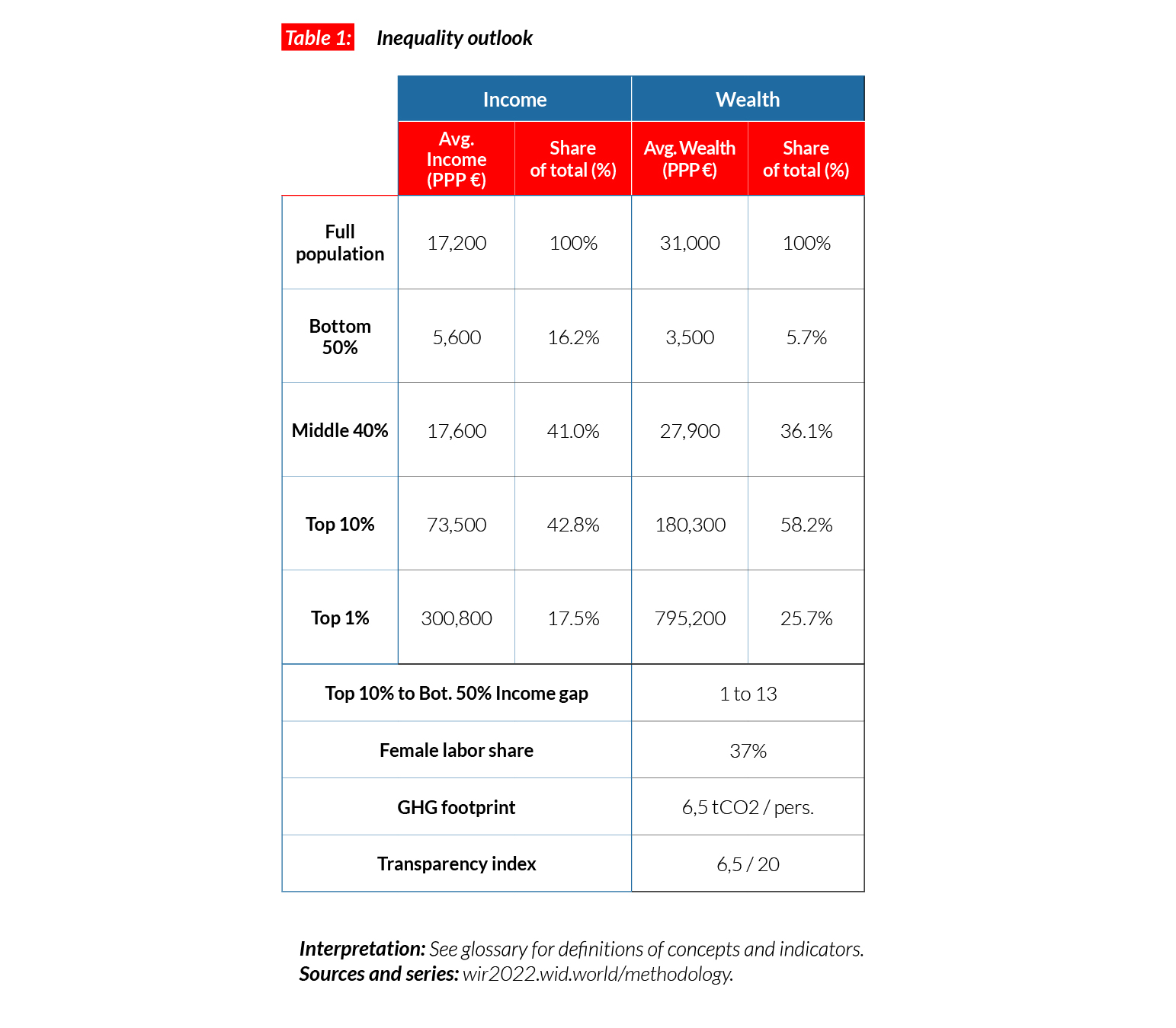
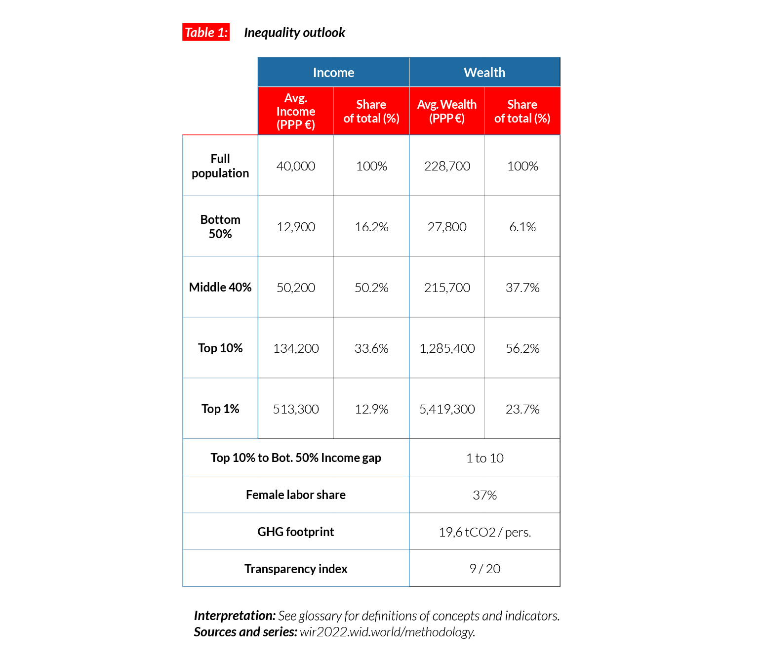
In Argentina, the average national income of the adult population is €PPP17,200 (ARS1,133,860).* While the bottom 50% earns €PPP5,600 (ARS368,050), the top 10% earns on average 13 times more (€PPP73,500 or ARS4,850,920). Though inequalities in Argentina are lower than the average in Latin America, they remain, overall, particularly high. In 2021, the top 10% earn around more than 40% of total national income (the share rises to more than 55% for Latin America as a whole). This is lower than in neighboring countries, including Brazil and Chile (59%), but significantly greater than in European countries (30-35%).
*€1 PPP = $PPP 1.4 = ARS 66.0
Inequalities in the long run
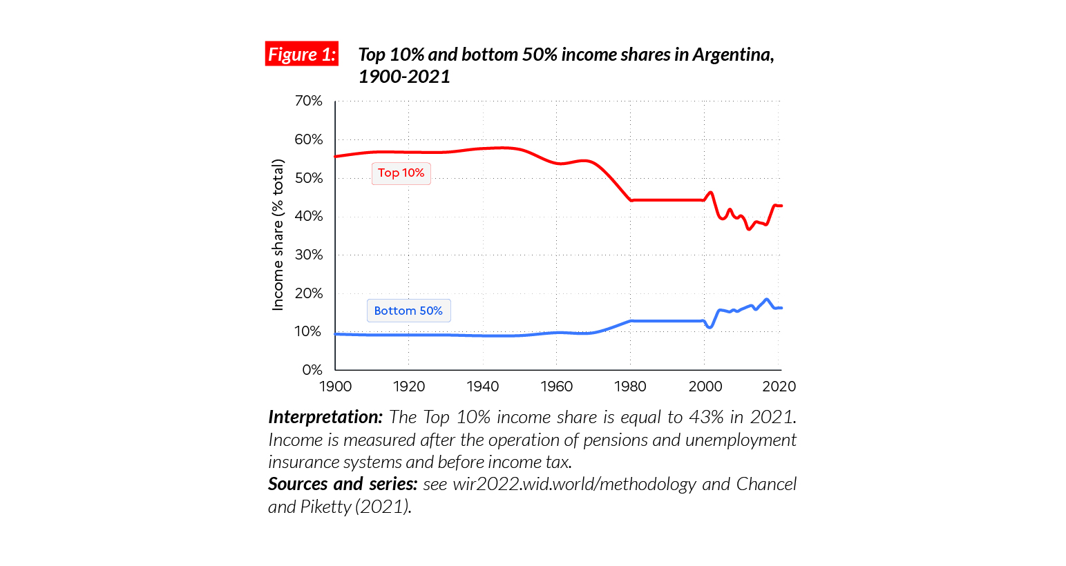
Available estimates suggest that inequality in Argentina declined over the second half of the 20th century, down from extreme levels: the top 10% share was above 55% between 1900 and 1960, and is close to 40% today. Over the past four decades, two movements are observed: a reduction in top 10% income share in the 2000s, followed by an increase since the early 2010s in the context of a generalized drop in incomes.
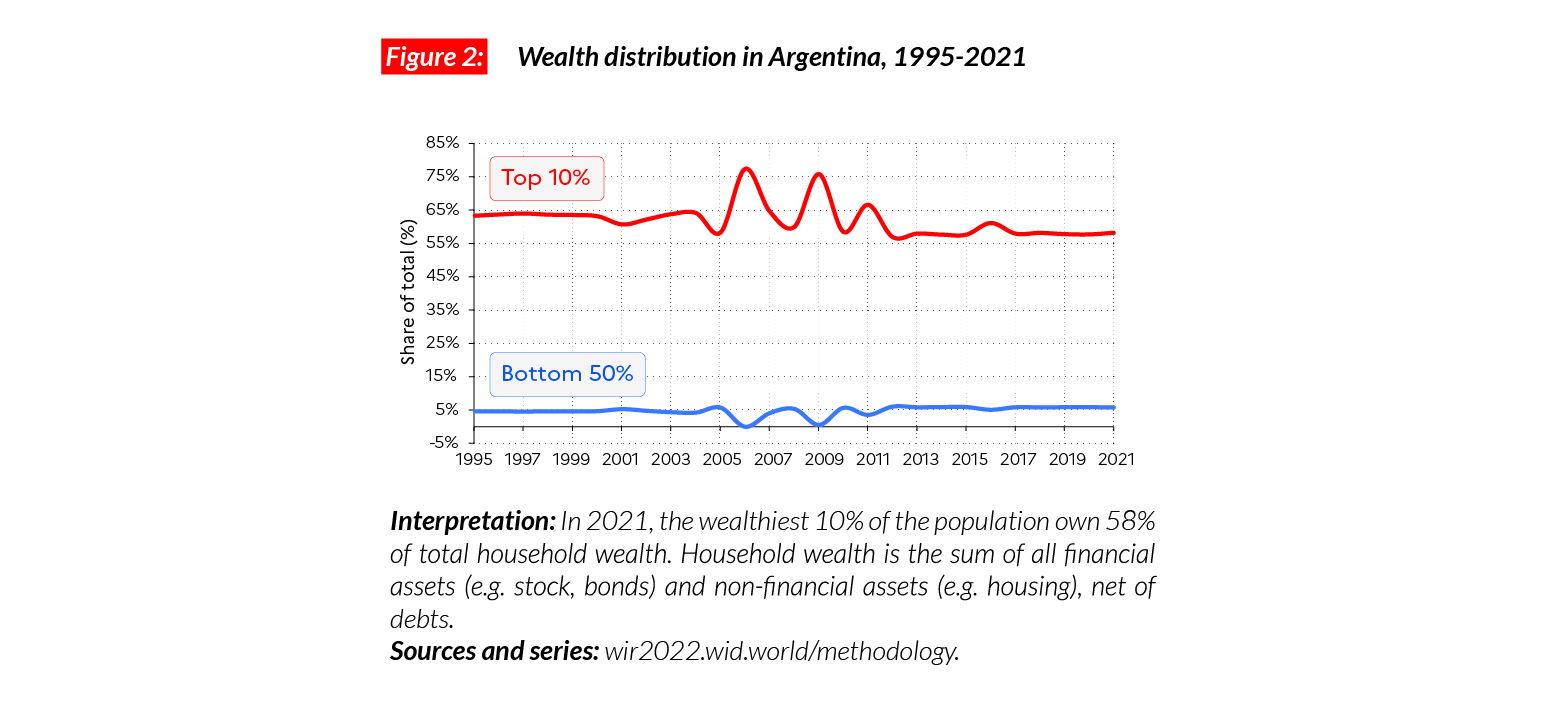
Wealth inequality maintained at an extreme level
Average household wealth has more than doubled in Argentina since 1995 but wealth inequality has remained at very high levels, with a top 10% wealth share oscillating between 60 and 70%. In 2021, the top 10% owns €PPP180,300 (ARS 11,903,540) on average, while the bottom 50% own €PPP3,500 or ARS234,090 (less than 6% of the total) in 2021. Argentinian wealth inequality is slightly lower than in the rest of Latin America but remains very high from an international standpoint.
Gender inequality
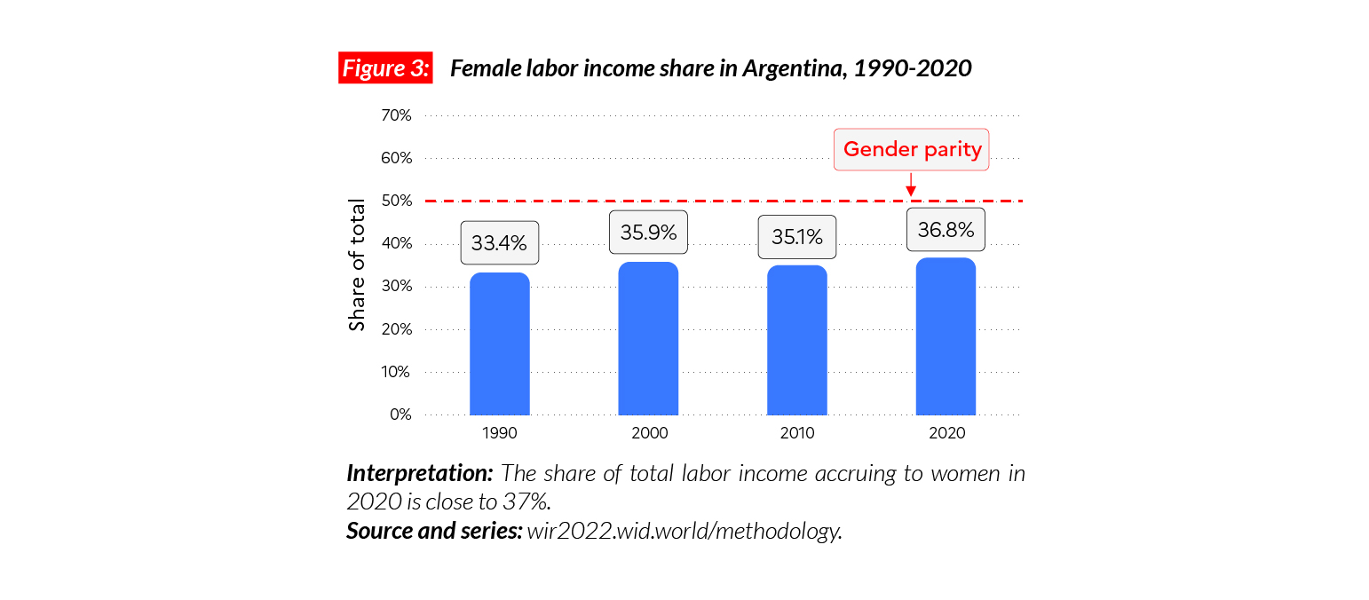
In Argentina, the female labor income share is equal to 37%. This value places Argentina slightly above the Latin American average (35%). Female labor income share is close to levels in Western Europe (38%), lower than Eastern Europe (41%) but higher than in Asia (21% excluding China) or Sub-Saharan Africa (28%). Since 1990, the female labor share has been increasing slowly (+4 p.p).
Carbon inequality
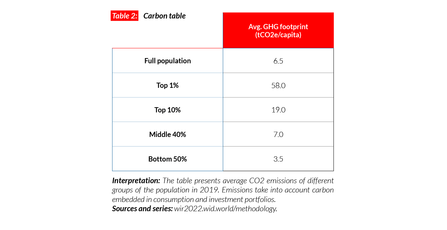
The average per capita greenhouse gas footprint in Argentina is equal to 6.5 tCO2e. The bottom 50%, middle 40% and top 10% were on average responsible for respectively 3.5, 7 and 19tCO2e/ capita in 2019. Average emissions are high compared with other Latin American countries (average per capita GHG consumption in Brazil is equal to 5 tCO2e) but lower than in high-income countries such as Germany Canada and Japan (around 11-19 tonnes).
Autralia
Pop. 25,656,000 (2021)
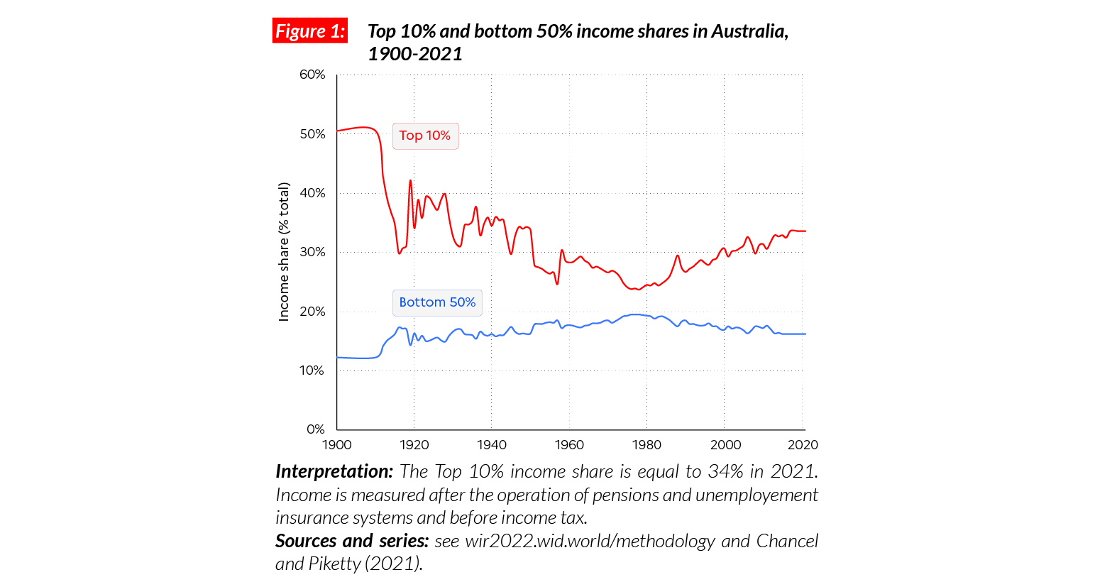
Income inequality in Australia today
Australia is a high-income country. The average per adult national income is equal to €PPP40,000 (AUD83,850).* This is comparable with other developed countries such as France (€PPP36,300) and Canada (€PPP38,000). While the bottom 50% earns €PPP13,000 (AUD27,110), the top 10% earns on average 10 times more (€PPP134,000 or AUD281,720).
*€1 PPP = $PPP 1.4 = AUD 2.1
Income inequality in the long run
Income inequality in Australia has been rising steadily since the early 1980s. Forty years ago, the top 10% income share was below 25%, it reached 30% at the turn of the century, and nears 34% in 2021. This trend stands in contrast with the 1900- 1970 period, when top incomes experienced a severe drop, making 1970s Australia one of the most equal countries on the planet. The 2010s has been a lost decade, in particular for the bottom 50%, whose incomes are slightly under their level 10 years ago.
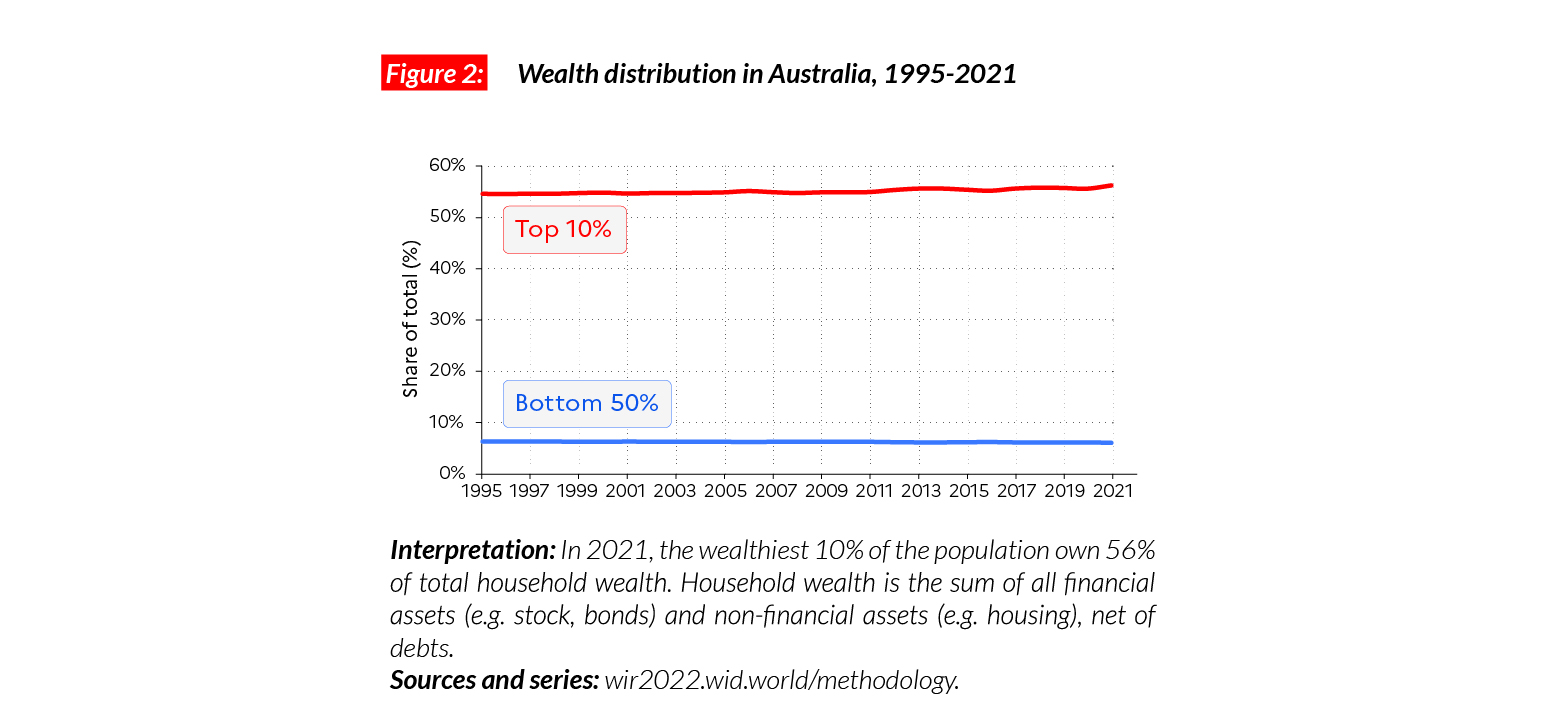
Wealth inequality
Wealth inequalities in Australia have remained stable at a medium level since the mid-1990s. The share of the bottom 50% of total national wealth is around 6%, while the middle 40% and top 10% own around 38% and 56% respectively of all personal wealth.
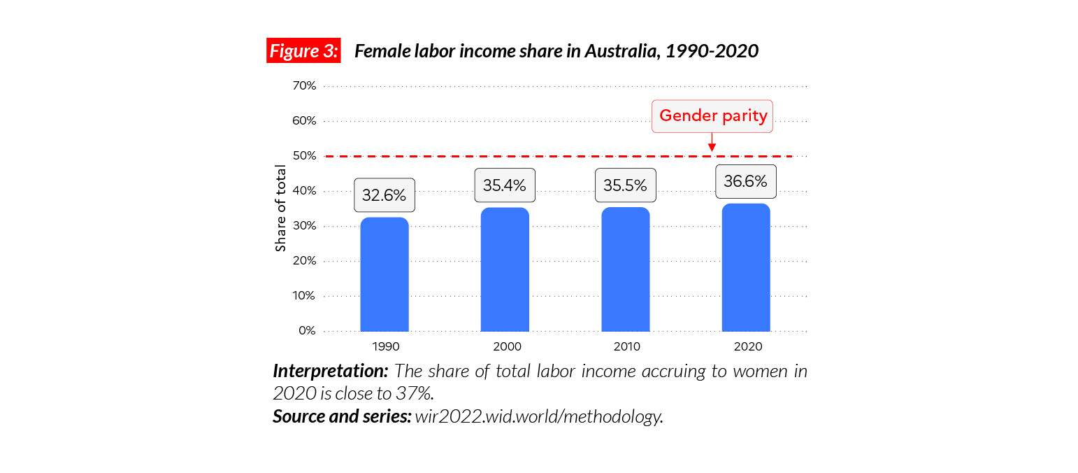
Gender inequality
In Australia, the female labor income share is equal to 37%. This level is comparable with those in Western Europe (38%) and North America (38%), lower than in Eastern Europe (41%) and higher than in Asia (21%, excluding China) and sub-Saharan Africa (28%). Women’s labor share is increasing slowly and has grown by four percentage points since 1990.
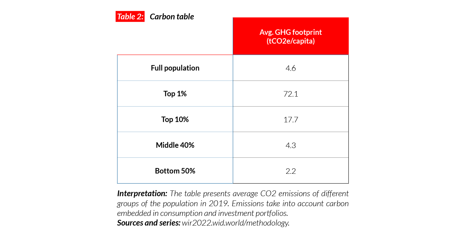
Carbon inequality
Average carbon emissions in Australia are close to 20 tCO2e/capita, one of the highest levels in the world and comparable with those in the US (21 tCO2e/capita). The bottom 50%, middle 40% and top 10% of the population respectively emit 10, 22 and 60 tonnes of carbon every year. Since 1990, carbon emissions have been slowly decreasing in the country: average emissions have gone down by two tonnes. This decrease took place in the poorest categories of population: while the bottom 50% and middle 40% decreased emissions by two and five tonnes, the top 10 % increased their emissions by 13 tonnes.

Brazil
Pop. 213,993,000 (2021)
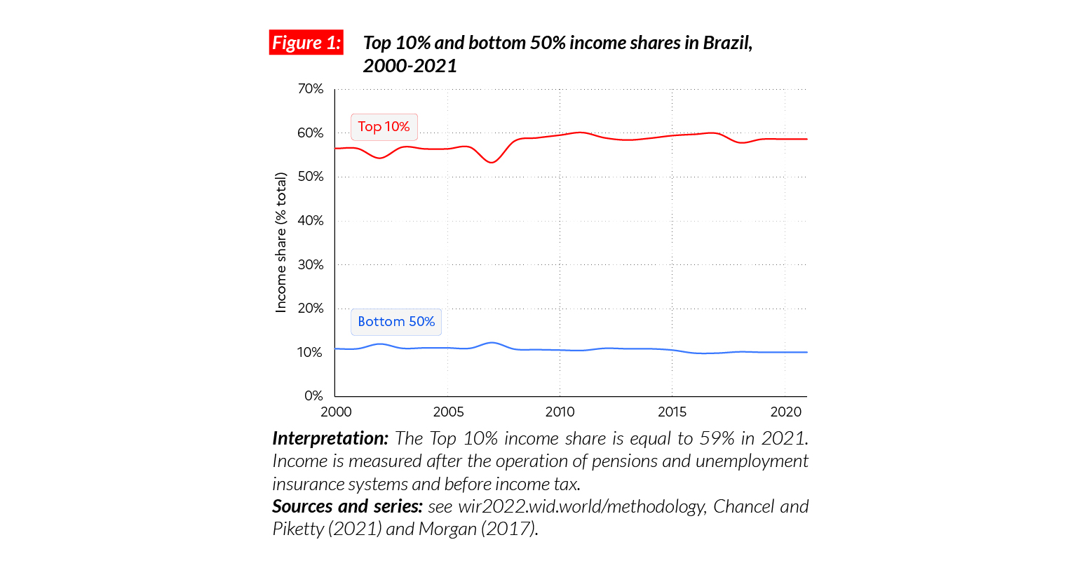
The top 10% earn more than half of total income
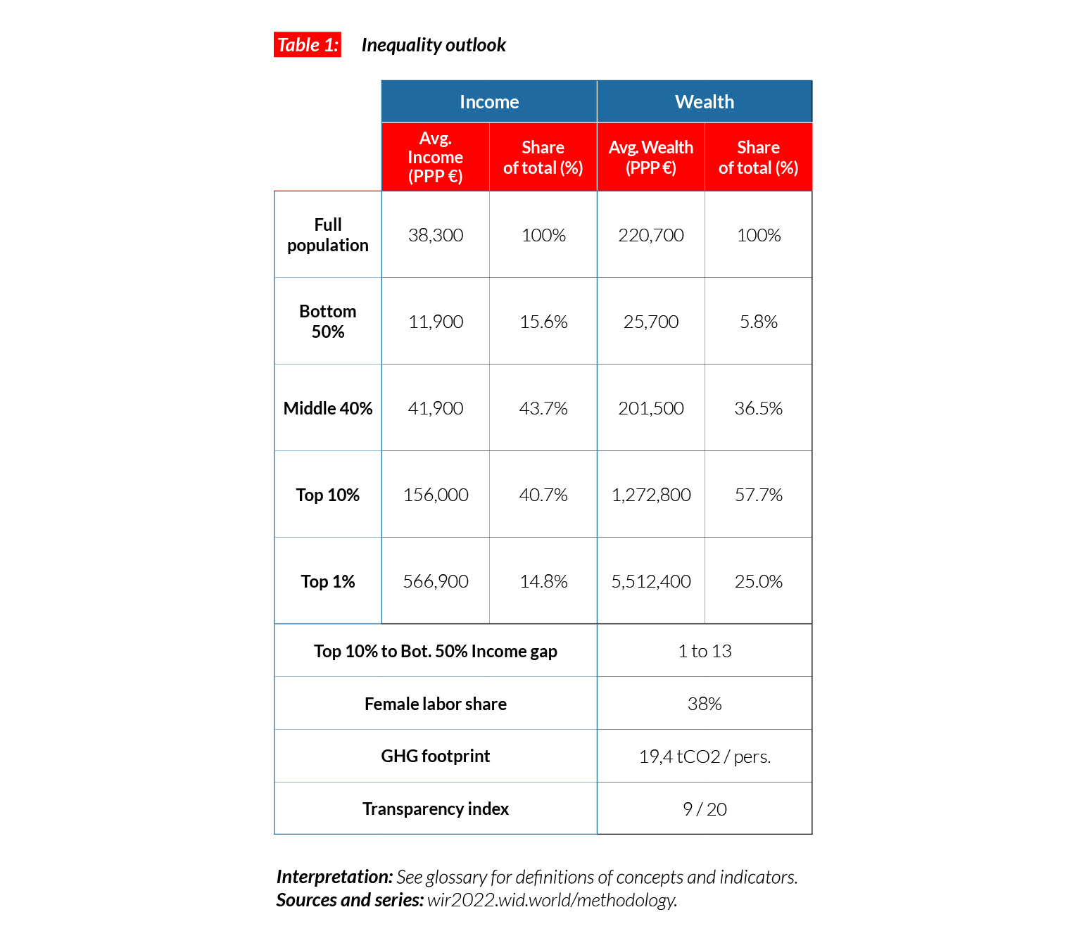
In Brazil, the average national income of the adult population is €PPP14,000 (BRL,43,680)*.4 While the bottom 50% earns €PPP2,800 (BRL8,800), the top 10% earns almost 30 times more (€PPP82,000 or BRL255,760). Brazil is one of the most unequal countries in the world: the top 10% captures 59% of total national income while the bottom half of the population takes only around 10%. Inequalities in Brazil are higher than in the US, where the top 10% captures 45% of total national income, and China, where it is 42%.
*€1 PPP = $PPP 1.4 = BRL 3.1
Income inequality since the 2000s
Income inequality in Brazil has long been marked by extreme levels. Available estimates suggest that the top 10% income share has always been higher than 50%. Since the 2000s, wage inequality has been reduced in Brazil and millions of individuals lifted out of poverty, largely thanks to government programs such as the increase in the minimum wage or Bolsa Família. At the same time, in the absence of major tax and land reform, overall income inequality has remained virtually unchanged, with the bottom 50% capturing around 10% of national income and the top 10% about half of it.
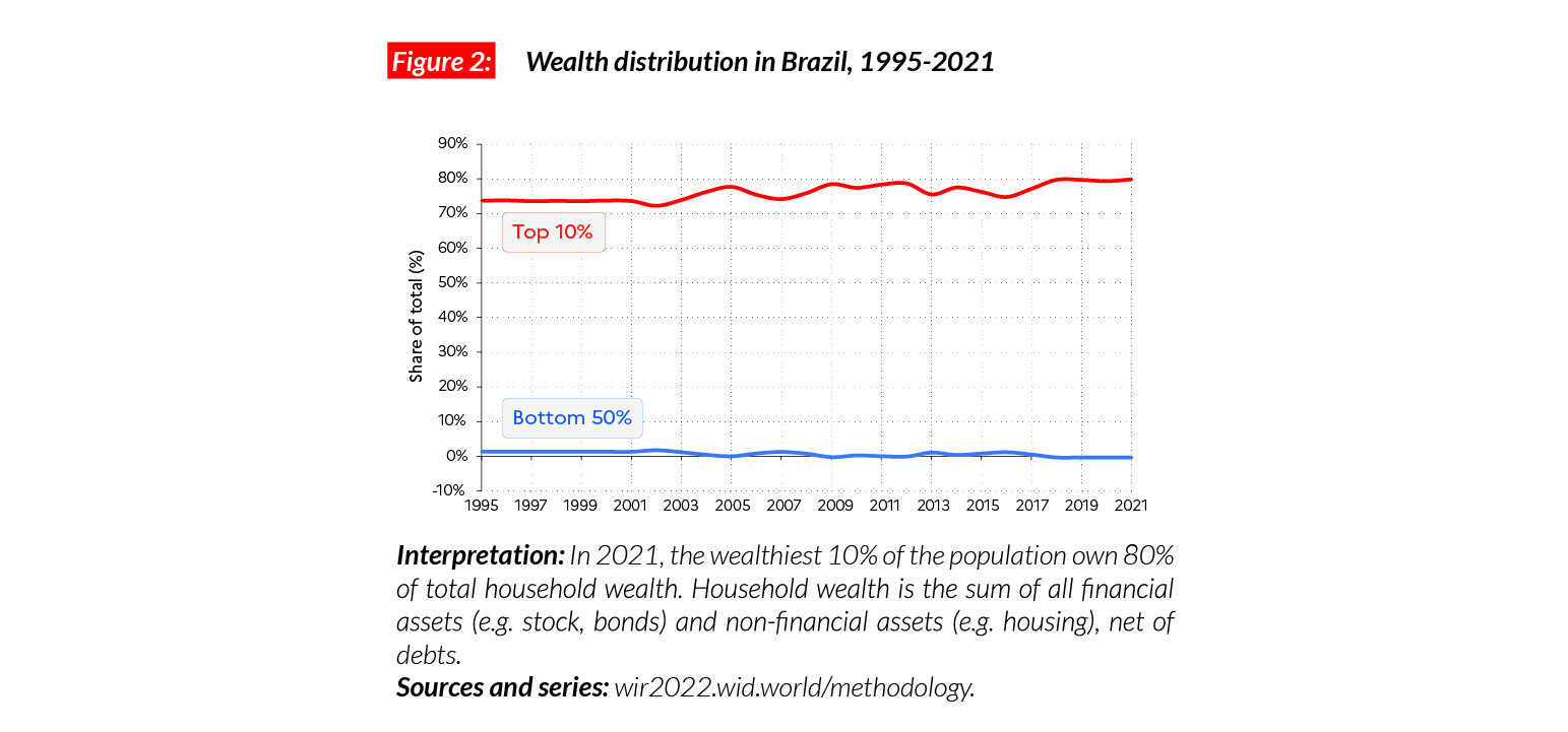
Extreme levels of wealth inequality, still on the rise
Wealth inequality in Brazil is also among the highest in the world. In 2021, the bottom 50% in the country owns less than 1% of total national wealth (compared with 6% in Argentina, for example), whereas the top 1% of the population owns about half of total wealth. Available data suggests that wealth inequality has increased since the mid-1990s in a context of financial deregulation and no major tax reform.
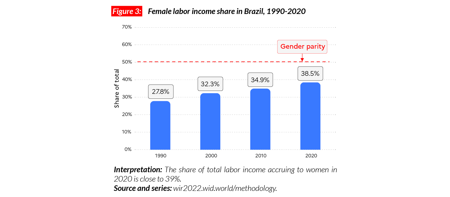
Gender inequality in Brazil
In Brazil, the female labor income share is equal to 38.5% of all labor income. This is slightly higher than in other Latin American countries, including Argentina (37%) and Colombia (36%). Compared with other countries, the growth in labor income share is particularly significant in Brazil: between 1990 and 2019, it grew by 10 points. Gender inequality levels are now equal to the average in Western Europe (38%).
Carbon inequality in Brazil
The average per capita greenhouse gas footprint in Brazil is equal to 4.6 tCO2e. The bottom 50%, middle 40% and top 10% are on average responsible for respectively around 2, 4.5 and 18 tCO2e/capita. Average emissions are lower than in Argentina (6.5 tCO2e) and Europe. Brazil has a very specific place in climate mitigation policies because of the importance of the Amazon forest on its territory. Representing half of remaining rain forest in the world, the deforestation of the Amazon puts Brazil at the center of global environmental debates. Recent studies suggest that the forest is on the brink of becoming a source of carbon emissions, rather than a carbon sink.
Canada
Pop. 38,006,000 (2021)
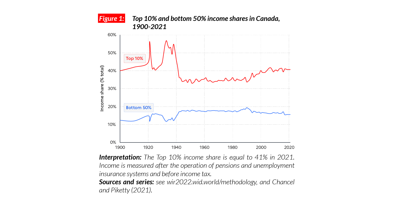
Inequality in Canada today
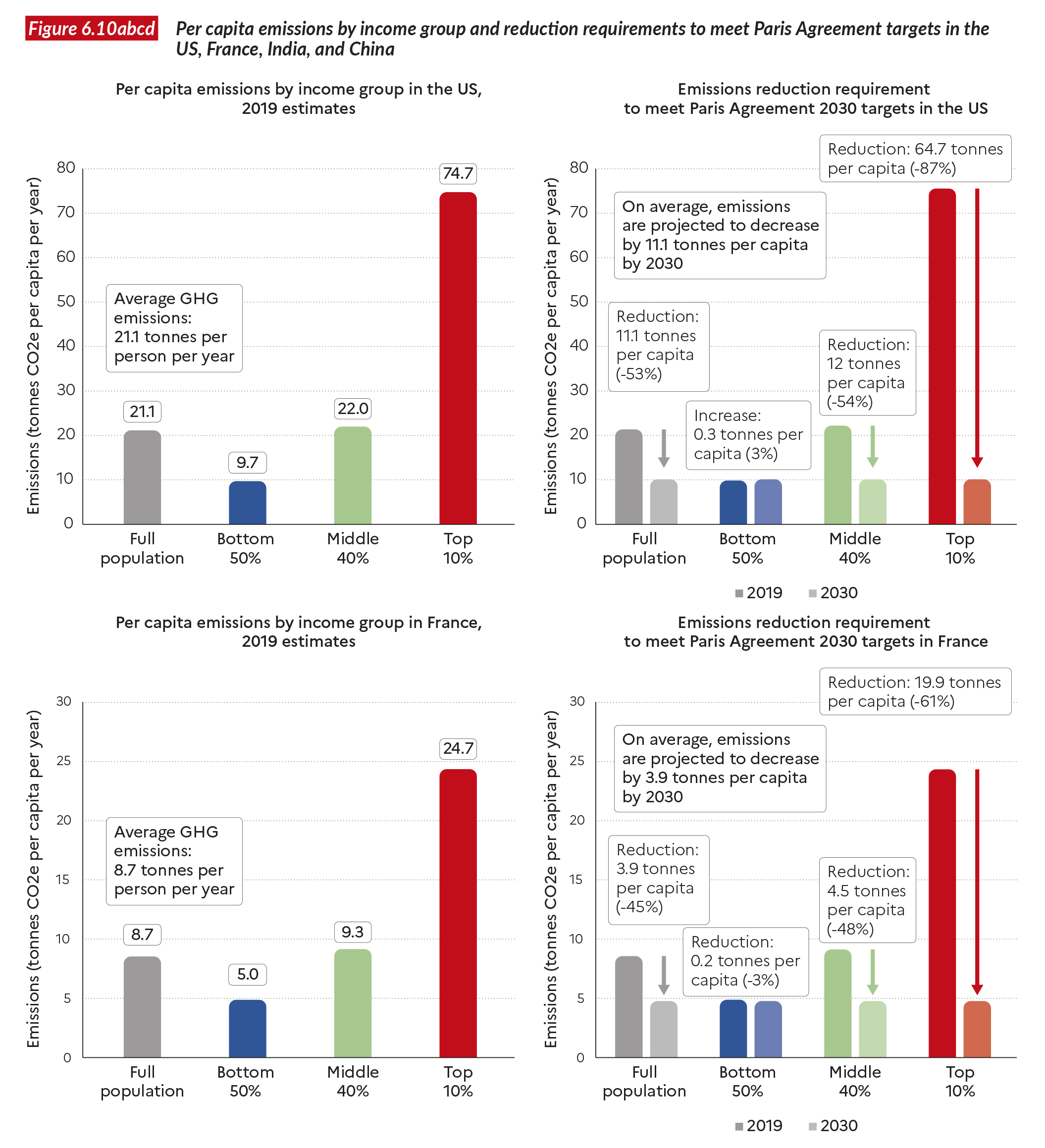
In Canada, the average national income of the adult population is €PPP38,000 (CAD65,590.)* While the bottom 50% earns €PPP12,000 (CAD20,440), the top 10% earns on average 13 times more (€PPP156,000 or CAD266,950). Canada is a country with high levels of inequality, midway between the US and Europe. The ratio between the incomes of the top 10% and the bottom 50% is equal to 13, compared with nine for the European Union and 17 for the US. While the average Canadian earns 30% more than the average citizen of the European Union (in purchasing parity terms), the poorest half of Canadians earn 85% less than the poorest half of Western Europeans.
*€1 PPP = $PPP 1.4 = CAD 1.7
Income inequality in the long run
Income inequality in Canada has been rising significantly over the past 40 years. In 1980, the top 10% income share was close to 35% and the bottom 50% captured almost 20% of national income. Inequality in Canada dropped after the Second World War and was maintained at low levels from the 1950 to the 1980s thanks to a mix of capital control and social policies, in a context of high economic growth. Since the 1980s, financialization, deregulation and lower taxes contributed to rising inequalities, though the rise was not as fast as in the US.
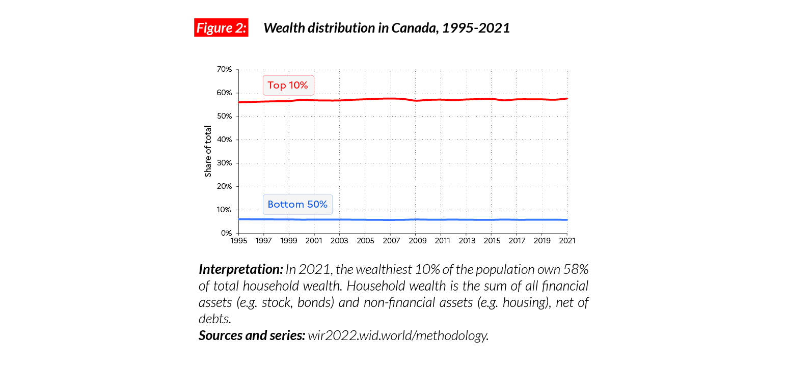
A wealthy country, with high levels of wealth inequality
Canada is a wealthy country, with an average wealth of €PPP220,700 (CAD377,680). The bottom 50% holds on average €PPP25,700 (CAD43,950), and these figures rise to €PPP202,000 (CAD914,110) and €PPP1,273,000 (CAD5,602,434) for the middle 40% and top 10%, respectively. This is comparable with Western European countries such as France (respectively bottom 50%, middle 40% and top 10% average wealth of 22,300, 203,000 and 1,356,000 €PPP). Since the mid-1990s, wealth inequality levels have remained relatively stable in the country with the shares of the bottom 50%, middle 40% and top 10% equal to around 6%, 37% and 58% respectively.
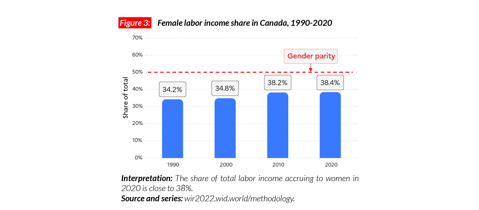
Gender inequality in Canada
In Canada, the female labor income share is 38%. This share is slightly lower than in the US (39%). It is higher than the average in Sub-Saharan Africa (28%), Asia (21%, excluding China) and Western Europe (38%), but lower than in Eastern Europe (41%). The growth of the female labor income share has been moderate since 1991 (+ 4 p.p.).
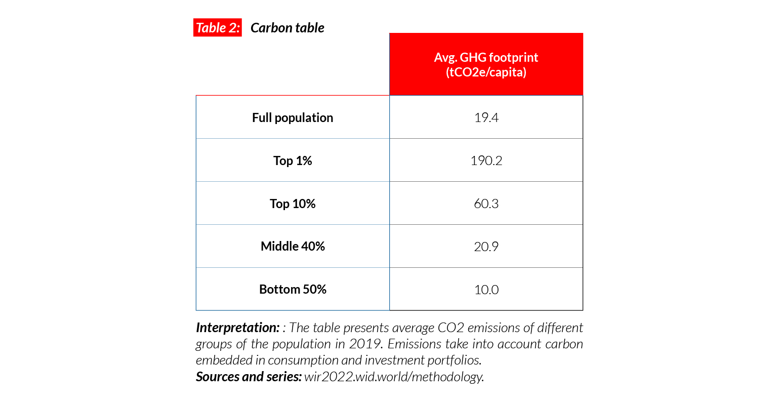
Carbon Inequality in Canada
Canada is one of the highest emitters in the world in per capita terms. Average per capita emissions are equal to 19.4 tCO2e. This is lower than in the US (21 tCO2e) but much higher than in Germany (11) and China (8). Since 1990, emissions have decreased by 3.1 tonnes of carbon per person. While the bottom 50% and middle 40% have reduced their emissions by 3.5 and 4.5 tonnes respectively per person, emissions of the top 10% have increased by around 4 tonnes per person. Canada’s official objective is to reach 12.3 tCO2e/ capita by 2030. To reduce their carbon footprint to this level, the top 10% and the middle 40% will have to reduce emissions by around 48 and eight tonnes per person, respectively.
Chile
Pop. 19,212,000 (2021)
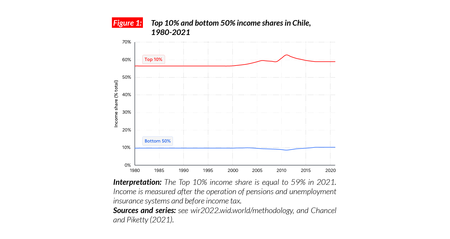
Extreme income inequality in Chile
In Chile, the average national income of the adult population is €PPP22,100 (or CLP14,083,780).* While the bottom 50% earns €PPP4,500 (CLP2,866,570), the top 10% earns almost 30 times more (€PPP130,200 or CLP82,966,190). The bottom 50% in Chile earn only 10% of total income, while the top 10% share is equal to almost 60%. The country is one of the most unequal in Latin America. These levels are comparable with inequalities in Brazil, where the bottom 50% share is also close to 10%.
*€1 PPP = $PPP 1.4 = 637.2

Income inequality in the long run
Available estimates suggest that inequality in Chile has been extreme over the past 120 years, with a top 10% income share constantly around 55%-60% and a bottom 50% income share around 9-10%. The persistence of extreme inequality in Chile, even after the end of the military dictatorship (1973-1990), has recently triggered a wave of social protests. In 2019-2020, Chileans went to the streets to protest against a dual economy system characterized by an economic elite living according to wealthy North American standards on the one hand, and a very poor working class and increasingly pauperized middle class on the other.
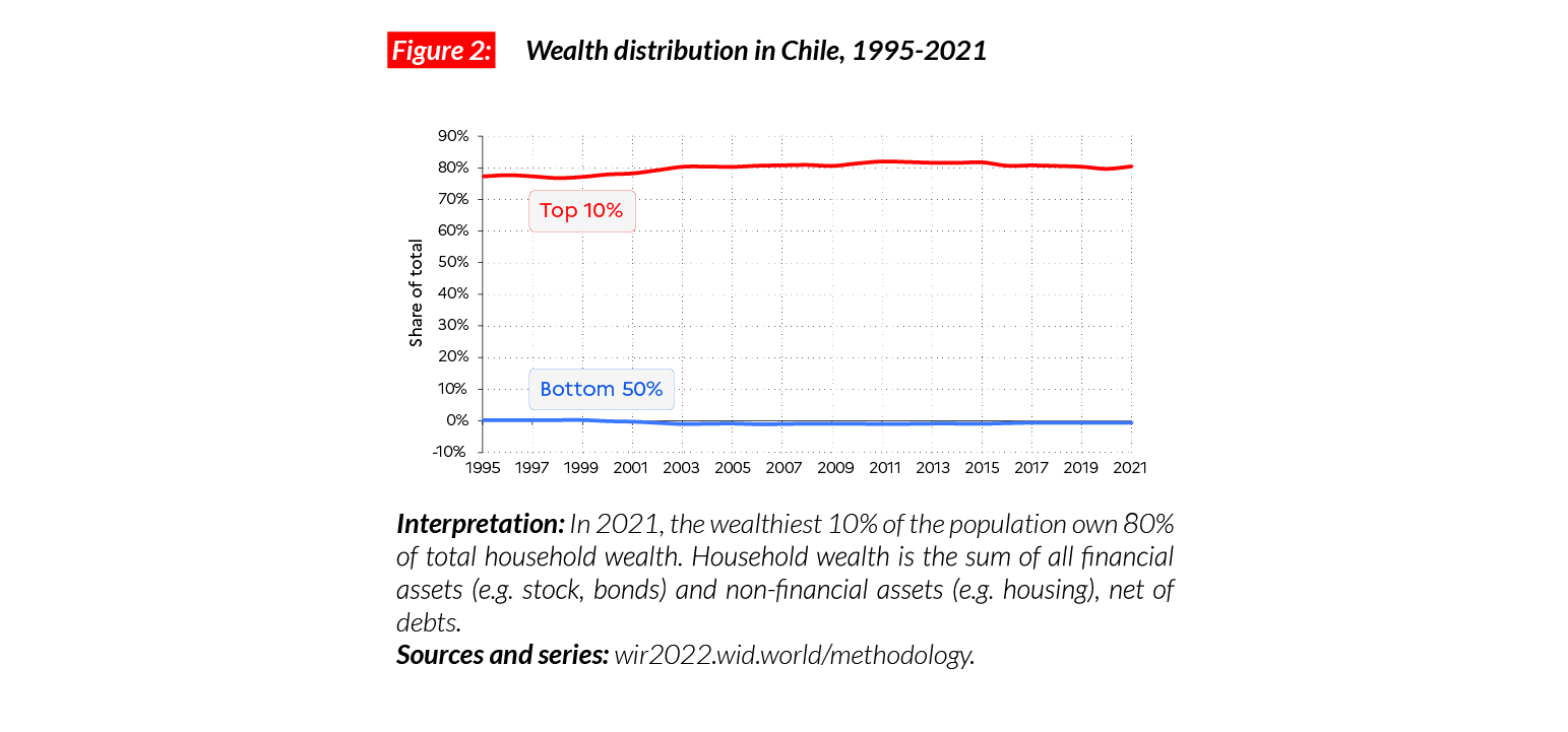
The poorest half owns no wealth, the richest 1% owns half of it
In 2021, the average wealth for the bottom 50% in Chile is negative, with a high number of Chilean in debt. On the other hand, the top 10% and top 1% of the population respectively hold 80% of the total (€PPP433,000 on average, CLP276,160,350) and 50% of the total (€PPP2,670,000 on average, CLP1,701,429,350). In the last 25 years, these extreme levels of inequalities have continuously increased. Between 1995 and 2021, the average wealth of the poorest half has remained around zero. Simultaneously, the averages of the top 10% and top 1% have more than doubled.
Gender inequality
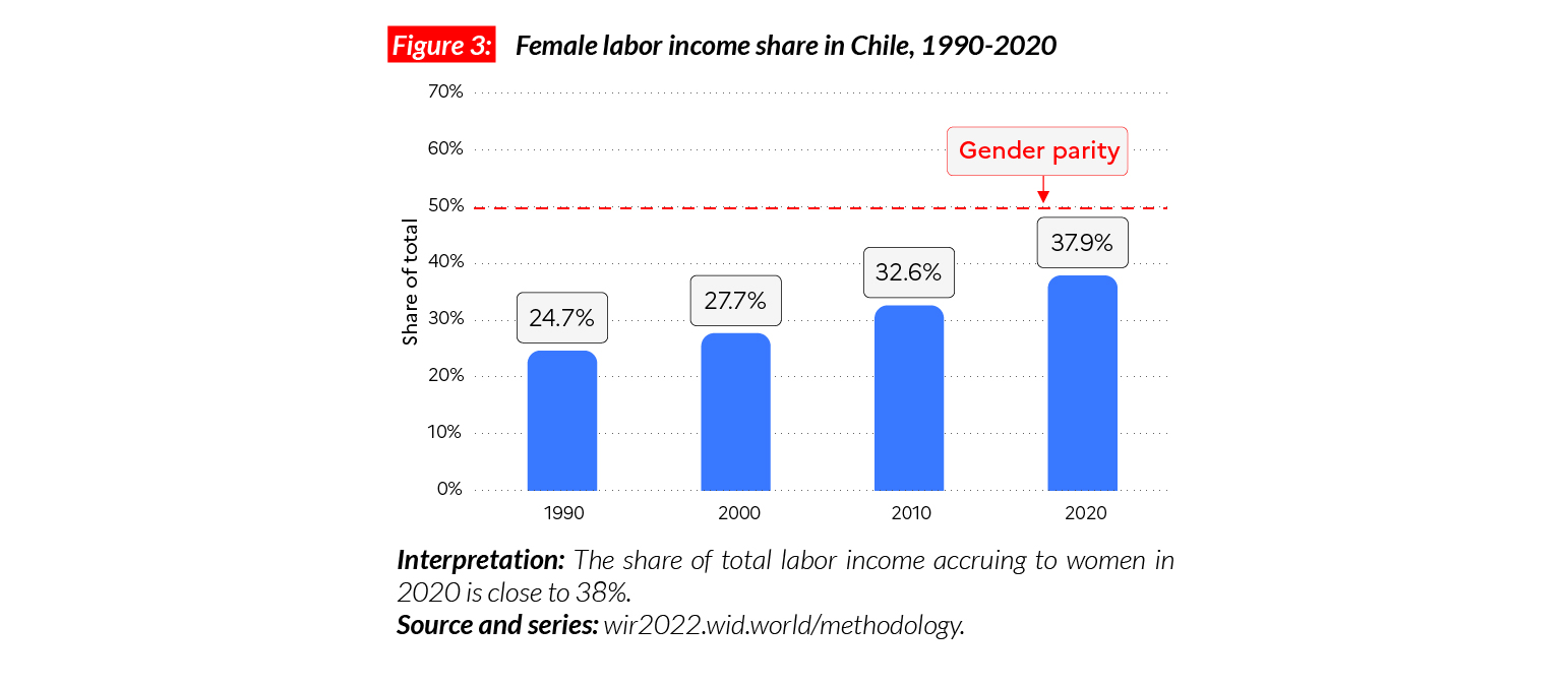
In Chile, the female labor income share is equal to 38%. This is very close to other Latin American countries, including Argentina (37%) and Brazil (38%). Similar to Brazil, the decrease in gender inequality in Chile has been significant in the last 30 years. Between 1991 and 2021, female labor income share has increased by 14 points.
Carbon inequality
Unsurprisingly, carbon inequalities in the country are also very high. The average carbon consumption is around 6 tCO2e/capita. While the top 10% emit on average 26 tonnes every year, the bottom 50% and middle 40% emit respectively three and six tonnes. Between 1990 and 2011, the average carbon footprint in Chile went from 3.7 tonnes to 6.3 tonnes. Since then, it has stabilized.

China
Pop. 1,411,132,000 (2021)
Income inequality in China today
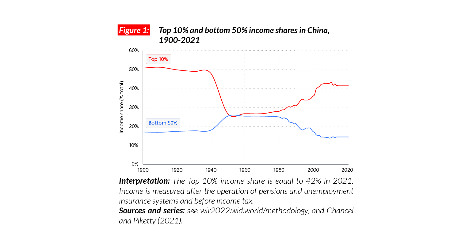
In China, the average national income of the adult population is €PPP17,600 (or CNY88,870).* While the bottom 50% earns €PPP5,100 (CNY25,520), the top 10% earns on average 14 times more (€PPP73,400 or CNY370,210). This gap between incomes of the bottom 50% and the top 10% is higher than the inequalities observed in Europe, but below that of the US (17) and India (21).
*€1 PPP = $PPP 1.4 = CNY 5.0

Income inequality in the long run
Economic inequality in China followed a U-shape trajectory over the course of the 20th century. The establishment of the People’s Republic of China in 1949 was associated with a fall in inequality levels in the context of a general decline in incomes. The post-1978 economic reforms led to fast-rising average incomes as well as growing inequality until the middle of the first decade of the 2000s. Post-2005, investments in health, education and infrastructure in rural areas, helped to keep inequality in check, but wealth inequality continued to increase at the very top of the social pyramid (see below).
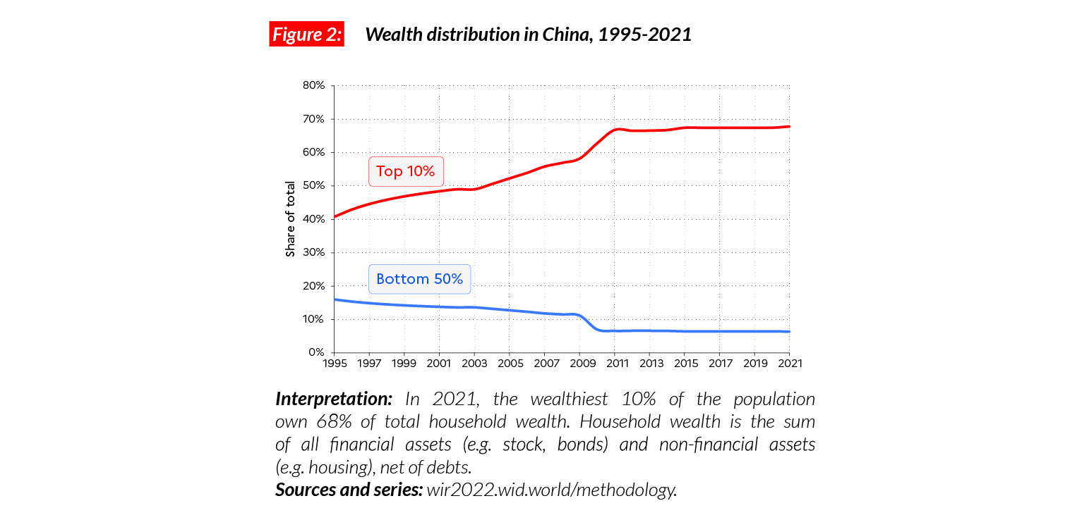
A constant rise in wealth inequality
The average wealth of the bottom 50%, middle 40% and top 10% is equal to €PPP11,000, €PPP56,000 and €PPP583,000 respectively (CNY55,270, CNY280,500 and CNY2,943,907). Overall, the top 10% in China own almost 70% of total national wealth. Wealth inequality in China is higher than the levels found in India (where the share of the top 10% is equal to 64%) and comparable with inequality levels in the US (71%). Since the 1990s, wealth inequality has been on the rise.
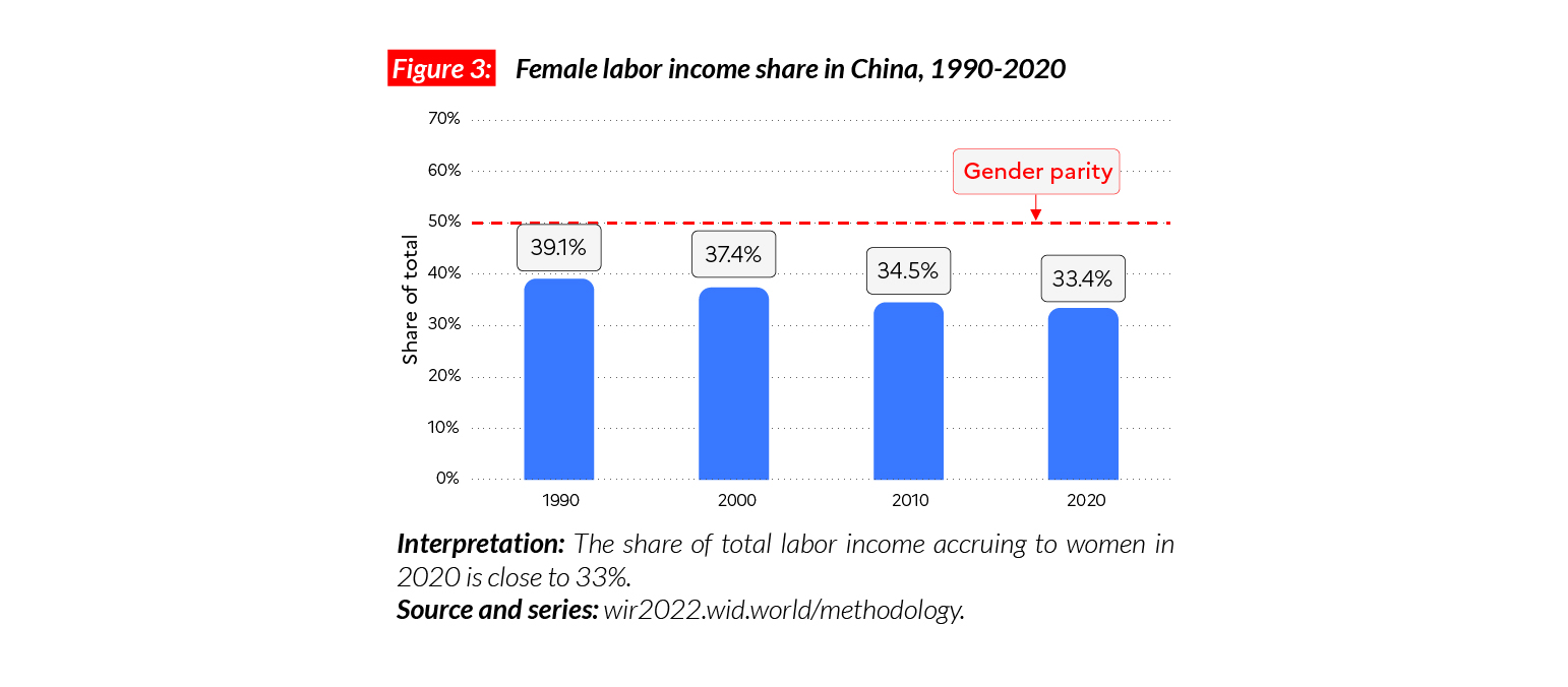
Gender inequality
Here, China is an exception within Asia. The female labor income share is higher than the average in the region (33% vs. 21%) and in Japan (28%). Contrary to the general trend, however, female labor income share in the country is currently declining. Between 1991 and 2019, it decreased by six percentage points.
On average, the top 10% in China emit 10 times more emissions than the bottom 50%
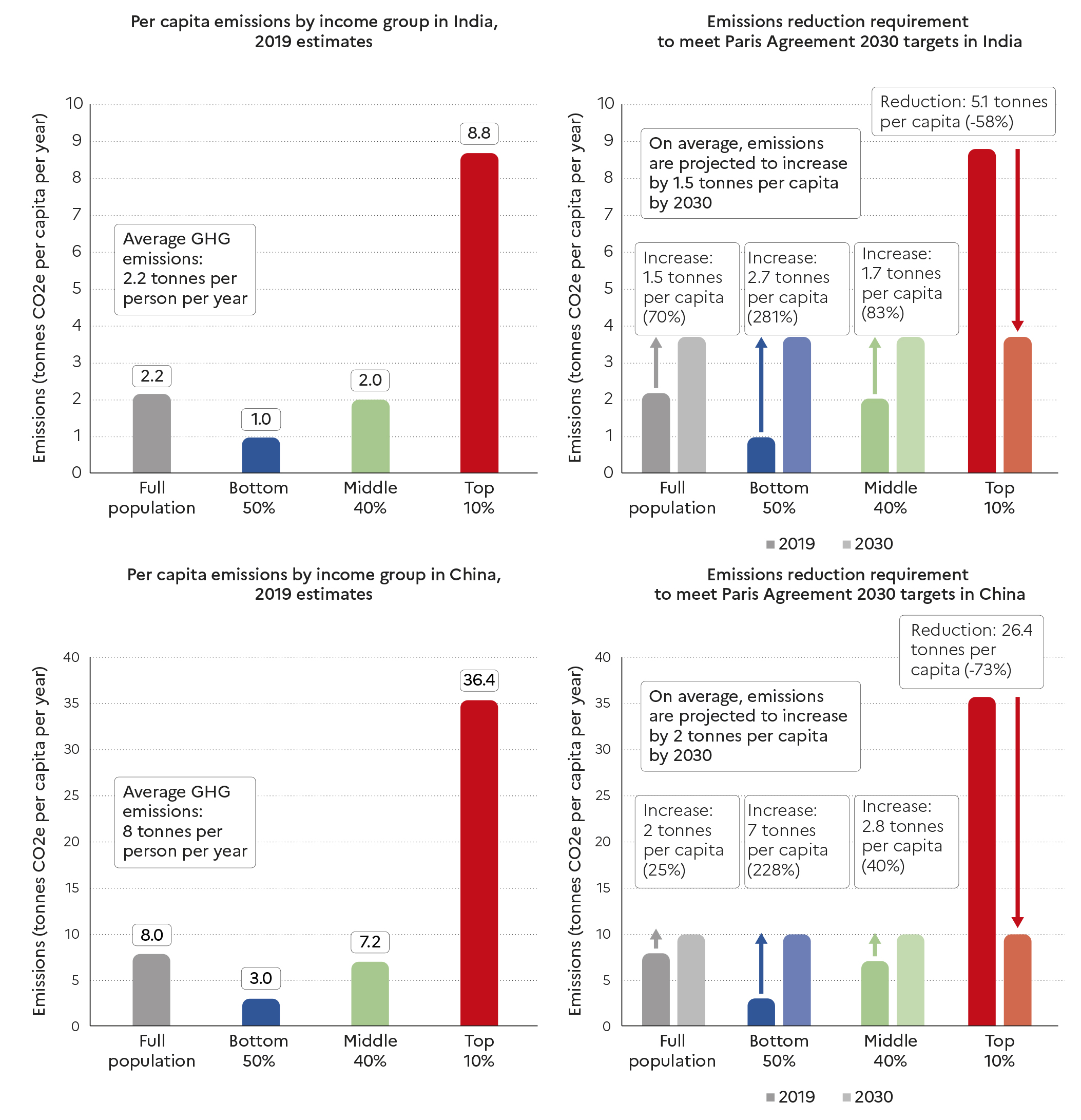
Although China is by far the world’s largest emitter in aggregate due to the size of its population, its per capita footprint consumption is lower than European levels and equal to 8 tCO2e/capita. This value is comparable with France’s carbon footprint (8.7 tCO2e/hab), but inequality levels are much higher. The bottom 50%, middle 40% and top 10% are on average responsible for respectively three, seven and 36 tonnes of CO2e/capita. Since 1990, average per capita emissions have notably increased, rising from 2.7 tCO2e/capita to 8 tCO2e/ capita. The emissions of the top 10% increased faster than the average, from around 7 tCO2e/ capita to over 30 tCO2e/capita. In comparison, the bottom 50% only increased their emissions from 1.5 to 3.0 tCO2e/capita over the period.

France
Pop. 67,035,000 (2021)
Income inequality in France today
In France, the average national income is €PPP36,300 (or €38,360).* While the bottom 50% earns €PPP16,500 (€17,430), the top 10% earns on average seven times more (€PPP117,000 or €123,610). This gap between incomes of the bottom 50% and the top 10% is smaller than some other European countries, including Germany (10), and comparable with others, including the UK (8.8). This ratio is much smaller than in the US (17) and China (14).
*€1 PPP = $PPP 1.4 = € 1.1

Income inequality in the long run
Income inequality in France declined significantly over the course of 20th century, a decline partly due to the impacts of the First and Second World Wars, the 1929 crisis and the fall of foreign assets, as well as to the post-WWII development of the social state, and pro-labor policies implemented after the 1968 social protests. After 1983, a wave of deregulation and liberalization policies partly reversed the downwards trend. More recently, top-end inequality has increased as a result of tax cuts concentrated on wealthiest income groups.

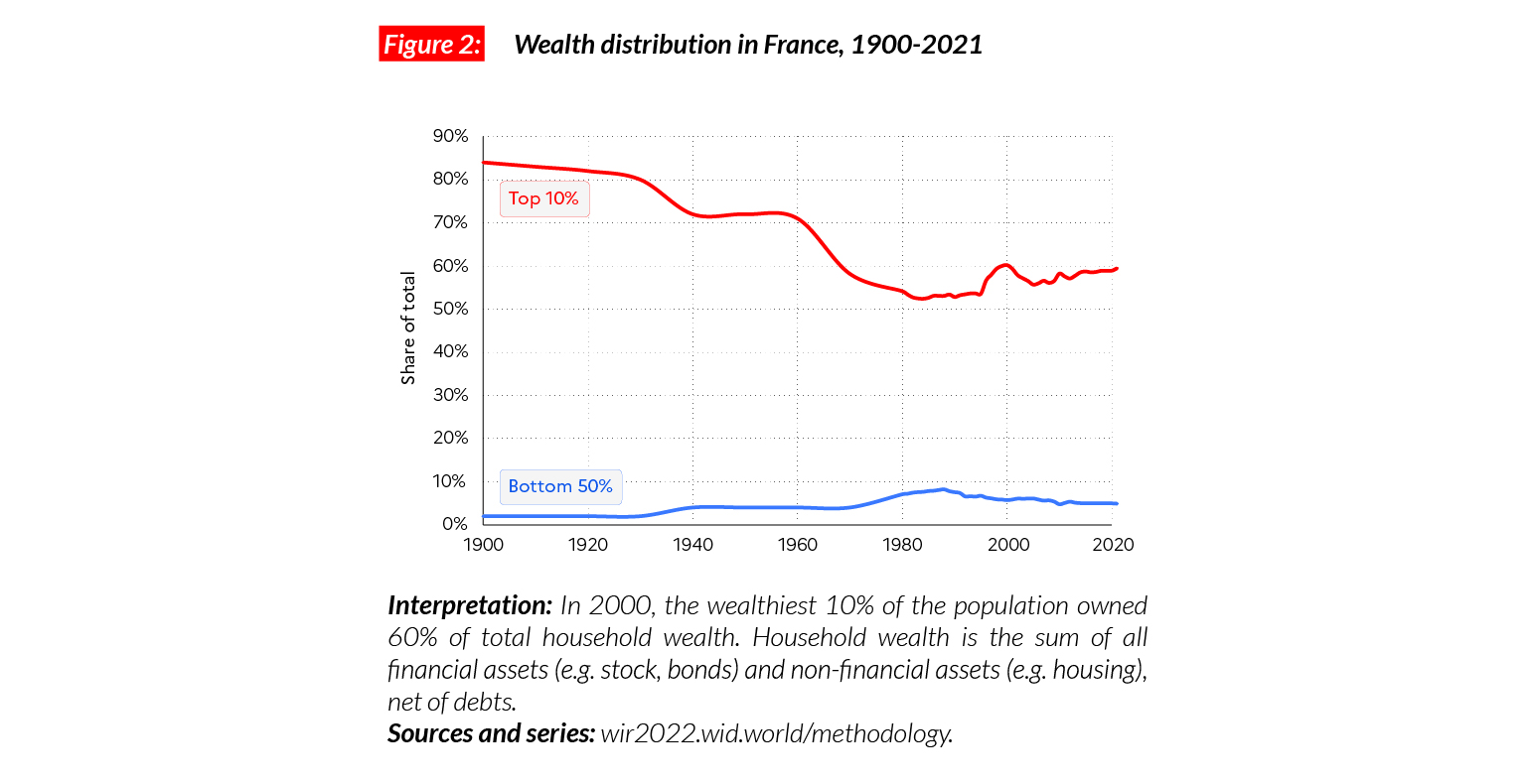
A continued rise in wealth inequality
The average wealth for the top 10%, middle 40% and bottom 50% groups in France is respectively equal to €PPP1,356,000, €PPP203,000 and €PPP22,300 (€1,432,950, €214,640 and €23,560). Wealth inequalities in France are much higher than income inequalities and continue to rise. Wealth inequality levels are, however, lower than in China (where the top 10% own 67% of the wealth) and the US (where 66% of the wealth is concentrated in the top 10). In Europe, French inequality levels are comparable with those in the UK (where the top 10% holds 57% of national wealth).
Gender inequality
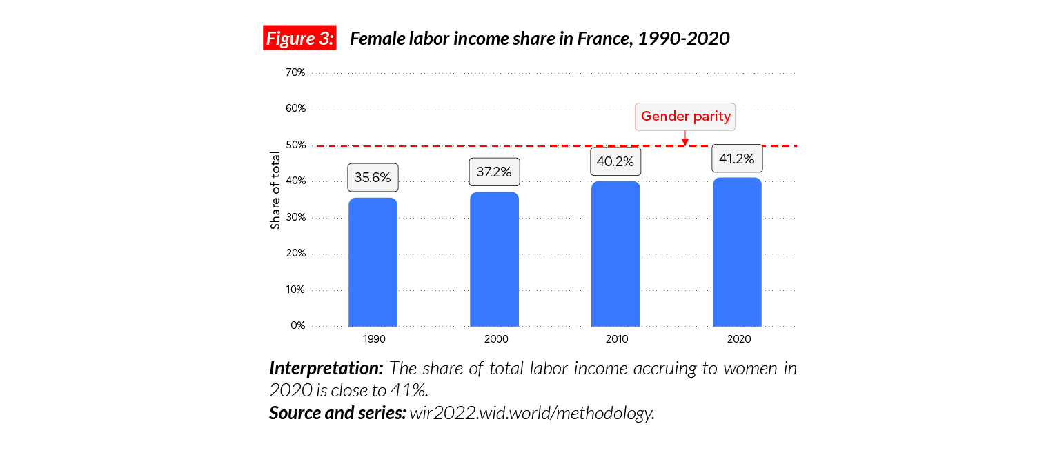
In France, the female labor income share is equal to 41%. This share is higher than the UK (38%) and the Western European average (38%). It is higher than the average in Sub-Saharan Africa (28%), Asia (21%, excluding China) and North America (38%), but slightly lower than in Eastern Europe (41%). Since 1990, changes in the female labor income share in France have followed the general Western European trend, with a moderate increase over 30 years (+ 5 p.p.).
Carbon inequality
The average yearly GHG consumption in France is equal to 8.7 tonnes of CO2e per capita. While the bottom 50% emits on average 5 tCO2e, the top 10% is responsible for nearly 25 tCO2e in emissions per capita. While emissions among the bottom 50% have declined by 29% since 1990, top 10% emissions decreased by 18%. Official carbon mitigation objectives for France amount to reaching an average of around 5 tCO2e/capita by 2030. Bottom 50% emissions are close to this level already, while the top 10% would need to cut their individual emissions by almost 20 tCO2e to get there.
Germany
Pop. 84,588,000 (2021)
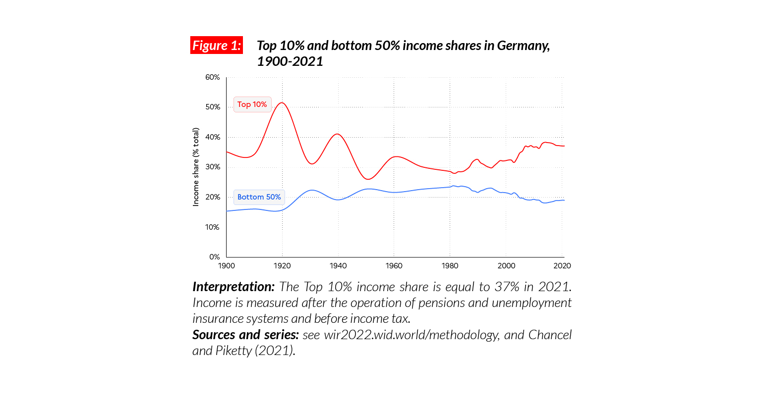
Income inequality in Germany today
In Germany, the average national income of the adult population is €PPP39,900* While the bottom 50% earns €PPP15,200, the top 10% earns on average 10 times more (€PPP148,000). This ratio is higher than in France (7), but smaller than in the US (17) and China (14).
*€1 PPP = $PPP 1.4 = € 1.1

Inequality in the long run
Income inequality in Germany decreased substantially between 1917 and 1970. At the beginning of the 20th century, estimates suggest that more than half of national income accrued to the top 10% of the population, while around 15% went to the bottom 50%. Top incomes were barely affected by the hyperinflation that was followed by the 1929 crisis and the Second World War. Inequality was further reduced between the 1960 and the 1980s, thanks to a combination of progressive income and wealth taxes in a context of high growth rates for all, and in particular for low and middle income earners. The top 10% income share rose significantly after 1980, partly driven by liberalization policies.
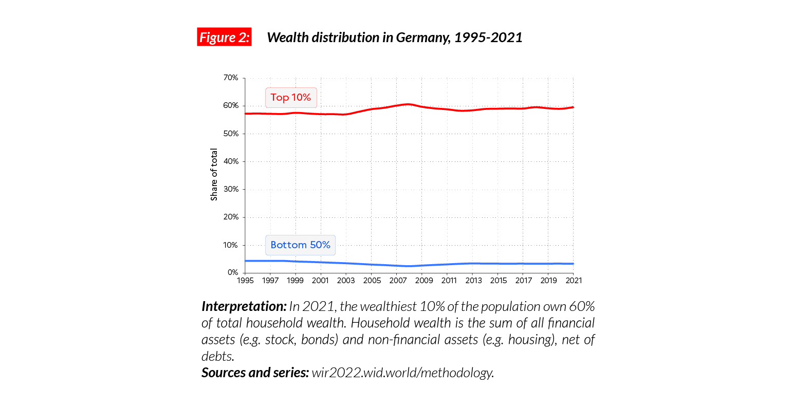
Wealth inequality in Germany
Wealth inequality in Germany has followed a similar pattern to income inequality. The top 1% wealth share was slightly above 45% in the early 20th century and dropped to 20-25% in the 1990s, before slightly increasing over the past 30 years. From an international perspective, wealth inequality in Germany is similar to that of other European countries, for example France and the UK, and below the US (where the top 1% wealth share is close to 40%).
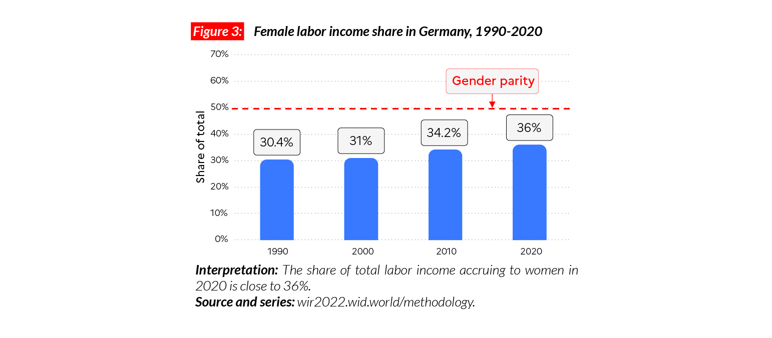
Gender inequality
In Germany, the female labor income share is equal to 36%. This is comparable with levels observed across Western Europe, although slightly lower than in France (41%) and the UK (38%). It is higher than the average in sub-Saharan Africa (28%), and Asia (21%, excluding China). The female labor income share has grown by about 6 p.p. since 1990.
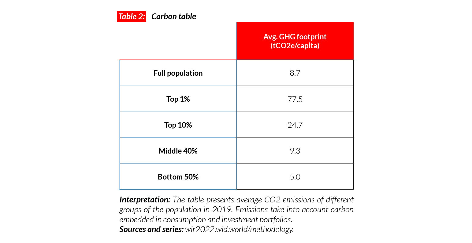
Germany is one of the highest emitters in the European Union
Within the European Union, Germany is one of the highest CO2 emitters. While average footprint emissions in the EU are 9.5 tCO2e/capita, in Germany, they are above 11 tCO2e/capita. The top 10% emit on average 34 tons, i.e. six times more than the bottom 50%. Germany has pledged to cut its territorial emissions by 55% before 2030, compared with 1990 levels. This would mean reaching a per capita emissions average close to 6.5 tCO2e/capita – approximately the current level of the poorest half of the population.

India
Pop. 1,393,409,000 (2021)
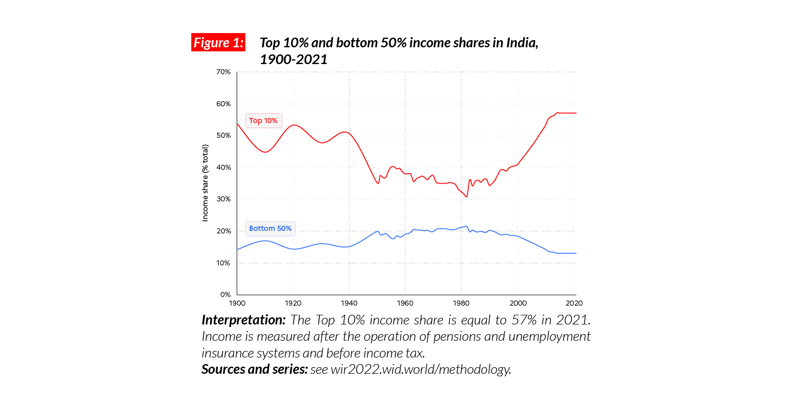
Extreme income inequalities in India
The average national income of the Indian adult population is €PPP7,400 (or INR204,200).* While the bottom 50% earns €PPP2 000 (INR53,610), the top 10% earns more than 20 times more (€PPP42 500 or INR1,166,520). While the top 10% and top 1% hold respectively 57% and 22% of total national income, the bottom 50% share has gone down to 13%. India stands out as a poor and very unequal country, with an affluent elite.
*€1 PPP = $PPP 1.4 = INR 27.5

Income inequality in the long run: a historical high
Indian income inequality was very high under British colonial rule (1858-1947), with a top 10% income share around 50%. After independence, socialist-inspired five-year plans contributed to reducing this share to 35-40%. Since the mid- 1980s, deregulation and liberalization policies have led to one of the most extreme increases in income and wealth inequality observed in the world. While the top 1% has largely benefited from economic reforms, growth among low and middle income groups has been relatively slow and poverty persists . Over the past three years, the quality of inequality data released by the government has seriously deteriorated, making it particularly difficult to assess recent inequality changes.
Wealth inequality
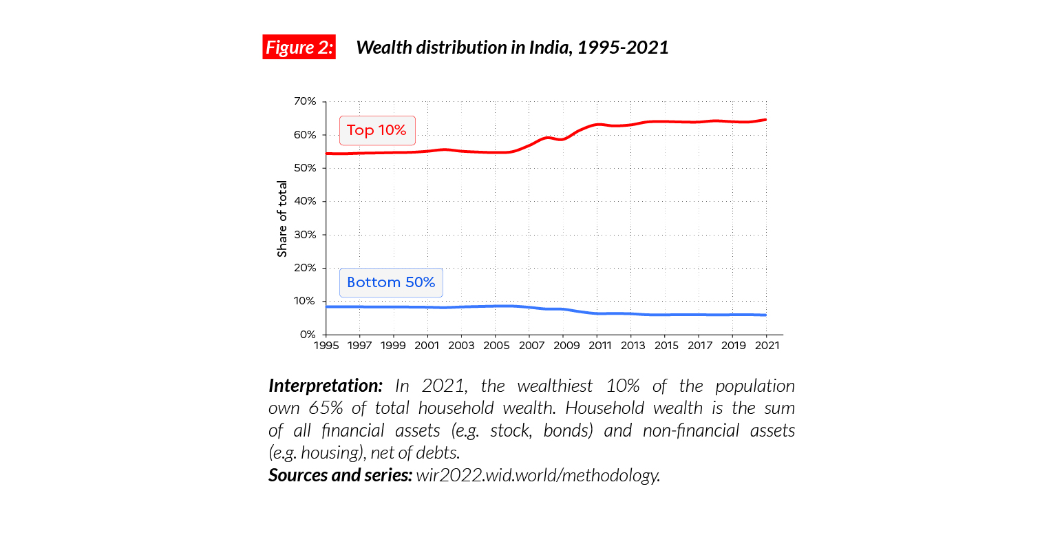
Average household wealth in India is equal to €PPP35,800 or INR983,010 (compared with €PPP86,100 in China). The bottom 50% own almost nothing, with an average wealth of €PPP4,200 (6% of the total, INR115,000). The middle class is also relatively poor (with an average wealth of only €PPP26,400 or INR723,930, 29.5% of the total) as compared with the top 10% and 1% who own respectively €PPP231,300 (65% of the total) and over €PPP1.2 million (33%), INR6,354,070, and INR32,449,360.
Gender inequality
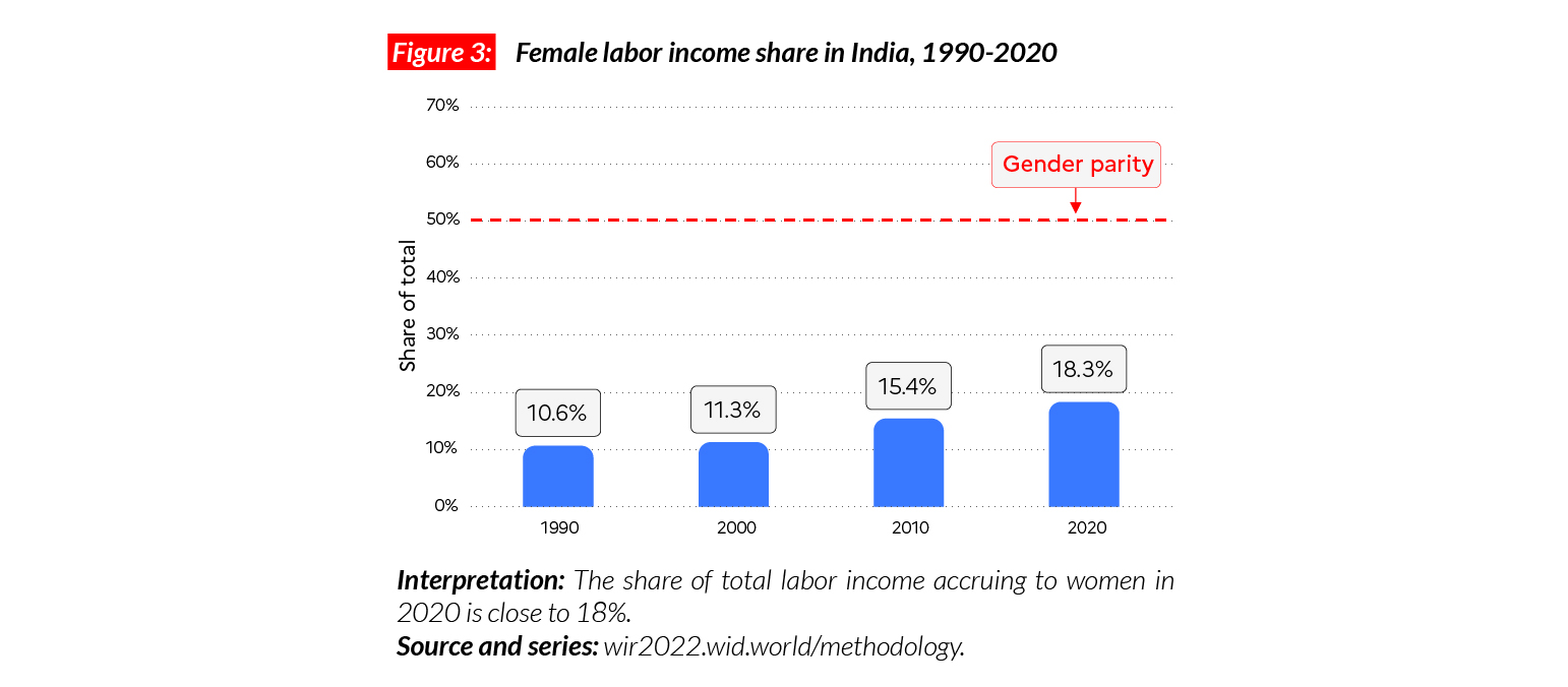
Gender inequalities in India are very high. The female labor income share is equal to 18%. This is significantly lower than the average in Asia (21%, excluding China). This value is one of the lowest in the world, slightly higher than the average share in Middle East (15%). The significant increase observed since 1990 (+8 p.p.) has been insufficient to lift women’s labor income share to the regional average.
Carbon inequality
India is a low carbon emitter: the average per capita consumption of greenhouse gas is equal to just over 2 tCO2e. These levels are typically comparable with carbon footprints in sub-Saharan African countries. The bottom 50%, middle 40% and top 10% respectively consume 1, 2, and 9 tCO2e/capita. A person in the bottom 50% of the population in India is responsible for, on average, five times fewer emissions than the average person in the bottom 50% in the European Union and 10 times fewer than the average person in the bottom 50% in the US.

Indonesia
Pop. 276,362,000 (2021)
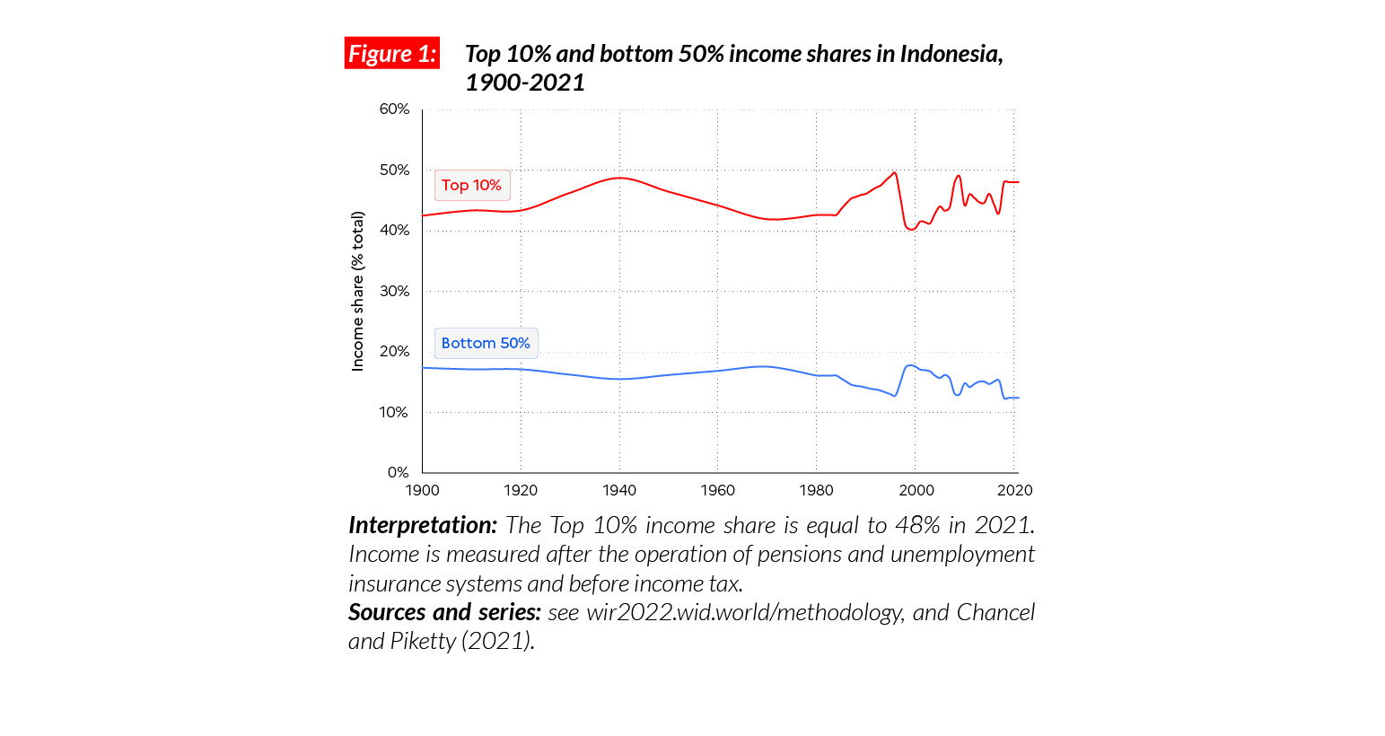
Income Inequalities in Indonesia today
In Indonesia, the average national income of the adult population is €PPP11,700 (or IDR69,030,990).* While the bottom 50% earns €PPP2,900 (IDR22,612,000), the top 10% earns on average 19 times more (€PPP56,100 or IDR285,073,820).
*€1 PPP = $PPP 1.4 = IDR 5911.7

Income inequality in the long run
Historical estimates for inequality in Indonesia reveal that the top 10% income share has oscillated around 40-50% since 1900. Inequality has slightly increased since the 1980s, after significant but short-spanned ups and downs in the late 1990s and early 2000s.
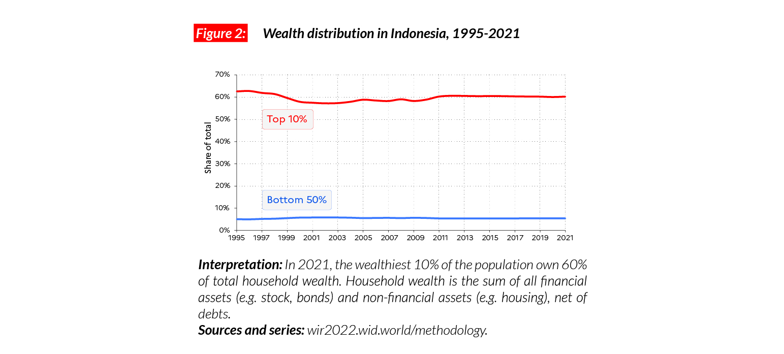
Wealth inequality
Indonesia has millions of poor people. The bottom 50% of the population, representing more than 135 million people, has an average wealth of €PPP1,916 (IDR8,159,830) and holds just over 5% of total national revenue. Since 1999, Indonesia has seen a significant growth in wealth levels. While the 1995 average was €PPP14,600 (IDR86,310,820) this has multiplied by four to reach €PPP52,530 in 2021 (IDR310,540,544). However, this growth has left the huge wealth inequality almost unchanged.
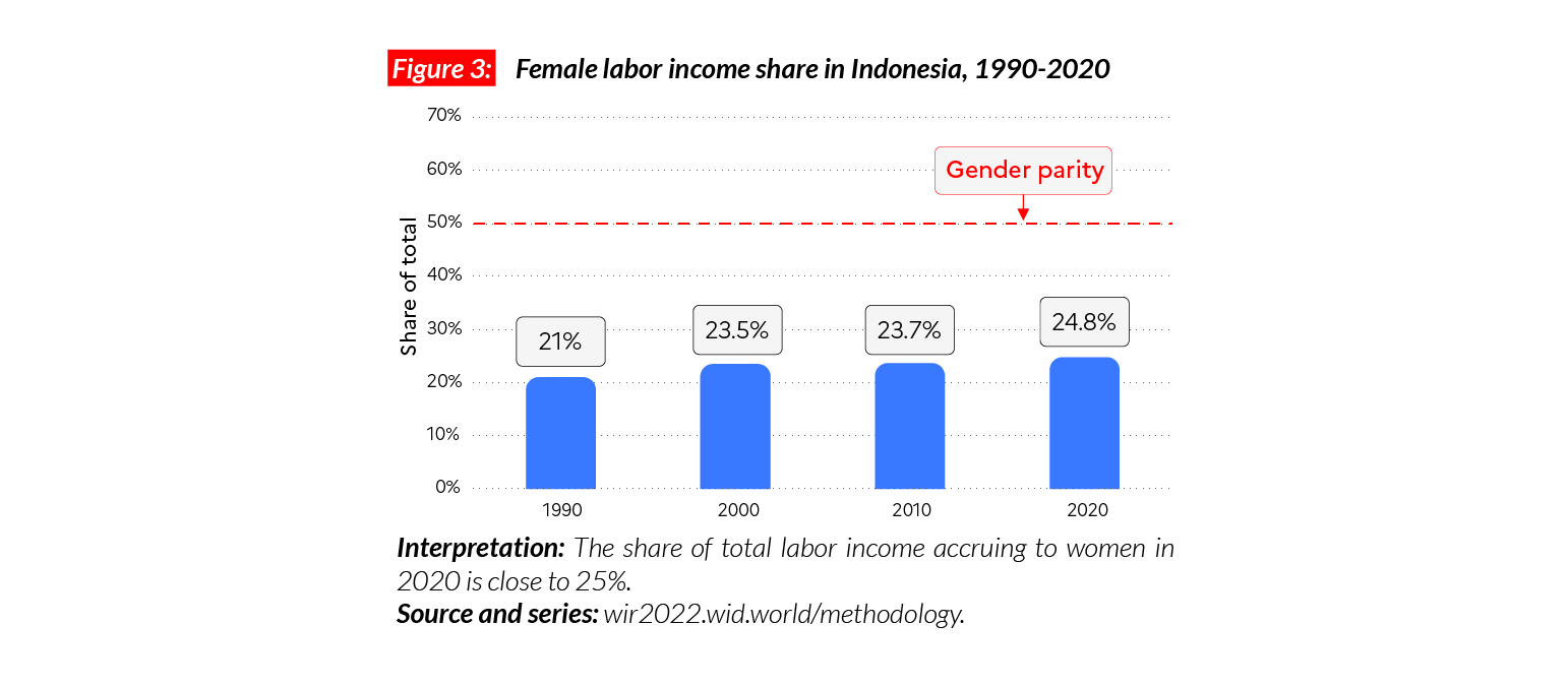
Gender inequality
Indonesian gender inequalities are significant, the female labor income share in the country is equal to 25%. This level of inequality is slightly higher than the average in Asia (21%, excluding China). The female labor income share is lower than in Japan (28%) and Korea (32%) but significantly higher than in India (18%). As in many countries around the world, we observe a small upwards trend for female labor income share since 1991: it has gone up by four percentage points.
Carbon inequality
Carbon emissions in Indonesia are relatively low:
on average, an individual emits three tonnes of greenhouse gas per year. This is more than in India (2 tCO2e/capita) but less than in other Asian countries, including China (8 tCO2e/capita) and Japan (12 tCO2e/capita). The bottom 50% emits 1.4 tonnes in contrast to 11.8 tonnes for the top 10%.

Italy
Pop. 60,753,000 (2021)
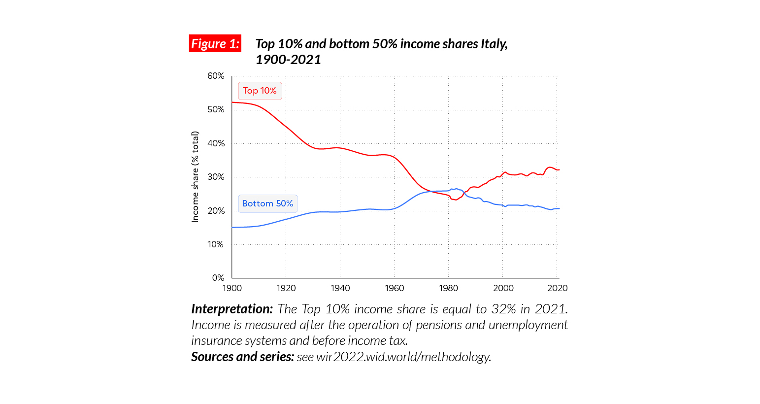
Income inequality in Italy today
In Italy, the average national income of the adult population is €PPP29,100 (or €27,340),* which is below some Western European countries including France and Germany (€PPP36,300 and 39,900, respectively) but similar to the average income in Spain (30,600). While the bottom 50% earns €PPP12 100 (21% of the total) or €11,320, the top 10% earns on average eight times more (€PPP93,900 or €1,166,520, 32% of the total)
*€1 PPP = $PPP 1.4 = € 0.9

Income inequality in the long run
Income inequality in Italy declined considerably over the course of the 20th century, following the military, political and economic shocks of the period 1910-1940s as well as the effects of post- WWII policies. But since the early 1980s, the top 10% income share rose considerably, by 8-10 p.p., while the bottom 50% share dropped from 27% to 21%. Between 2007 and 2019, the bottom 50% average incomes dropped by 15%, while national income per adult dropped by 12% as a result of the austerity policies that followed the financial crisis and the European debt crisis of 2012-2014.
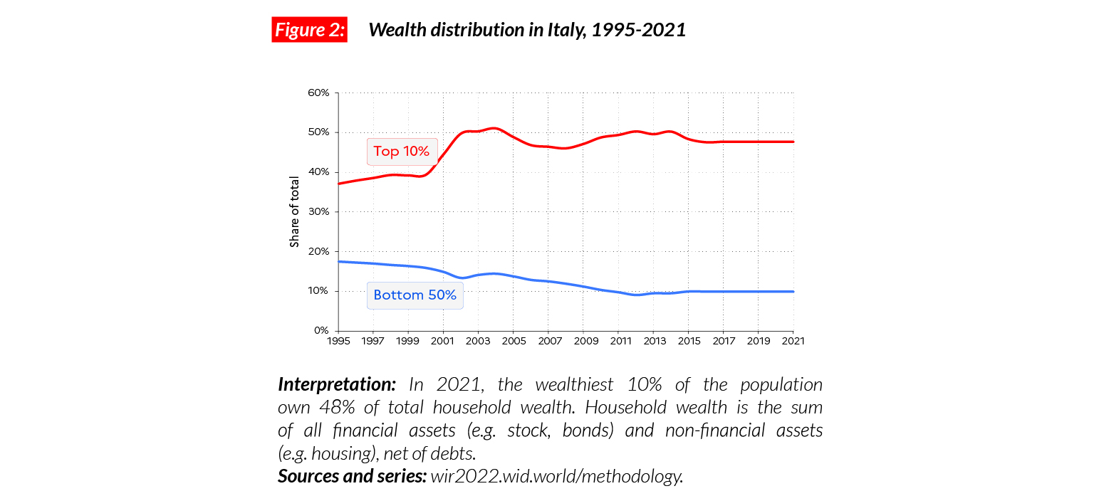
Wealth inequality
Italy is one of the countries with the highest wealth to income ratio. This implies that knowing the structure of wealth distribution in the country is crucial to a proper evaluation of the trends in inequalities. Wealth concentration in Italy today is high, but lower than most European Union countries. In 2021, the top 10% hold 48%, while the middle 40% and the bottom 50% respectively hold 42% and 10%.
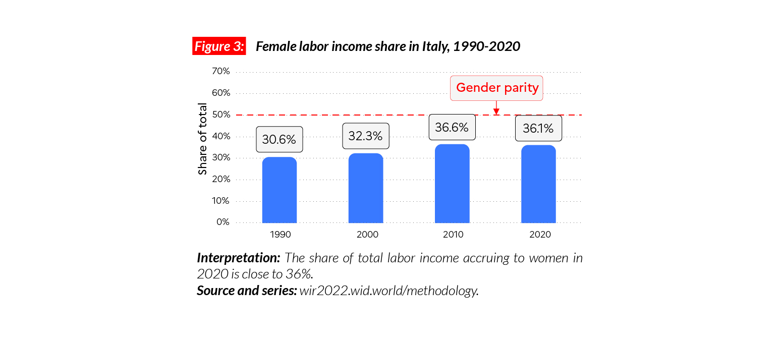
Gender inequality
Gender inequalities in Italy are slightly higher than in other Western European countries. The female labor income share in the country is equal to 36%, which is close to values in North America (38%). This value is higher than in Sub-Saharan Africa (28%) and Asia (21%, excluding China) but significantly lower than in the Eastern European region (41%). We observe a recent significant decrease of gender inequalities in the country, with female labor income share gaining six points in the last 30 years.
Carbon inequality
In Italy, the average greenhouse gas production is around 9 tCO2e/capita. This is similar to European countries such as France (9 tonnes) and the UK (10 tonnes). The top 10% emit 24 tonnes in 2021 compared with five tonnes for the bottom 50%. Between 1990 and 2021, emissions in Italy decreased by around three tonnes of CO2e/ capita on average. While emissions among the top 10% have dropped by 8% since 1990, the bottom 50% recorded a 32% drop in its emissions. These dynamics are partly due to a stronger drop in incomes among the poor than among the rich after the lost decade of 2007-2017.
Israel
Pop. 8,790,000 (2021)
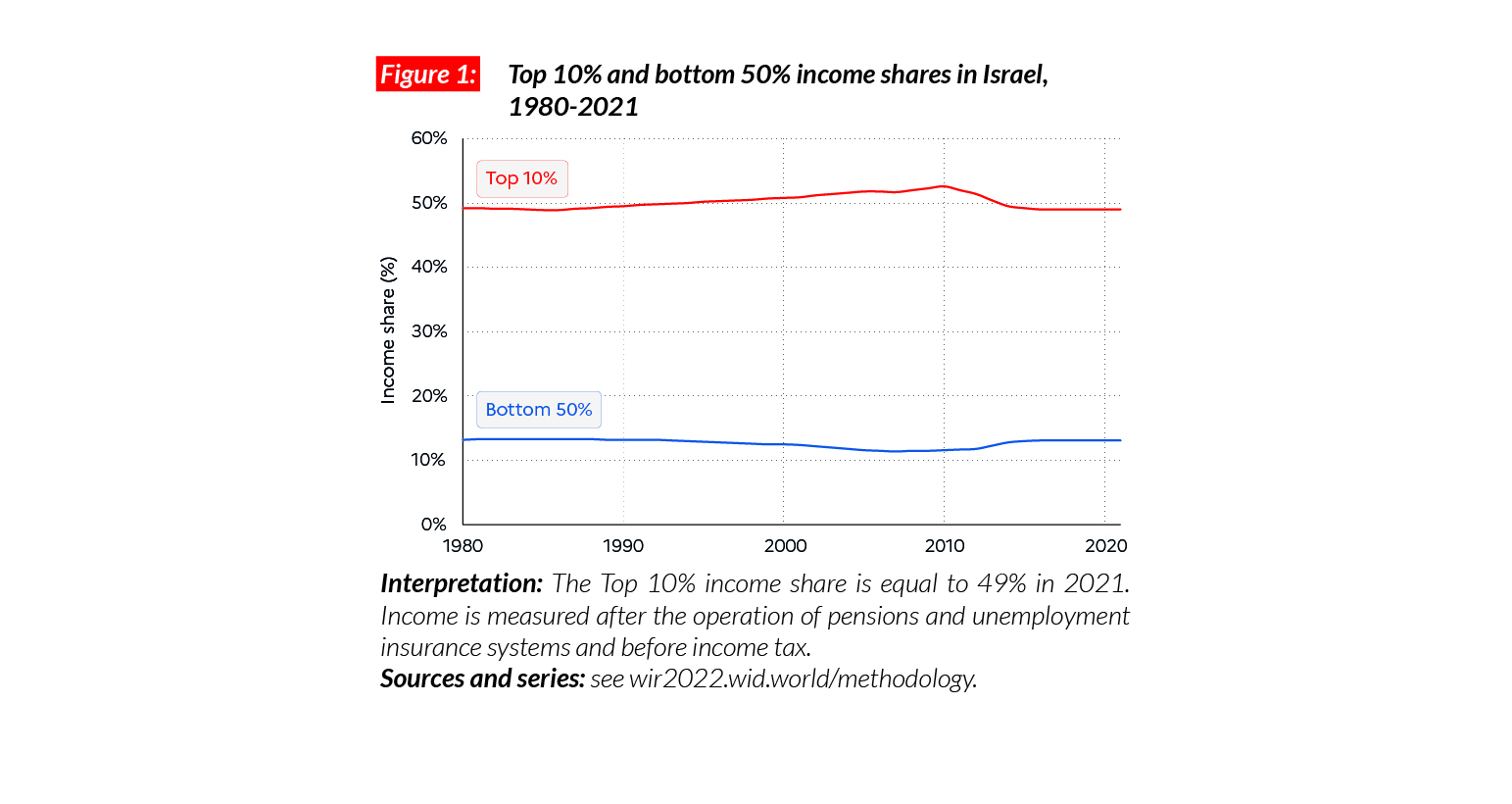
High income inequalities in a high-income country
Israel is an affluent country. The average national income for the adult population is equal to €PPP43,100 (or ILS223,040).* This is higher than affluent Western European countries such as France (€PPP36,300) and the UK (€PPP32,700) but lower than the US (€PPP54,300). However, Israel is one of the most unequal high-income countries. The bottom 50% of the population earn on average €PPP11,200 or ILS57,900, while the top 10% earn 19 times more (€PPP211,900, ILS1,096,300). Thus, inequality levels are similar to those in the US, with the bottom 50% of the population earning 13% of total national income, while the top 10% share is 49%.
*€1 PPP = $PPP 1.4 = ILS 5.2

Evolution of income inequality
Overall, income inequality has remained at a very high level in Israel over the past 30 years. Liberalization reforms of the of mid-1980s and 1990s led to a marked increase. While inequalities have slightly decreased since 2012, they remain at a very high level, in the context of a highly segregated society.
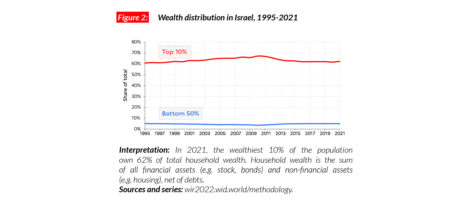
Wealth inequality
Average household wealth is equal to €PPP129,100 (ILS668,050), the average for the bottom 50% and top 10% are respectively equal to €PPP12,800 and €PPP804,700 (ILS 66,280 and 4,163,120). This means that the bottom 50% of the population holds only 5% of total national wealth, while the top 10% holds 62%.
Gender inequality
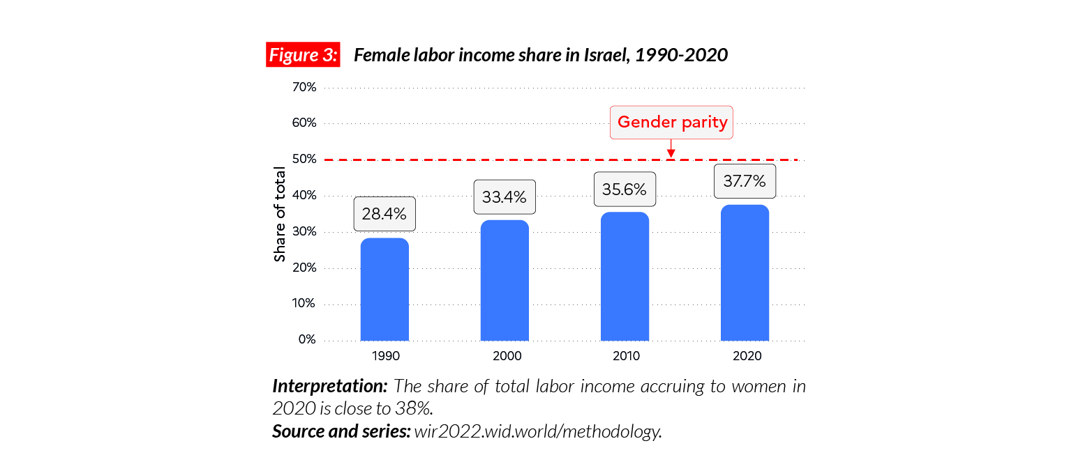
The female labor income share in Israel is equal to 38%. This level of inequality is comparable with levels in North America (38%). Gender inequality is slightly higher than in Western Europe but significantly lower than in the neighboring Middle East countries (15%). In the first part of the 21st century, inequalities decreased quickly, with female labor income share gaining 10 points between 1991 and 2019.
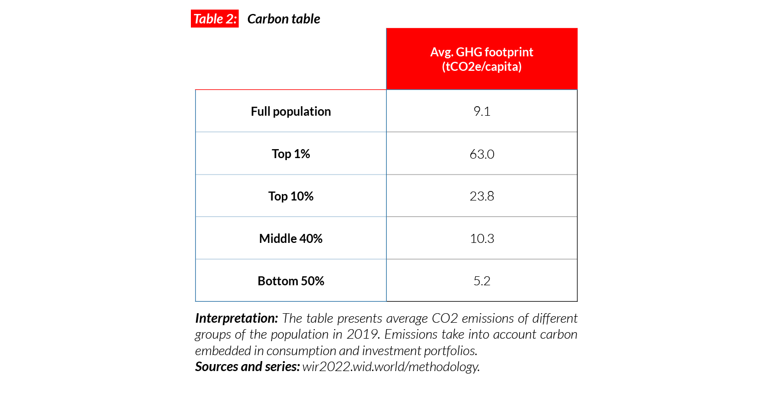
Carbon inequality
Carbon consumption in Israel is significantly above world average. With 12.5 tonnes of CO2 equivalent per capita, yearly greenhouse gas emissions are higher than the average in the EU. They are, however, lower than in the US (21 tCO2e/capita) and Canada (20 tCO2e/capita). While the bottom 50% and middle 40% of the population respectively emit 6.7 and 13 tonnes of CO2 equivalent every year, the top 10% emits 40 tonnes.

Japan
Pop. 124,851,000 (2021)
Rising inequalities since the 1980s
In Japan, the average national income of the adult population is €PPP30,500 (or JPY4,313,160).* While the bottom 50% earns €PPP10,200 (JPY1,447,440), the top 10% earns on average 13 times more (€PPP137 000 or JPY19,363,880).
*€1 PPP = $PPP 1.4 = JPY 141.4

Income inequality in the long run
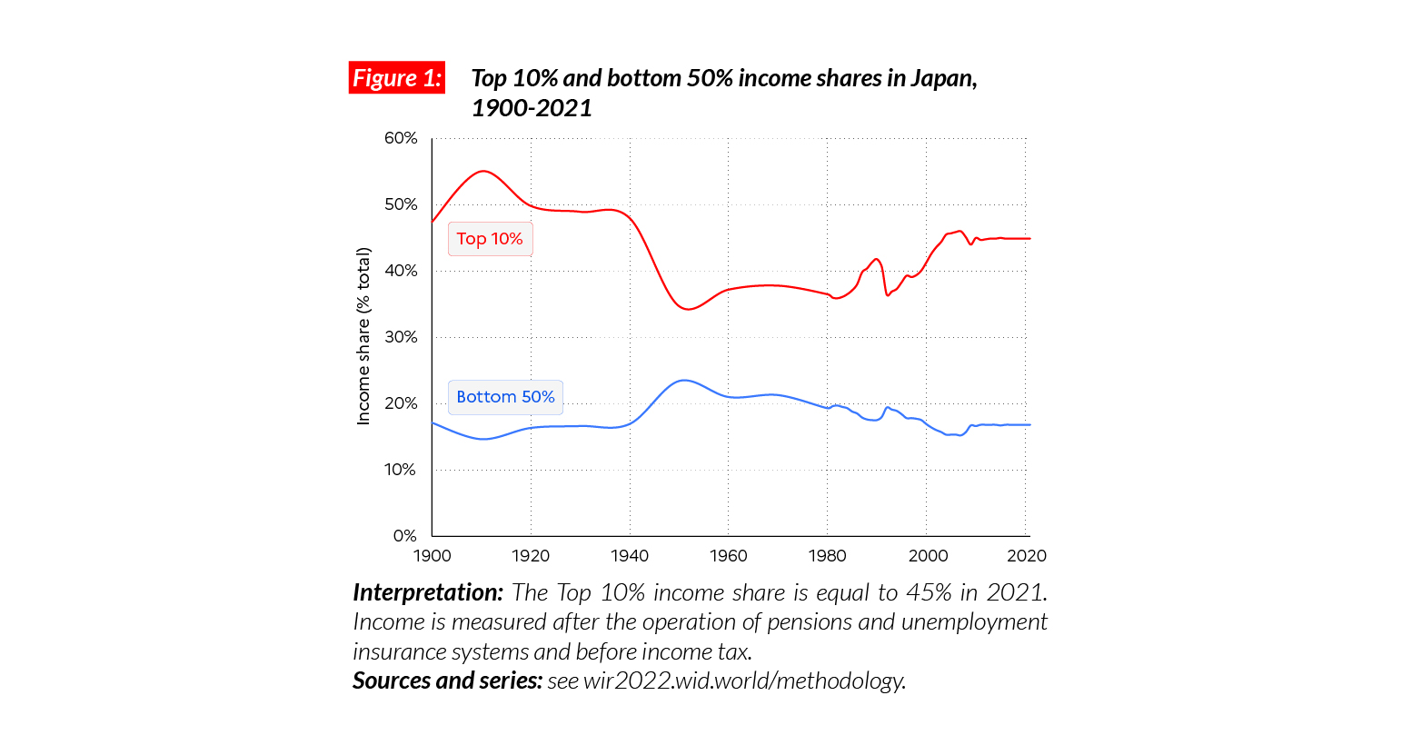
Income inequality in Japan dropped considerably after the Second World War and was maintained at low levels through the 1950-1980s thanks to the consolidation of a generous welfare system and a series of capital control policies. During that period, the top 10% income share oscillated around 30-35%. Financial deregulation and liberalization in the 1980s created a rise in inequalities. The asset price bubble burst in 1991 and the subsequent secular stagnation of average incomes was accompanied by a further increase in the top 10% income share, from 40% in the early 1990s to close to 45% today.
Wealth inequalities
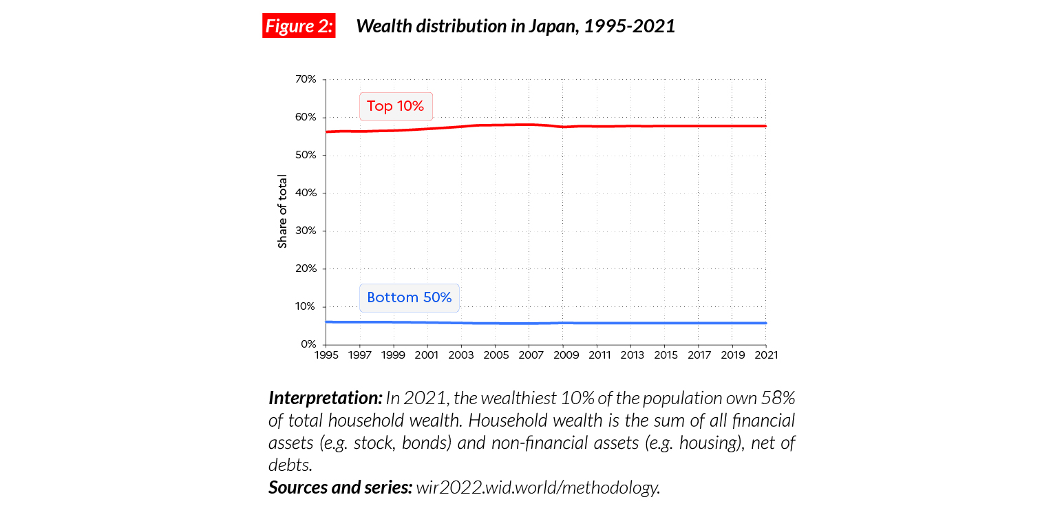
Japan is a relatively wealthy country: the average household wealth is equal to €PPP181,500 (JPY25,660,220). This is significantly above the Asian average and comparable with Western Europe levels. Wealth distribution in Japan is very unequal, but not more than in Western Europe countries. Since 1995, wealth shares have remained broadly stable, with the bottom 50%, middle 40% and top 10% holding on average respectively 6%, 36% and 58% of total wealth.
Gender inequality
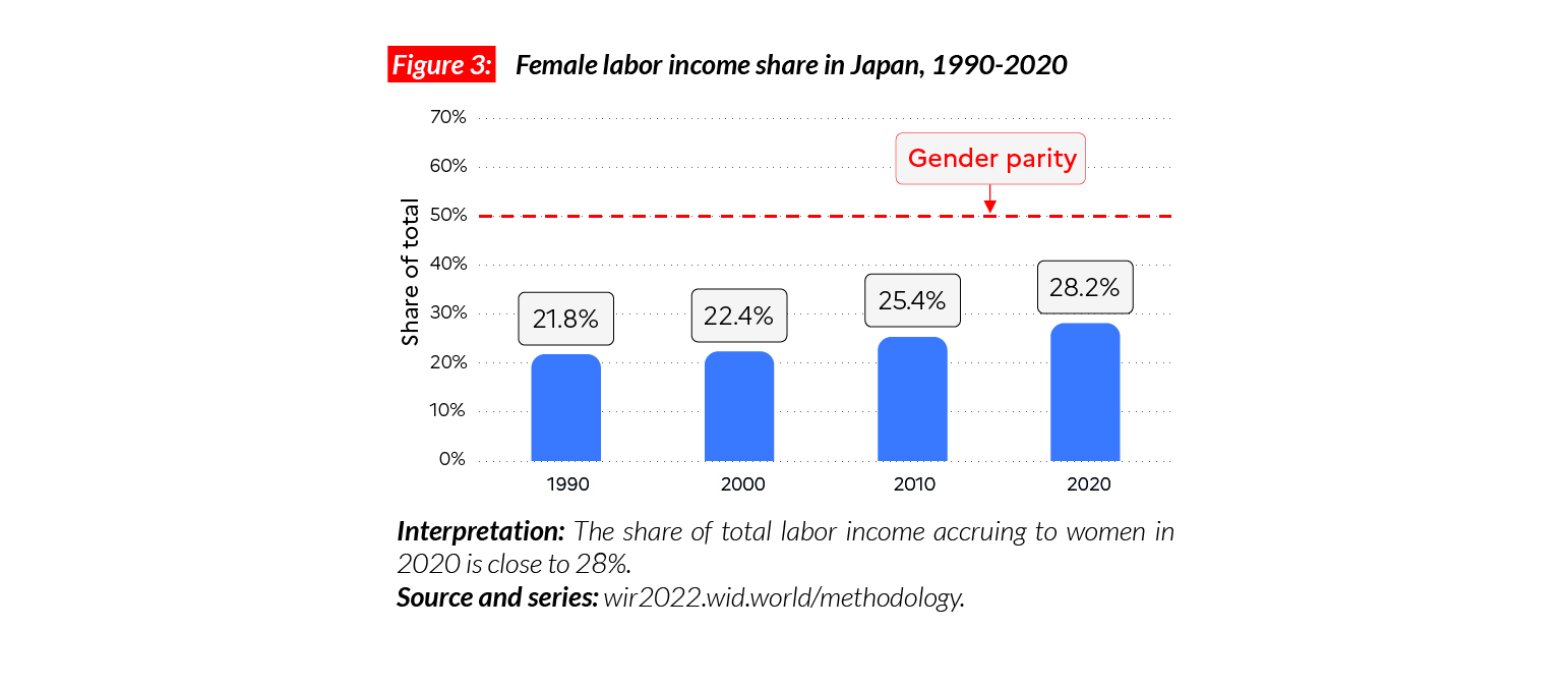
The female labor income share in Japan is equal to 28%. This is comparable with levels in Korea (32%) but higher than in India (18%). Overall, these shares are higher than in sub-Saharan Africa (28%) and MENA countries (15%) but lower than in Western and Eastern Europe (respectively 38% and 41%). Following the general world trend, we observe a continuous increase in women’s income share since 1990. During this period, it went up by six percentage points.
Carbon inequality
Japanese carbon emissions (12 tCO2e/capita) are significantly above the Asian average and slightly over Western European averages (9.5 tons). Contrary to the increasing trend in Asian countries, per capita emissions in Japan have remained stable since 1990. The bottom 50% emits slightly over six tons while the top 10% emits close to 38 tons per capita.
Mexico
Pop. 129,789,000 (2021)
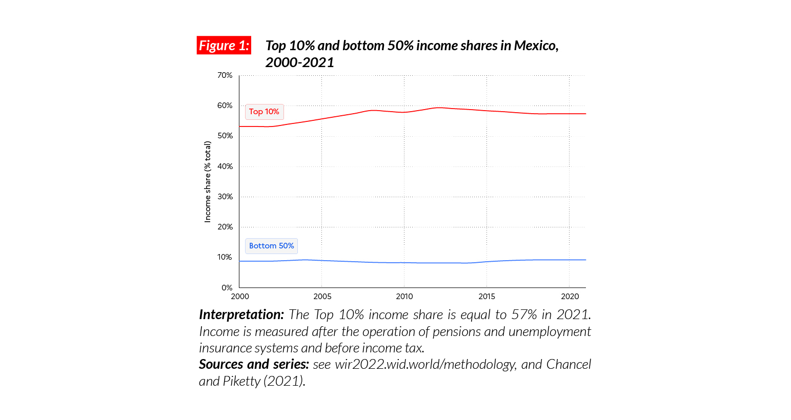
One of the most unequal countries in the world
In Mexico, the average national income of the adult population is €PPP17,300 (or MXN232,790).* While the bottom 50% earns €PPP3,200 (MXN42,700, 9% of the total), the top 10% earns more than 30 times more (€PPP99,400 or MXN1,335,030, 57% of the total).
*€1 PPP = $PPP 1.4 = MXN 13.4

Income inequality in the long run
Unlike large European, Asian and North American economies, available data suggest that Mexico did not experience a strong reduction in inequality over the 20th century. In fact, income inequality in Mexico has been extreme throughout the past and present centuries. The top 10% income share has oscillated around 55%-60% over that period, while the bottom 50% has been constant at around 8-10%, making of Mexico one of the most unequal countries on earth.
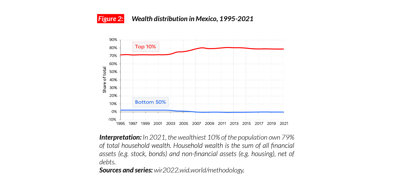
Wealth inequality
Average household wealth in Mexico amounts to €PPP62,000 (MXN833,660). The poorest half of the population is deprived of wealth: its net wealth is negative, meaning that this group has on average more debts than assets. This is in stark contrast to the top 10% of the population, which owns on average €PPP488,000 (or MXN6,561,490, 62% of the total).
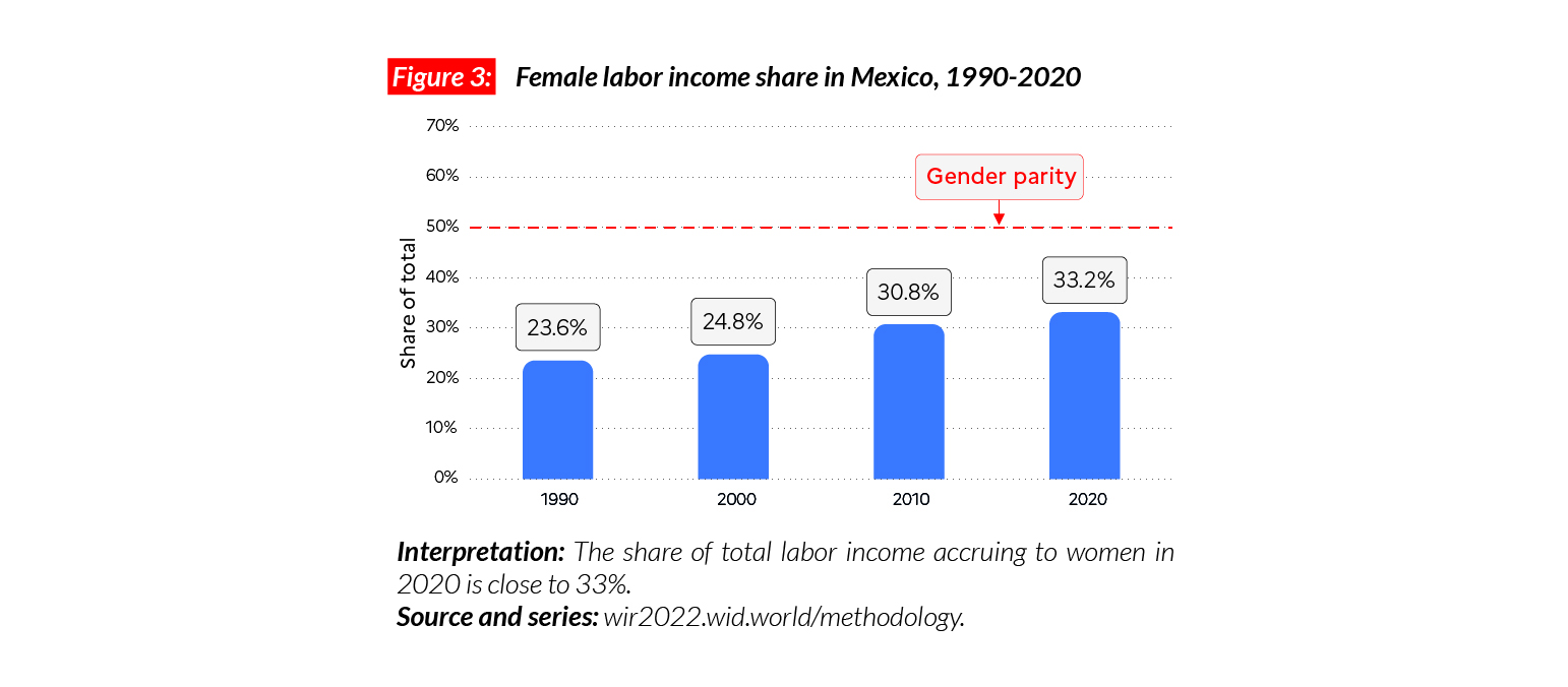
Gender inequality
The female labor income share in Mexico stands at 33%. This is below the average in Latin America (35%) and countries such as Brazil (38%) and Argentina (37%). This share is just slightly above the average in Sub-Saharan Africa (28%) and significantly below levels in Western and Eastern Europe (respectively 38% and 41%). However, since 1990, the female labor income share has increased quite significantly, by nine percentage points.
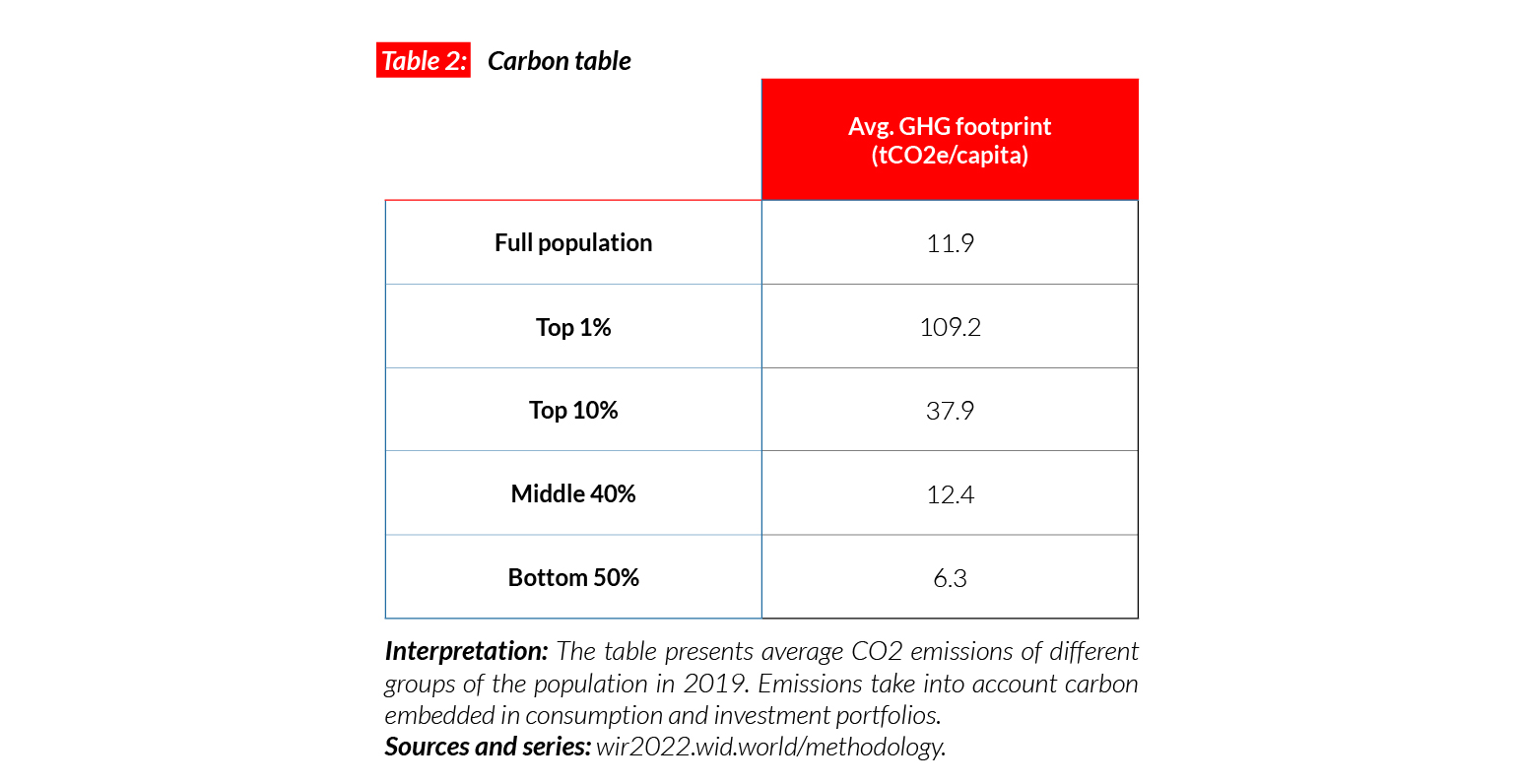
Carbon inequality
Carbon inequalities are also very high in Mexico.
Average carbon emissions are equal to around five tonnes per capita. While the bottom 50% of the population emits fewer than 2 tCO2e/capita, emissions for the top 10% of the population are more than 10 times higher (20t). These levels of inequalities are significantly higher than in Brazil (where the top 10% of the population emit eight times more than the bottom 50%) and comparable with China (12).

Morocco
Pop. 37,345,000 (2021)
Income inequality in Morocco today
In Morocco, the average national income of the adult population is €PPP7,800 (or MAD43,130).* Income inequality in Morocco is high and characterized by a relatively poor middle class: the bottom 50% earns €PPP2,100 (MAD11,700, close to 13.5% of the total), the middle earns on average €PPP7,200 (MAD39,910, 37% of the total) and the top 10% earns €PPP38,700 (MAD213,210, 49.5% of the total).
*€1 PPP = $PPP 1.4 = MAD 5.5

Income inequality in Morocco since the 1980s
Inequality has remained high over the past 40 years in Morocco. Despite slight shifts, the top 10% share has never been under 48% and the bottom 50% never over 14%.

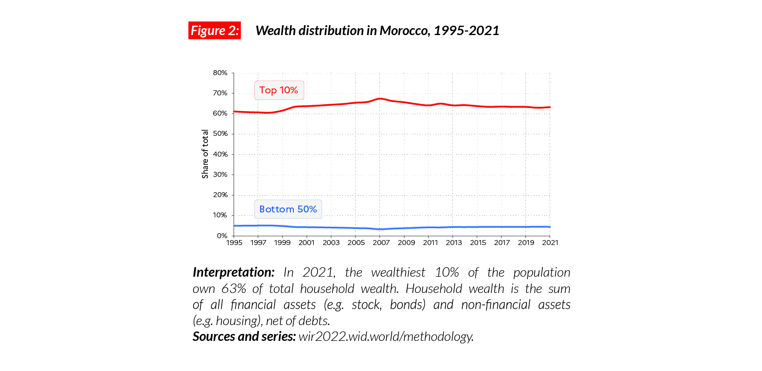
Wealth inequality
Wealth inequality in Morocco is extreme: the top 10% of the population own more than 63% of the total, whereas the bottom 50% own less than 5% of it. While the average household wealth in the country is equal to €PPP19,300 (MAD106,300), the bottom 50% possesses an average of €PPP1,700 (or MAD9,510). In comparison, the average for the top 10% and top 1% are equal to €PPP121,900 and €PPP585,500 (MAD671,870 and 3,227,020).
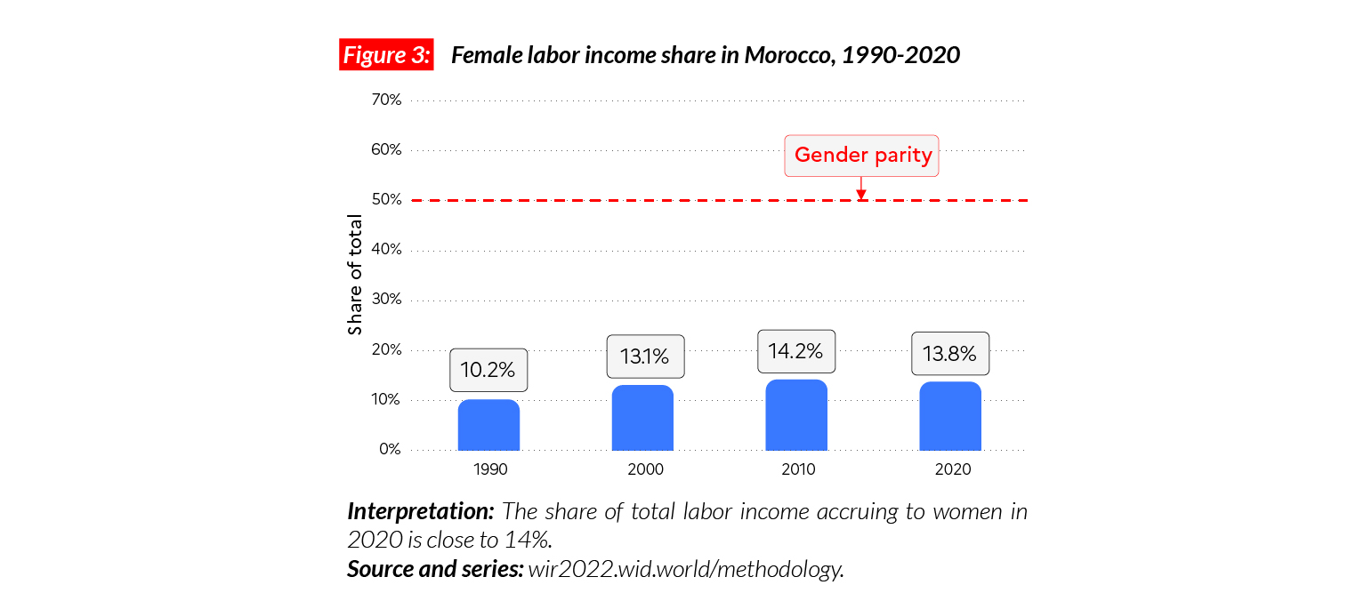
Gender inequality
Women’s income share in Morocco is extremely low (14%), and below even the MENA region average of 15%. The female labor income share is slightly above that of Algeria (13%) but lower than in Tunisia (19%). Between 1990 and 2005, the female labor income share rose up by four points but since then, it has fallen by more than 1 p.p.
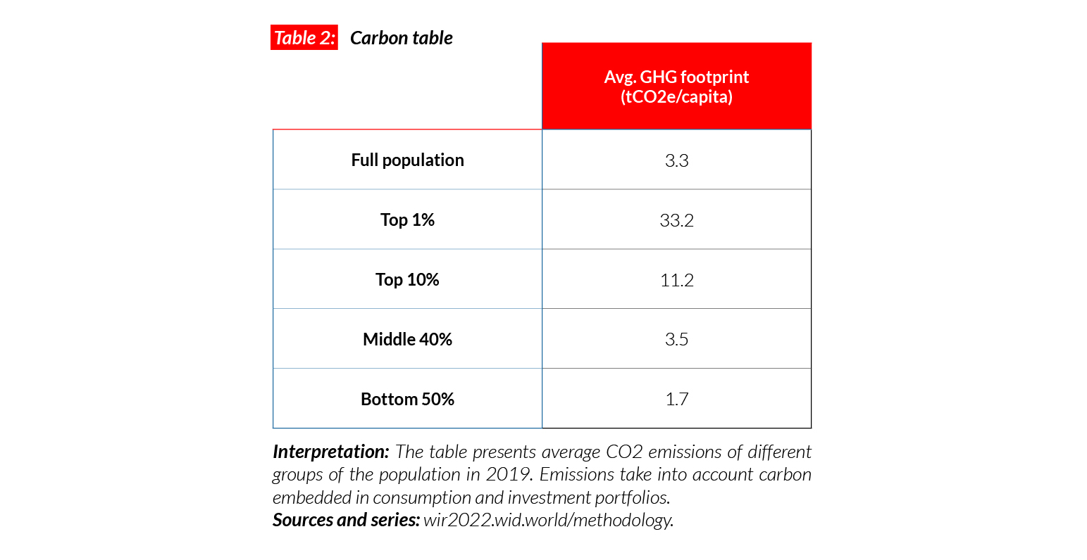
Carbon inequality
Carbon consumption in Morocco is also very low. Average emissions are just over 3 tCO2e/ capita. While the bottom 50% and middle 40% respectively emit 1.7 and 3.5, the top 10% emit 11tCO2e/capita.
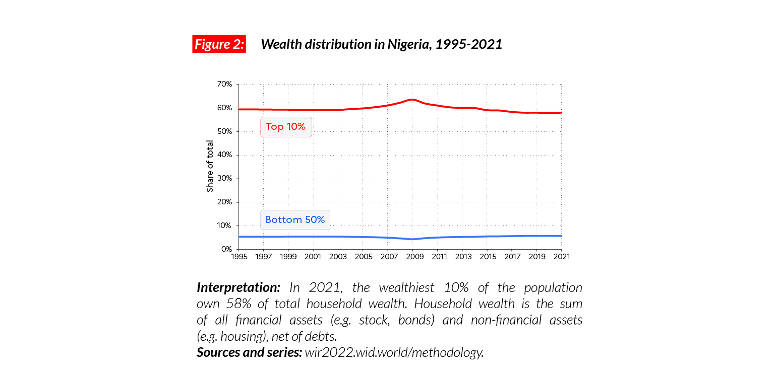
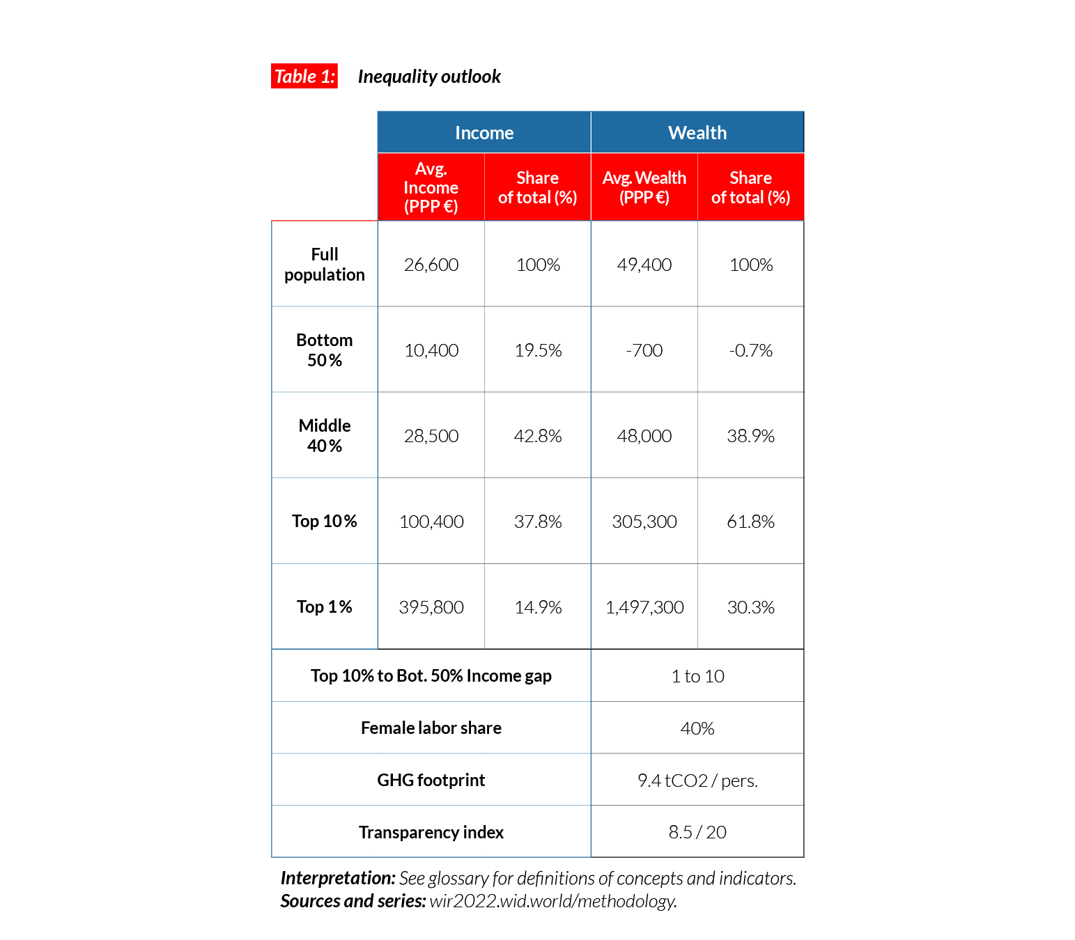
Nigeria
Pop. 211,401,000 (2021)
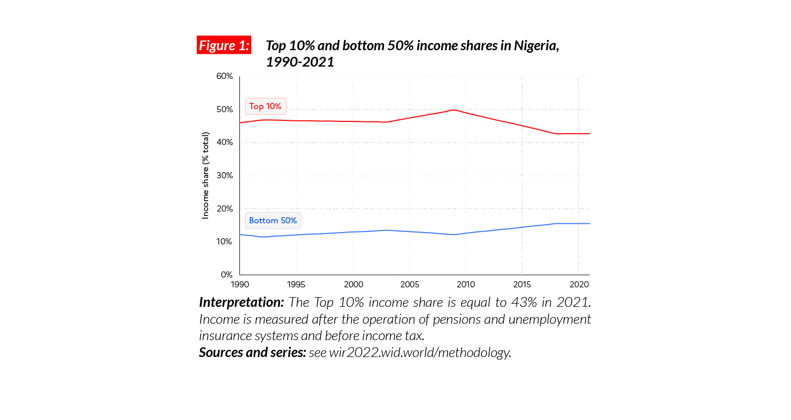
Income inequalities in Nigeria today
In Nigeria, the average national income is equal to €PPP7,600 (or NGN1,895,630).* The top 10% earn on average €PPP32,700 or NGN8,098,350 (this group makes 43% of national income). In comparison, the bottom 50% earn a yearly average of €PPP2,400 (NGN587,583, or 16% of total national income). This level of inequality is similar to that in China, higher than in Europe and lower than in North America.
*€1 PPP = $PPP 1.4 = NGN 248.0

Inequality in Nigeria over the past decades
Available estimates are scarce for Nigeria but sources suggest that inequality has remained at relatively high levels since the 1990s. Still, after 2010, a decrease in inequality was observed. This decrease was first marked by relatively fast-rising bottom and middle incomes in 2010-2015, but following the 2016 growth slowdown, average incomes have been trending downwards.
Wealth inequality
Wealth inequalities in Nigeria are very high. While the average household wealth in the country is €PPP26,600 (NGN6,592,200), the bottom 50% wealth is just over €PPP3,000 (NGN754,770, less than 6% of the total). In contrast, top 10% wealth is equal to €PPP154,300 or NGN38,277,170 (58% of the total).
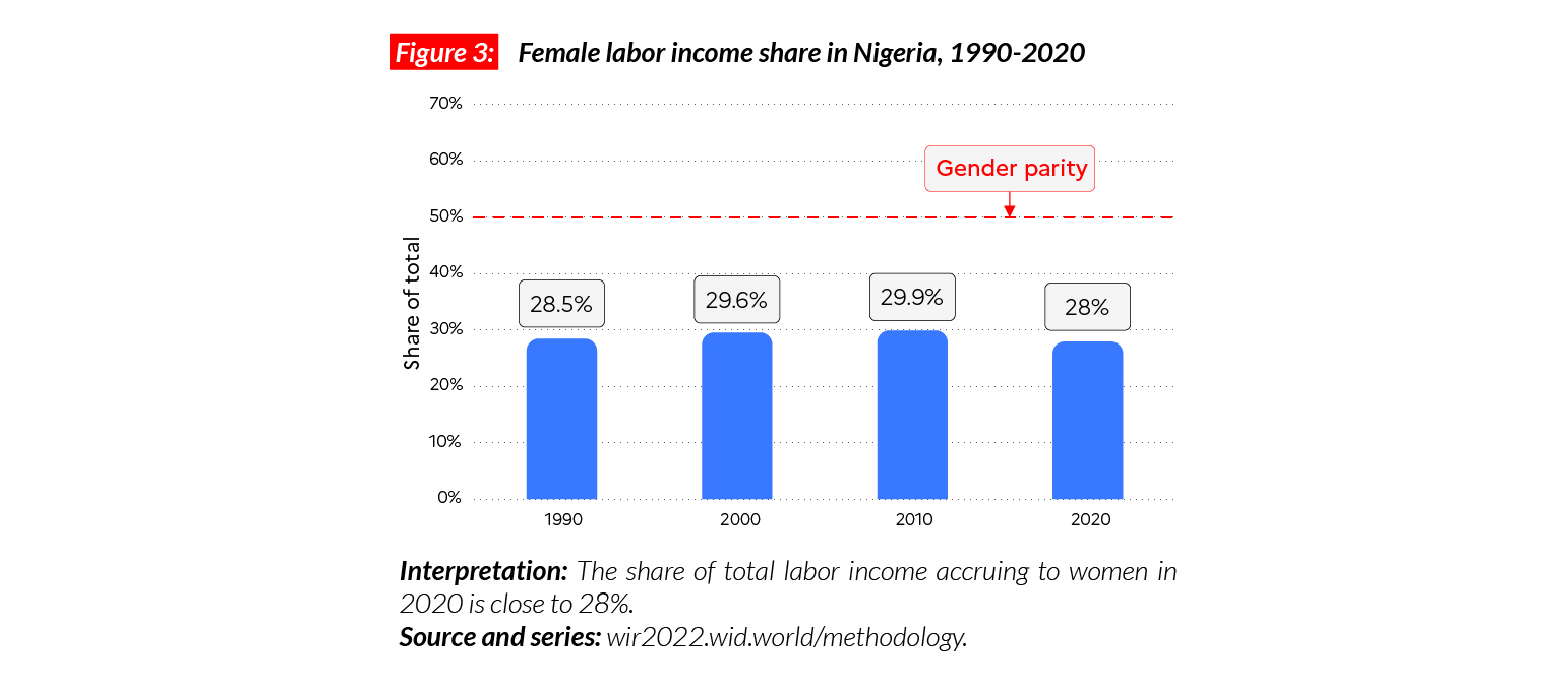
Gender inequality
In Nigeria, the female income labor share is equal to 28%. This is within the sub-Saharan African average but lower than in South Africa, where women’s labor incomes is 36% of the total. These gender inequality levels are lower than in MENA countries (where women earn on average 15% of labor income) and Asia (21%, excluding China) but higher than in Latin America (where the female share is 35%).
Carbon inequality
Carbon consumption in Nigeria is extremely low. Average emissions are equal to 1.6 tCO2e/capita. This is lower than North African countries, for example Morocco (3t). While the bottom 50% and middle 40% respectively emit one and two tonnes, the top 10% emits slightly over four tonnes. This means that a Nigerian from the richest 10% of the population emits over 2 times less carbon than a poor American from the bottom 50%.

Poland
Pop. 37,797,000 (2021)
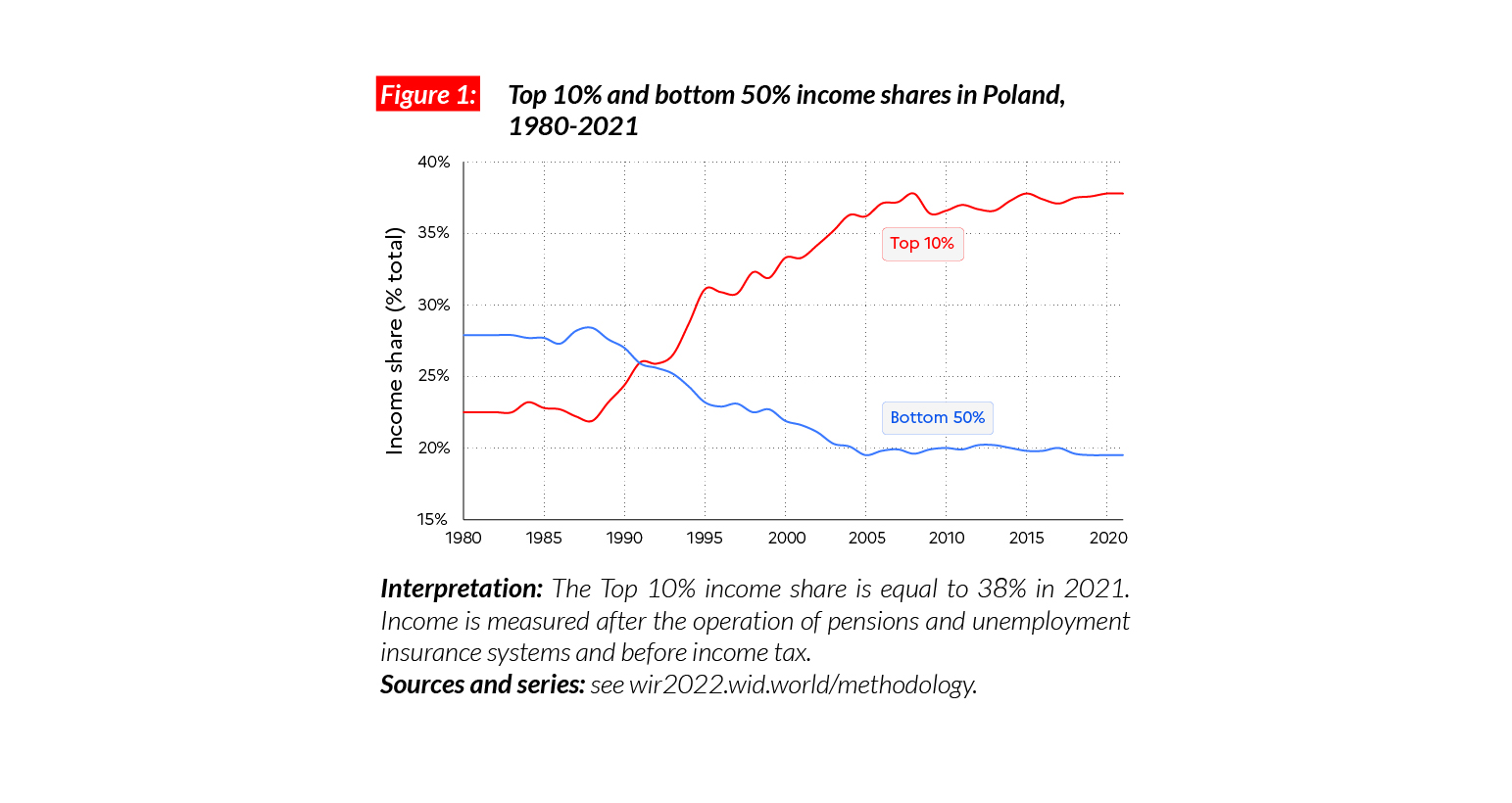
High income inequalities in Poland
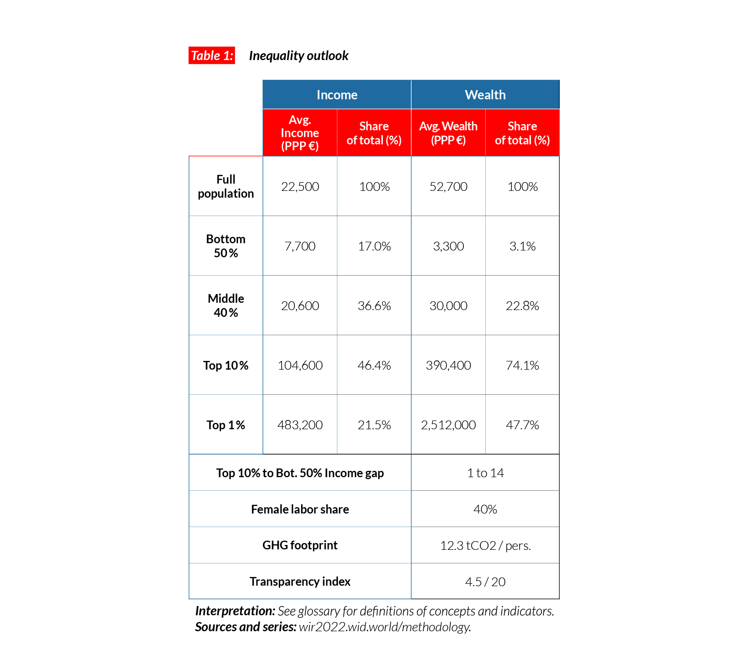
In Poland, the average national income of the adult population is €PPP26,600 (or PLN68,950).* While the bottom 50% earns €PPP10 400 (PLN26,850, 19.5% of the total), the top 10% earns on average 10 times more (€PPP100,400 or PLN260,260, almost 38% of the total). Income inequality in Poland is relatively high for a European country: the share earned by the top 10% is similar to that in Germany but significantly higher than other neighboring countries.
*€1 PPP = $PPP 1.4 = PLN 2.6
Income inequality in Poland since the 1990s
Since 1990 there has been a spectacular increase of inequality in Poland. In 1990, the bottom 50% captured 28% of national income whereas in 2021 they gain only 20%. The share of the top 10% increased from 20% to 38%. This increase is similar to that of other former Eastern Bloc countries, including Russia, which experienced an extreme rise of inequality in the context of a series of liberalization and privatizations policies which primarily favored wealthy groups.
Wealth inequality
Average household wealth in Poland is low compared with Western European countries and medium within Eastern Europe. It is equal to €PPP49,400 (PLN127,950), which is comparable with Russia (€PPP52,000) and slightly higher than Turkey (€PPP39,000). The average wealth of the top 10% is about €PPP305,000 or PLN791,130 (62% of the total), while the middle 40% owns about €PPP48,000 or PLN124,430 (39% of the total). In comparison, the bottom 50% average wealth is negative (-1% of the total): this group has more debts than assets.

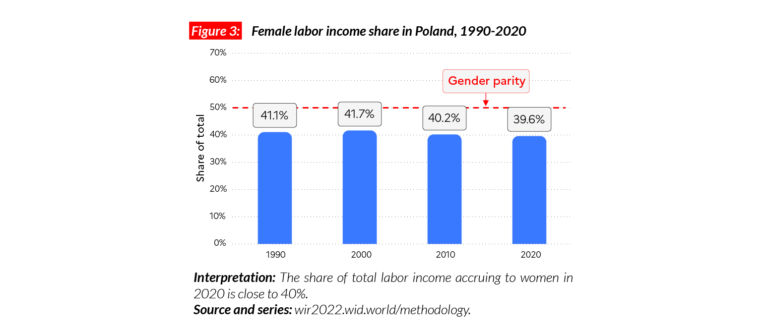
Gender inequality
In Poland, the female labor income share is equal to 40%. This value is significantly above the world average (35%). Poland was part of the ex-Soviet bloc, which encouraged women’s participation in the labor market. In general, women in Eastern European countries earn a larger share of total income than in the rest of the world (41% on average for countries in the former Eastern bloc). In Poland, women’s income share is equal to that in Spain (40%). In recent years, the share of total income earned by women in Poland has remained stable at around 40%.
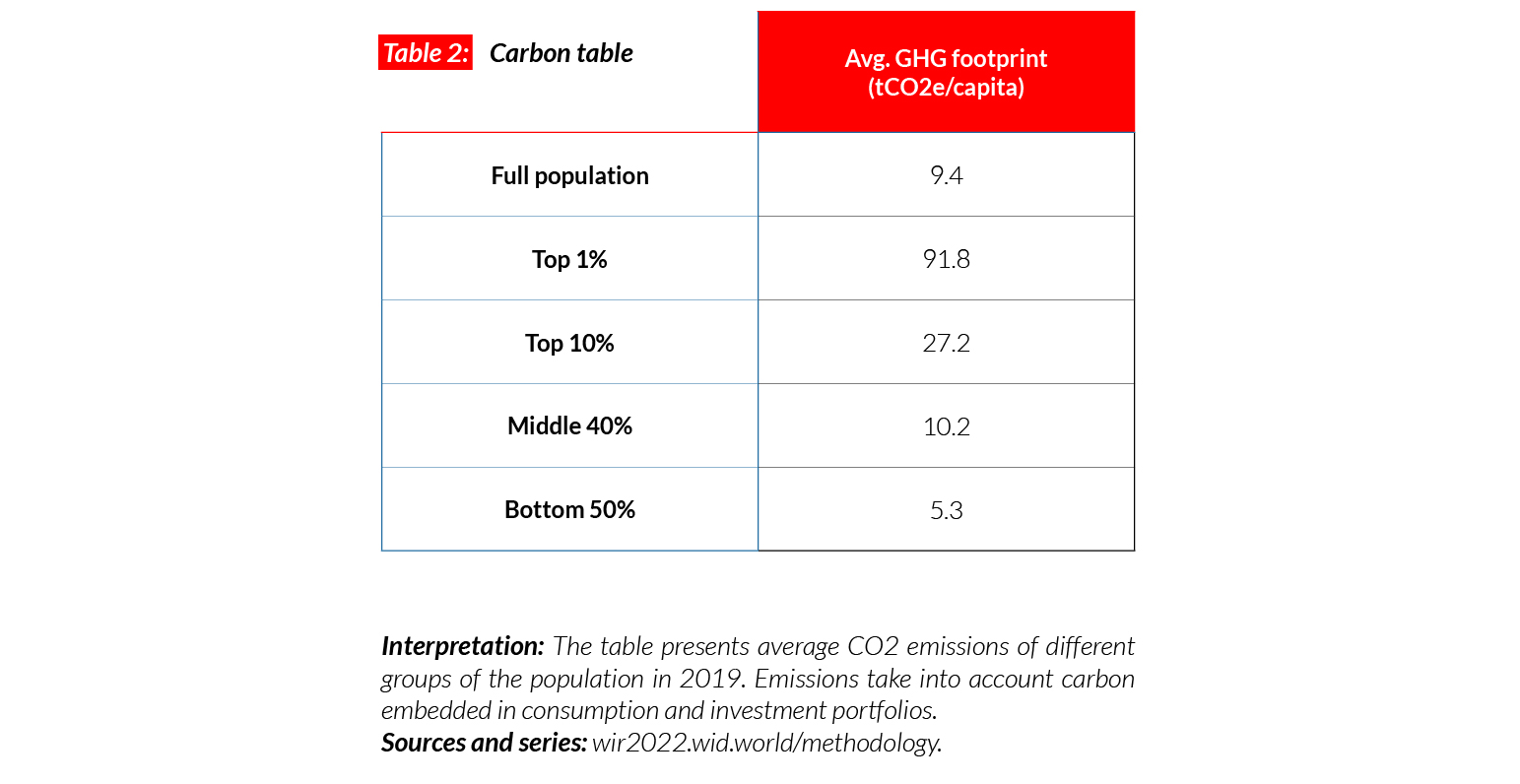
Carbon inequality
Average carbon emissions in Poland are equal to 9.4 tCO2e/capita. While Poland is much poorer than Western European countries, its emissions levels are comparable because a large share of its electricity is generated from coal. Average emissions are similar to those in the UK (10) and France (9). The bottom 50% emit on average 5.3 tonnes of CO2 equivalent every year, the top 10% emit around five times more (27t).
Russia
Pop. 147,185,000 (2021)
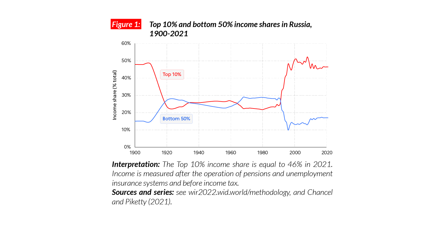
Income inequality in Russia today
In Russia, the average national income is equal to €PPP22,500 (or RUB896,150).* While the bottom 50% earns €PPP7 700 or RUB304,350 (17% of total income), the top 10% earns on average 14 times more (€PPP104,600 or RUB4,160,690, 46% of the total).
*€1 PPP = $PPP 1.4 = RUB 39.8
Income inequality in the long run
In the early 20th century, income inequality in Russia was especially high (the top 10% income share was close to 50%), but it dropped significantly after the 1917 revolution. After the implosion of the Soviet Union in 1991 and the subsequent “shock therapy” (a mixture of abrupt privatizations and deregulation), incomes at the bottom and the middle of the distribution declined. Conversely, the very rich gained substantially from the new economic regime, large-scale privatizations and very little control over financial flows. Tax evasion among wealthy Russians is particularly high.
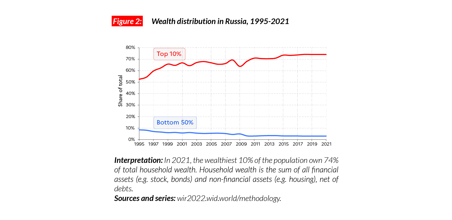
Wealth inequalities also on the rise
The transition to capitalism in Russia has also led to increased wealth accumulation in the country. Since the early 1990s, the share of the top 10% in net national wealth has risen to more than 70%, making the distribution of wealth in Russia one of the most polarized in the world.
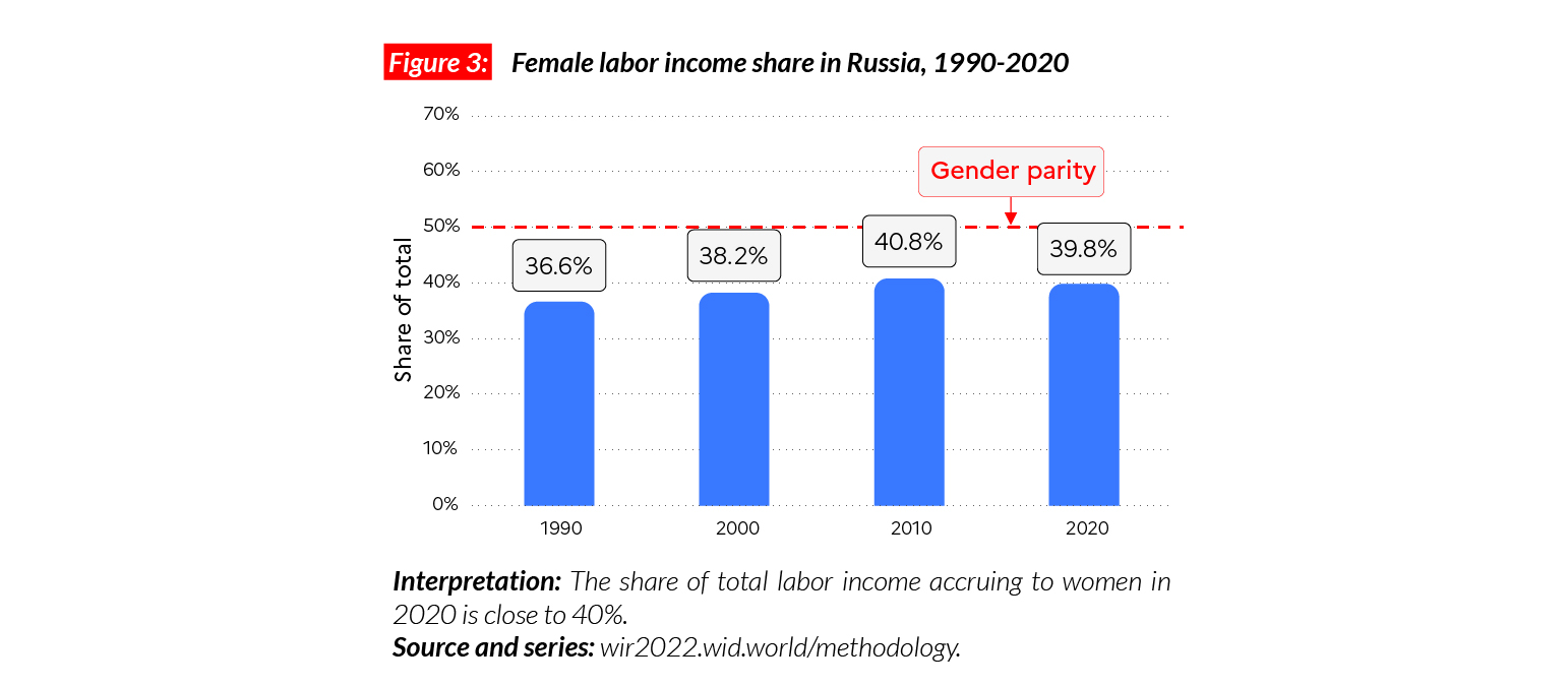
Gender inequality
In Russia, the female labor income share is equal to 40%. This value is significantly above the world average (35%). Historically, the USSR encouraged women’s participation in the labor market and so in general, women in Eastern European countries hold a larger share of total income than in the rest of the world (41% in average in countries of the Eastern bloc). In Russia, women’s income share is higher than Western European countries such as the UK (38%). The share of total income that women earn in Russia has gone up moderately in the last 30 years, gaining three percentage points.
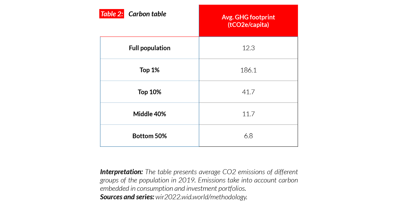
Carbon inequality
The average carbon footprint in Russia is equal to 12.3 tCO2e/capita. This is higher than the average country in the European Union (9.5t), but smaller than high-emitting countries such as the United States (21t) and Canada (19t). Since the early 1990s and the fall of the Soviet Union, per capita emissions have dropped significantly (by around 30%). The emissions of the bottom 50% stand at seven tons in 2021 (five tons below their 1990 value), while emissions of the top 10% reach 42 tons in 2021, up by around five tons since 1990.
Spain
Pop. 46,329,000 (2021)
Income inequality in Spain
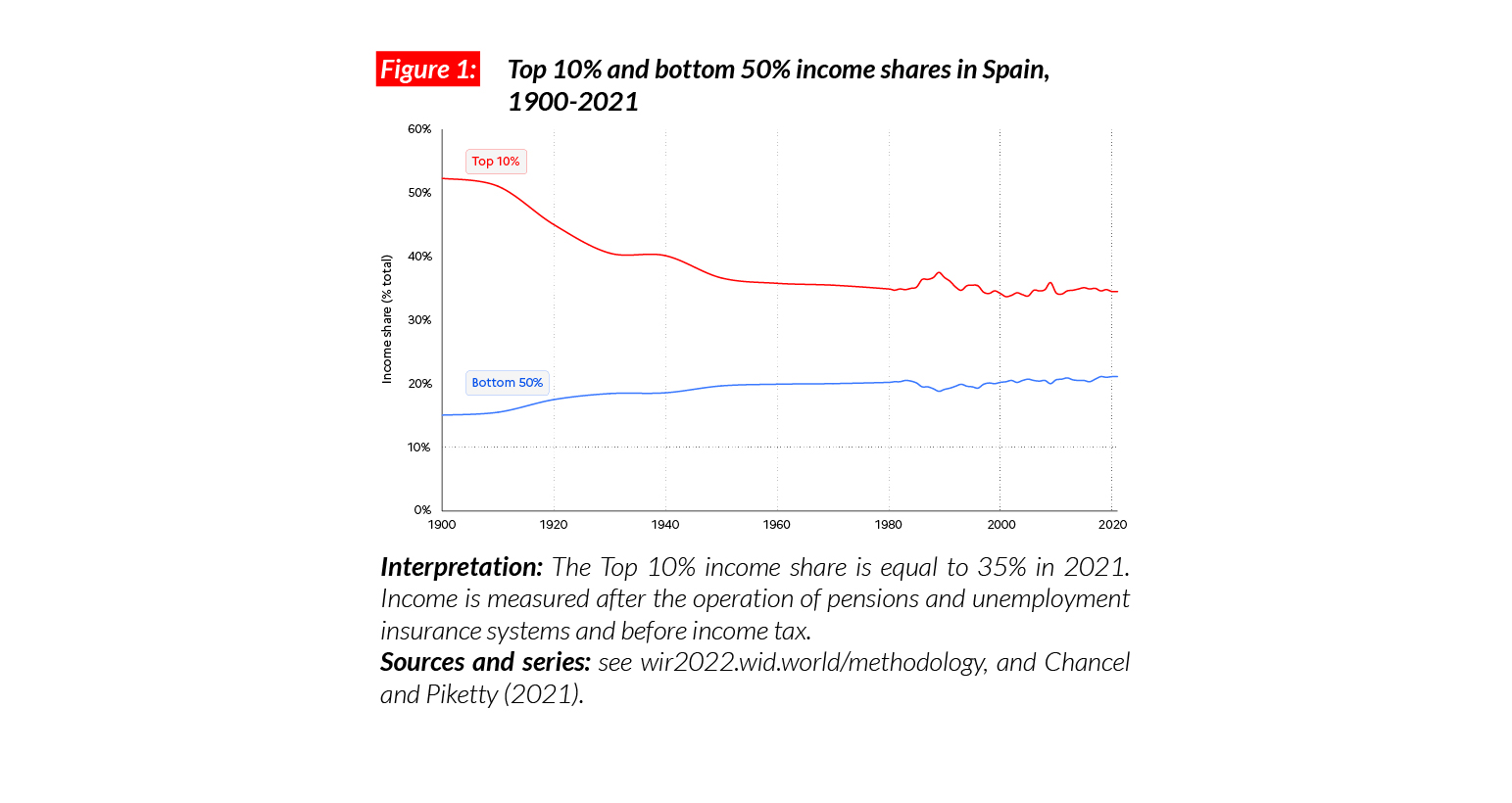
In Spain, the average national income of the adult population is €PPP30,600 (or €26,560).* While the bottom 50% earns €PPP12,900 (€11,220), the top 10% earns on average eight times more (€PPP 105,500 or €91,560, 34.5% of the total). Spain is a relatively equal country compared with its European neighbors: the top 10% captures 34.5% of national income, while the bottom 50% has 21%. Inequality levels are similar to those in France and lower than in Germany.
*€1 PPP = $PPP 1.4 = € 0.9

Income inequality in the long run
Income inequality in Spain declined significantly over the course of 20th century, following the trend in other European countries (the top 10% share was above 50% in 1900 and dropped to 35% in the 1960s). Over the next 40 years, income inequality was maintained at relatively low levels, but then the country went through important economic turnarounds. After the fast growth of 1995-2005, the 2008-2014 financial crisis depressed average incomes, including those of the bottom 50%. It is only since 2015 that the poorest half of the population has recovered its pre-2007 average income level.
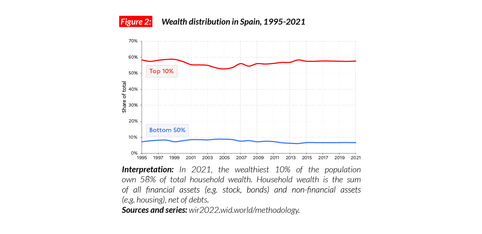
Wealth inequality
The richest 10% of the population in Spain owns 58% of total wealth, while the bottom 50% owns 7% of wealth. Over the past 30 years, despite financial booms and busts, the wealth share of the top 10% has remained largely stable. This relative stability can be explained by the fact that the richest Spaniards sold part of their housing assets during the bust of the real estate bubble in 2008.
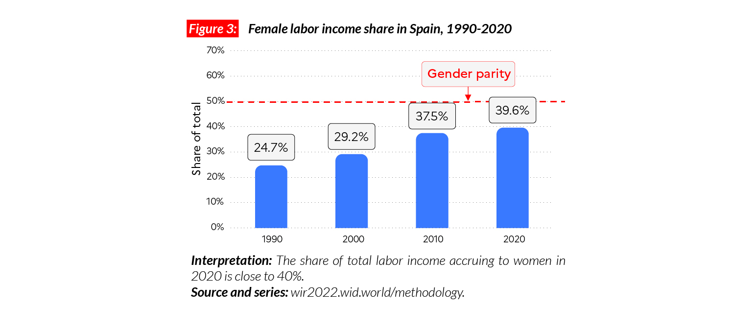
Gender inequality
Female labor income share in Spain in 2021 is equal to 40%. This is comparable with levels in France (41%), and higher than in the UK (38%). This level of inequality is close to the average in Western Europe (38%), but lower than in Eastern Europe (41%). Women’s share of total labor income in the country has increased significantly since the beginning of the century. Between 1990 and 2019, it grew by 15 percentage points, which is more than the general Western European trend (six percentage points during the period).
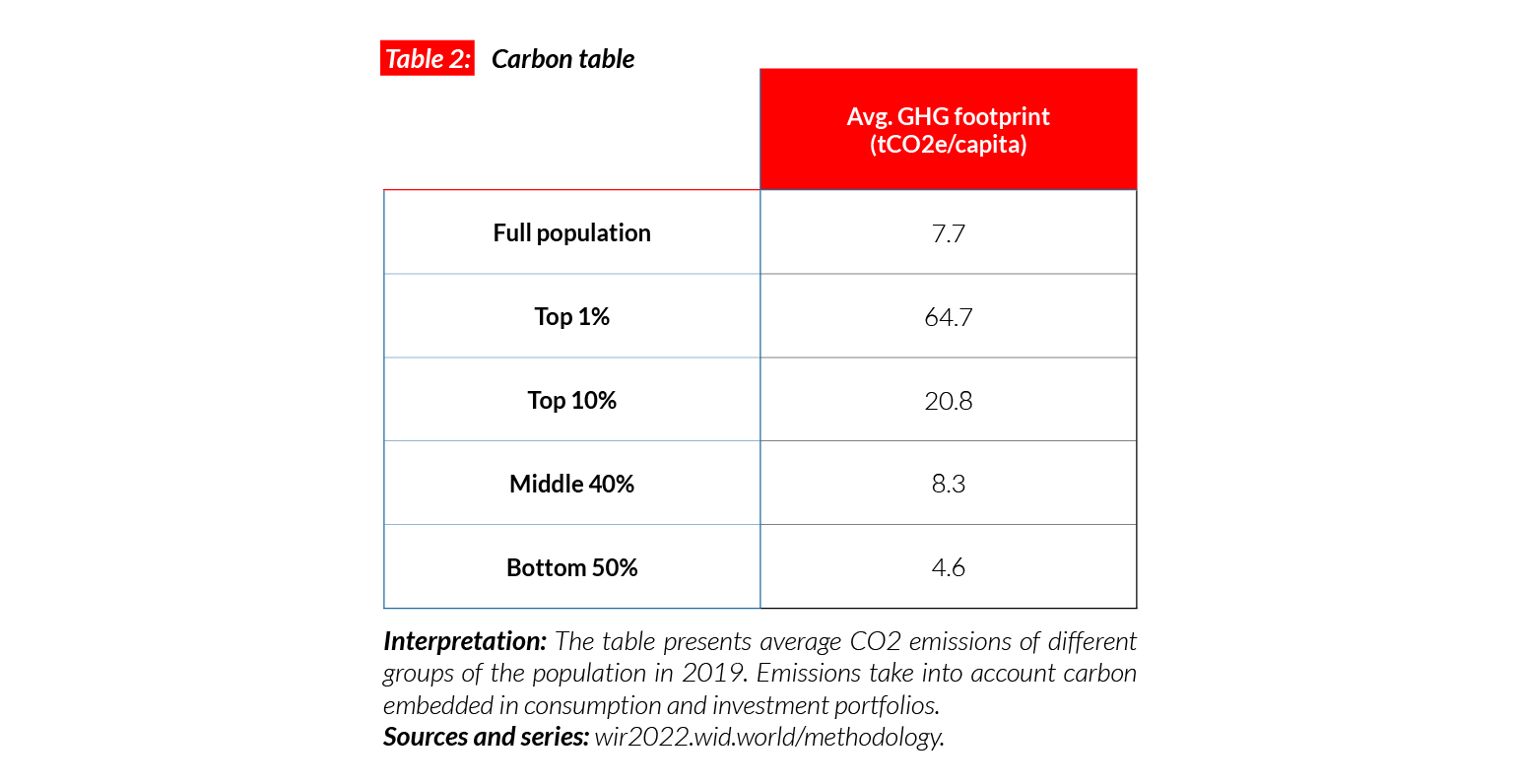
Carbon inequality
In Spain, average carbon emissions are equal to 8 tCO2e/capita. This is in between the rates of neighboring countries Portugal (6t) and France (9t). While the bottom 50% emits 4.6 tCO2e/ capita, the top 10% emits five times more (21t). Between 1990 and 2006, with a stable growth, benefiting also the poorest population groups, carbon emissions in Spain grew from 8.9 to 12.3 tCO2e/capita. Emissions for the bottom 50% increased by over two tonnes, up to 7.5. After the financial crisis, in a context of economic depression, carbon emissions decreased steadily.
South Africa
Pop. 59,012,000 (2021)
One of the world’s most unequal countries
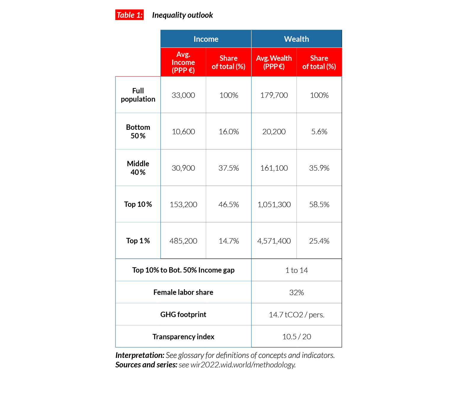
In South Africa, the average national income of the adult population is €PPP12,400 (or ZAR117,260).* While the bottom 50% earns €PPP1,300 (ZAR12,340), the top 10% earns more than 60 times more (€PPP82,500 or ZAR780,300). In 2021, the top 10% in South Africa earn more than 65% of total national income and the bottom 50% just 5.3% of the total.
*€1 PPP = $PPP 1.4 = ZAR 9.5

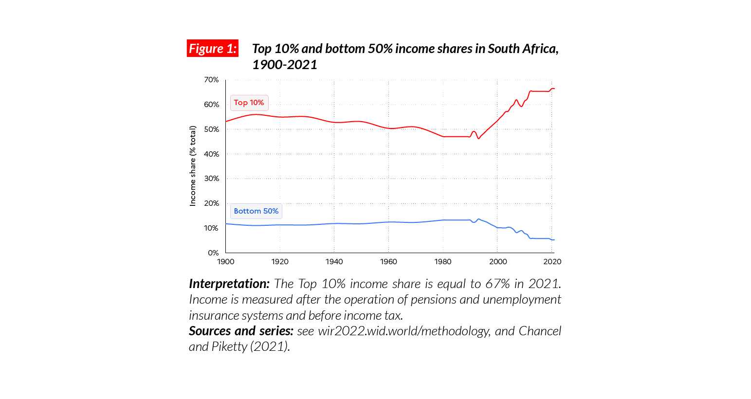
South African income inequality
Available estimates suggest that income inequality in South Africa has been extreme throughout the 20th and 21st centuries. The top 10% income share oscillated between 50 and 65% in this period, whereas the bottom 50% of the population has never captured more than 5-10% of national income. While democratic rights were extended to the totality of the population after the end of apartheid in 1991, extreme economic inequalities have persisted and been exacerbated. Post- apartheid governments have not implemented structural economic reforms (including land, tax and social security reforms) sufficient to challenge the dual economy system.
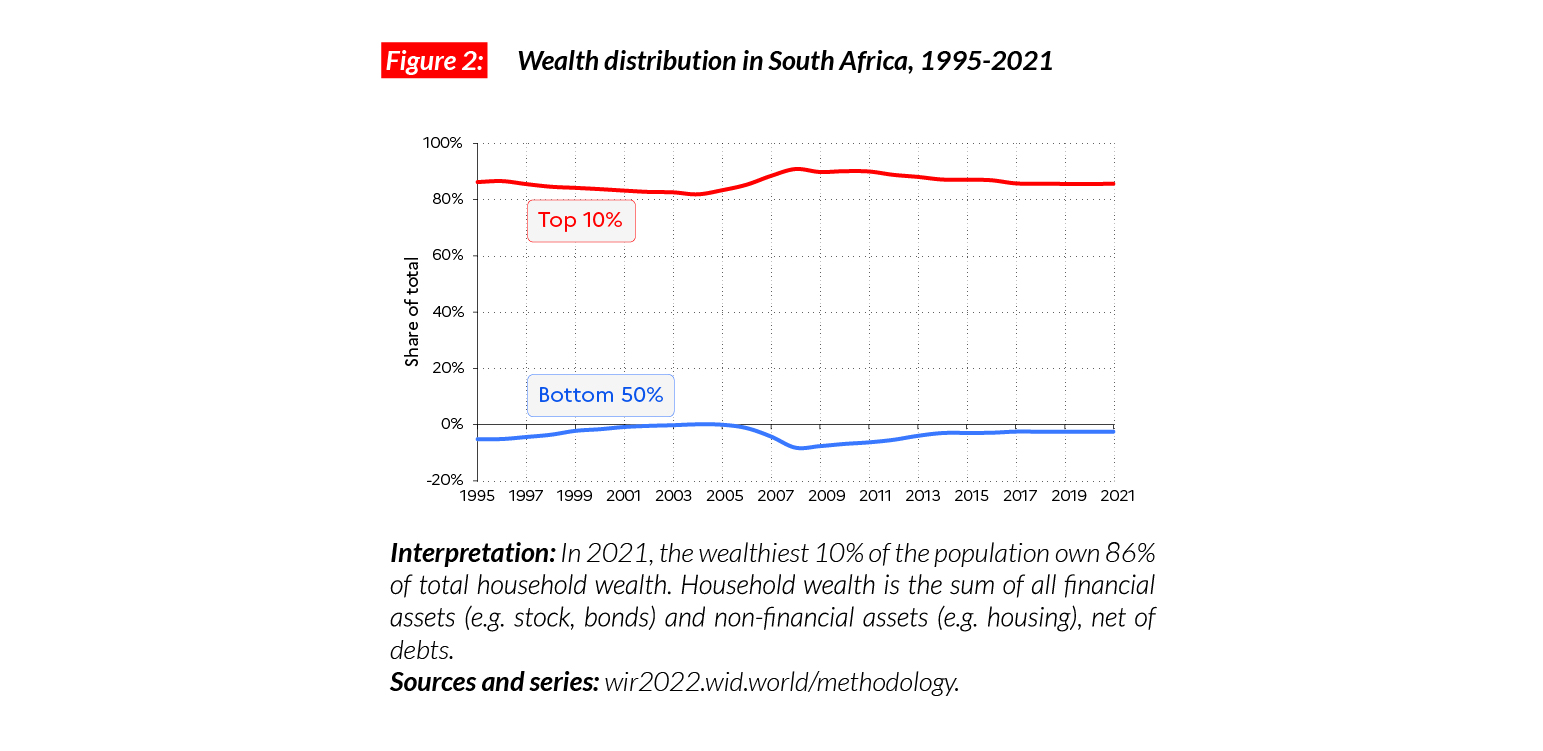
Wealth inequality
While the richest South Africans have wealth levels broadly comparable with those of affluent Western Europeans, the bottom 50% in South Africa own no wealth at all. The top 10% own close to 86% of total wealth and the share of the bottom 50% is negative, meaning that the group has more debts than assets. Since 1990, the average household wealth for the bottom 50% has remained under zero.
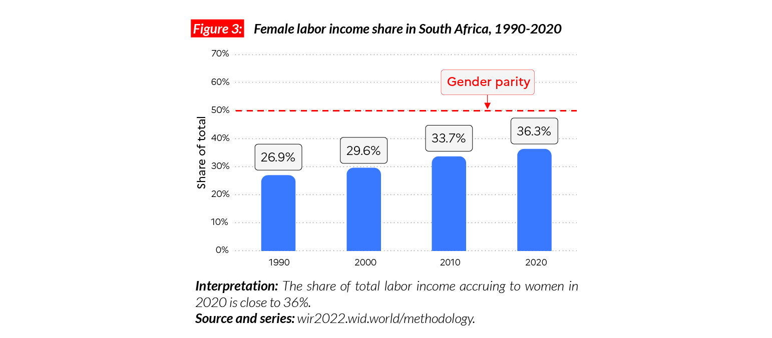
Gender inequality
South Africa stands out as an exception in the sub- Saharan African region. The country’s female labor income share is equal to 36%, which is significantly higher than the regional average (28%). Gender inequalities in South Africa are comparable with levels observed in Western Europe (where the average earnings of women are equal to 38% of total national income on average).
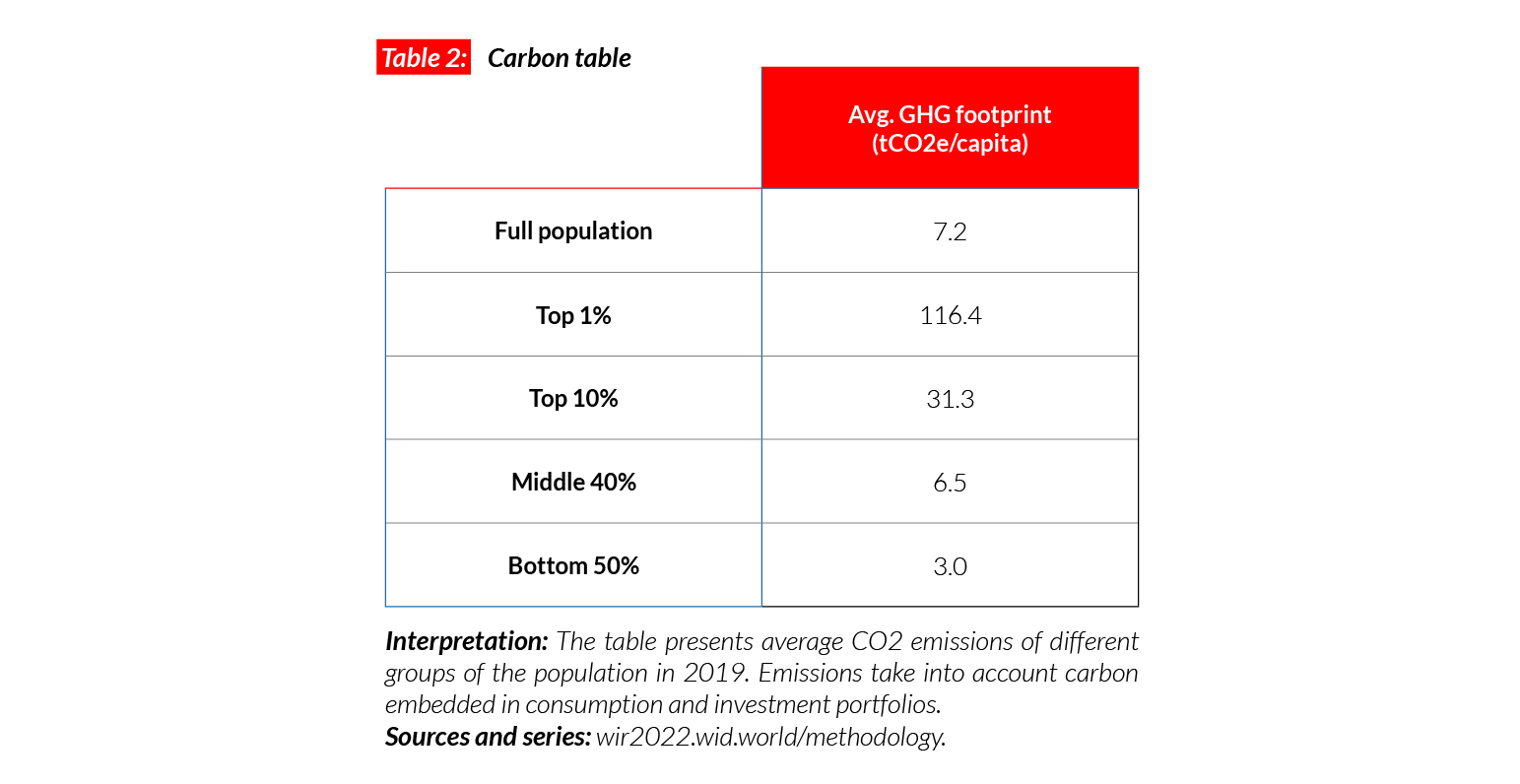
Carbon inequality
South Africa is one of the highest emitters in Africa. On average, GHG emissions per capita are equal to 7.2 tCO2e/capita. This is slightly fewer than in China (8.0) and France (8.7) but considerably more than in other African countries, including Kenya (1.4), and is well over the sub-Saharan African average. On average, the top 10% emit 10 times more emissions than the bottom 50%. Since the early 1990s, these high levels of carbon inequality have remained constant.
South Korea
Pop. 51,656,000 (2021)
Income inequality in Korea
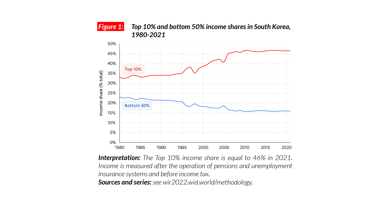
In Korea, the average national income of the adult population is €PPP33,000 (or KRW38,426,130),* a level close to that of affluent Western European countries. Inequality is higher than in Western Europe and closer to that observed in the United States. The bottom 50% earns €PPP10,600 or KRW12,326,845 (16% of the total), the top 10% earns on average 14 times more (€PPP153,200 or KRW178,508,110), 46% of the total).
*€1 PPP = $PPP 1.4 = KRW 1165.3
A spectacular rise of income inequality in Korea
South Korea is one of the four “Asian Tigers” which underwent rapid industrialization and economic development between the 1960s and the 1990s. This development came with liberalization and deregulation economic policies in a context of weak social protection. As a result, inequality grew substantially over the period, the top 10% share rising from 35% to 45% since 1990, at the expense of the bottom 50% which dropped from 21% to below 16%.
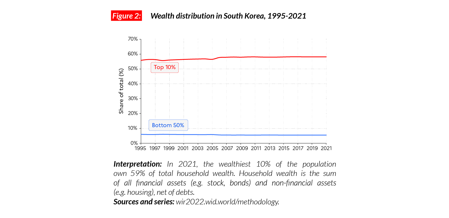
A wealthy country with medium levels of wealth inequality
South Korea is one of the wealthiest Asian countries. The average household wealth is equal to €PPP179,700 (KRW209,317,180). This is more than twice the average in China and eight times more than in India. Wealth inequality is very high, though. The share of total wealth held by the bottom 50%, middle 40% and top 10% is equal to 6%, 36% and 59% respectively. Inequality levels have increased in the last 30 years, with the middle class and working classes recording a slight decline in their share of total wealth, to the benefit of the top 10%.
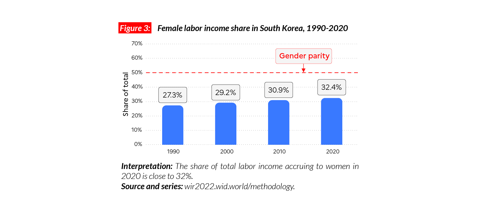
Gender inequality
The female labor income share in Korea is equal to 32%. This is higher than levels in Japan (28%) and India (18%). Overall, these shares are higher than in sub-Saharan Africa (28%) or MENA countries (15%) but remain lower than in Western and Eastern Europe (respectively 38% and 41%). Following the general world trend, we observe a small but continuous increase in women’s income share since 1990. During this period, it went up by five percentage points.
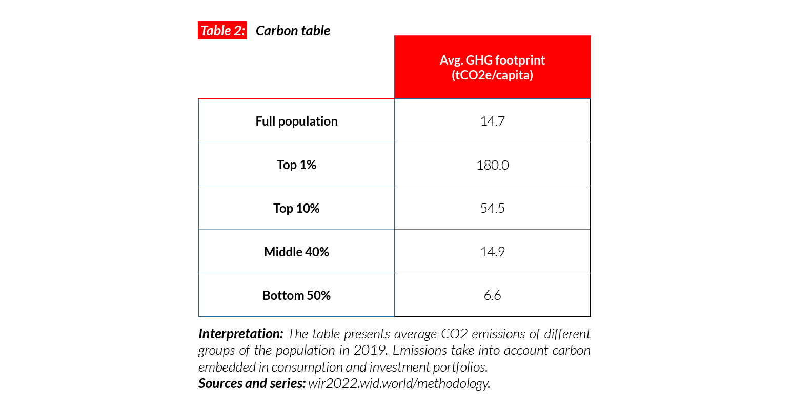
Carbon inequality
Korea is a high carbon emitter. Per capita greenhouse gas emissions are equal to 14.7 tCO2e on average. This is more than in China (8t) but less than in the US (21t) and Canada (19t). During the 1990s, carbon emissions in South Korea went up significantly. Average emissions increased by 66% over their 1990 level. While emissions in the bottom 50% increased by 43%, they increased by almost 200% for the top 10%.
Sweden
Pop. 9,870,000 (2021)
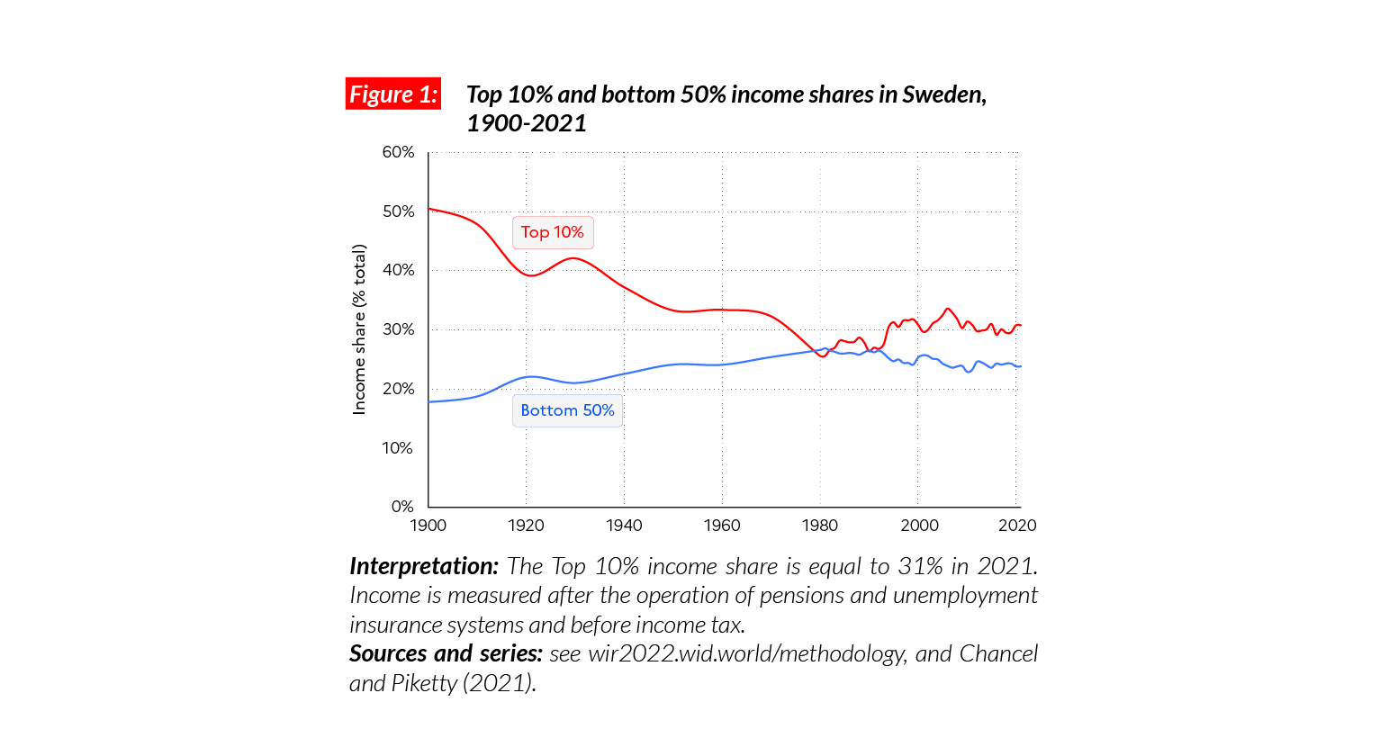
Income inequality in Sweden
In Sweden, the average national income of the adult population is €PPP45,200 (or SEK557,960).* While the bottom 50% earns €PPP21,500 (SEK265,380), the top 10% earns on average 6 times more (€PPP139,000 or SEK1,717,450). Sweden is one of the least unequal countries in terms of income in Europe and the world, with the top 10% of the population earning just over 30% of total national income and the bottom 50% earning almost 24% of national income.
*€1 PPP = $PPP 1.4 = SEK 12.3

Long run inequality
Sweden was one of the most unequal countries in Europe in the late 19th and early 20th centuries and democratic rights were tied to wealth ownership. The expansion of democracy and growing support for the Swedish socialist party paved the way for the development of the Swedish welfare state, which led to a large-scale drop in inequalities, accompanied by fast-rising average incomes for the vast majority of the population. While inequalities have risen in Sweden since the 1980s (the top 10% share rose by about 5 p.p. since then), the country remains one of the most equal nations on earth in 2021.
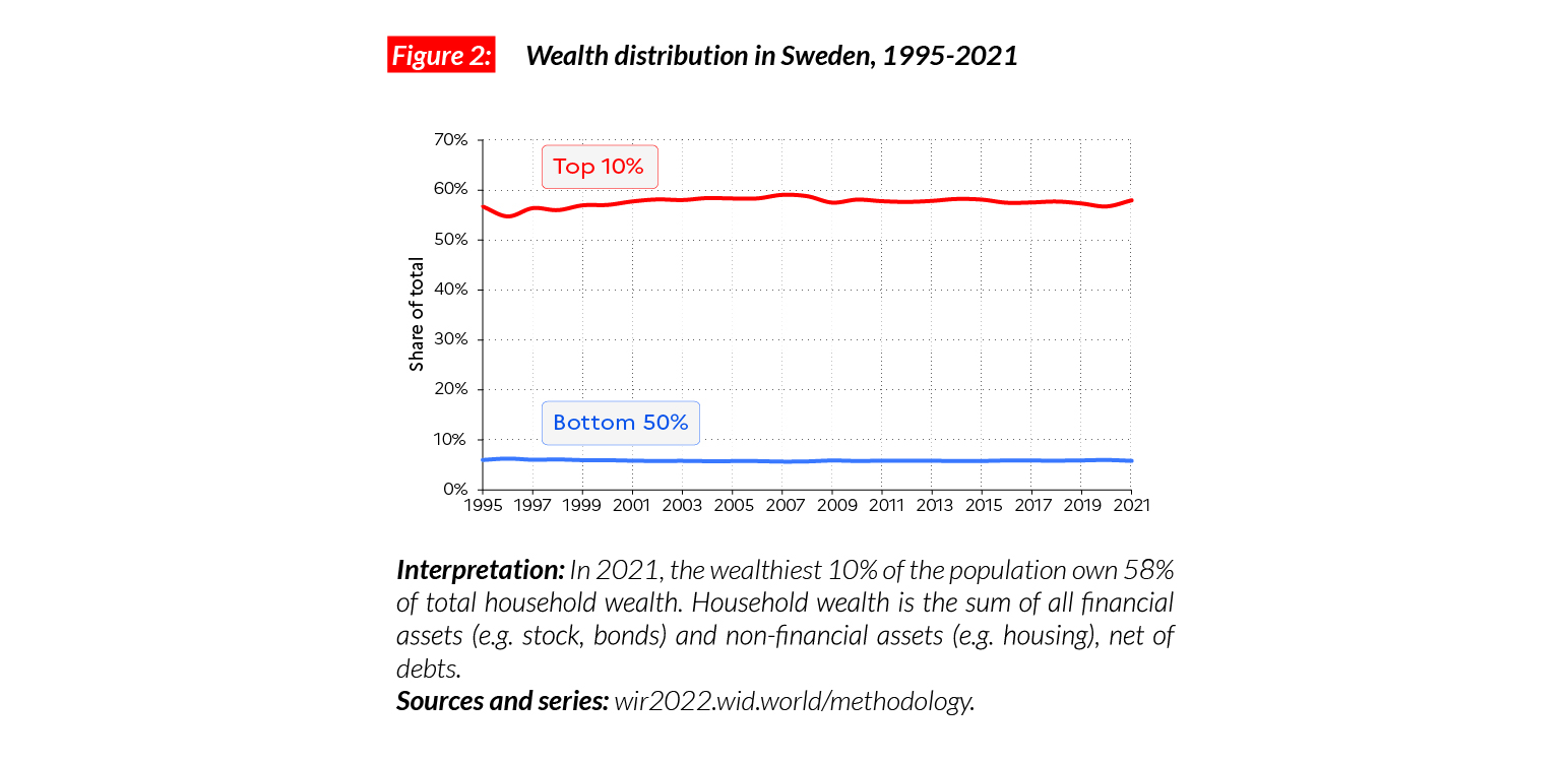
Wealth inequality
While income inequalities are relatively low in Sweden, wealth inequality remains high, comparable with countries such as France and Germany. In 2021, the bottom 50%, middle 40% and top 10% respectively hold 6%, 36% and 58% of total national wealth.
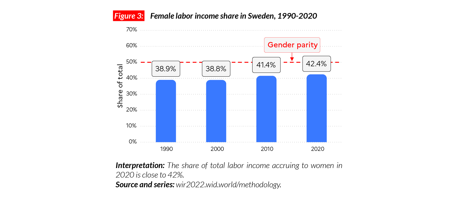
Gender inequality
The female income labor share in Sweden is equal to 42% of the total. This value is significantly above the Western Europe average of 38% and slightly higher than in the former Eastern bloc countries (41%). This share has increased from around 39% in 1991.
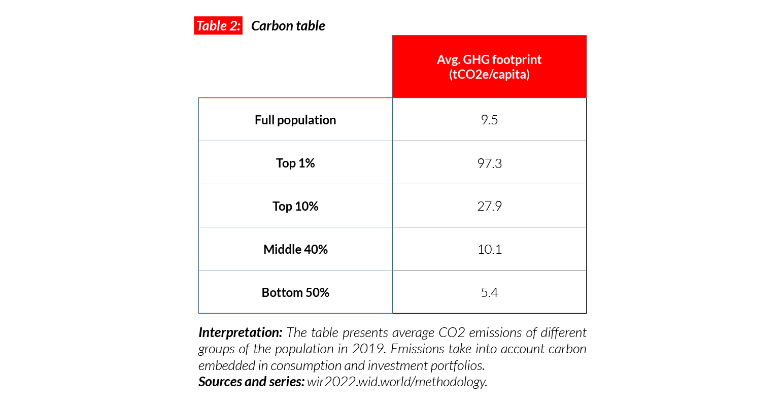
Carbon inequality
The average carbon footprint in Sweden is equal to 9.5 tCO2e/capita. This is similar to the European Union average. The top 10% emit on average 28 tonnes of CO2e every year. In comparison, the bottom 50% emit five times less (5.4 tonnes).
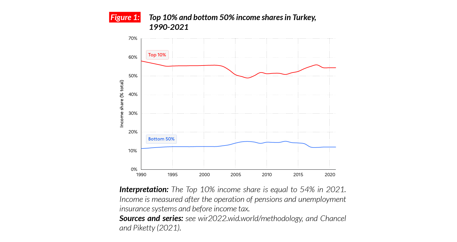
Turkey
Pop. 85,043,000 (2021)
Income inequalities in Turkey
In Turkey, the average national income of the adult population is €PPP27,400 (or TRY85,010).* While the bottom 50% earns €PPP6,500 (TRY20,260), the top 10% earns on average 23 times more (€PPP149,400 or TRY463,020). The top 10% captures 54.5% of total income while the bottom 50% takes 12%.
*€1 PPP = $PPP 1.4 = TRY 3.1

Income inequality over the past three decades
Estimates of inequalities in Turkey are very limited: the country’s transparency index is 3/20. Sources suggest that after a decline in inequality during the 1980-1990s, inequality has risen over the past 15 years. The recent economic slowdown (2018- 2021) has depressed the average incomes of all population groups.
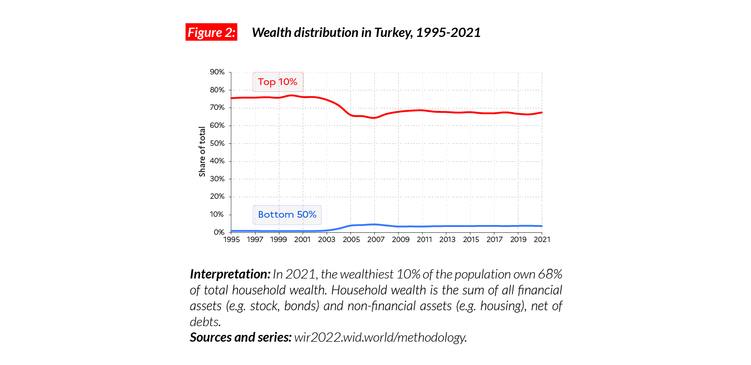
Wealth inequality
In the last 25 years, average wealth in Turkey has more than doubled, to €PPP39,100 in 2021 (TRY121,160). In terms of wealth, Turkey appears to be more unequal than other countries with comparable wealth levels. In 2021, the bottom 50%, middle 40% and top 10% respectively hold 4%, 29% and 68% of total national wealth. This means that there is still a high number of very poor people, with the bottom 50% holding on average less than €PPP 2,900 (or TRY 8,910).
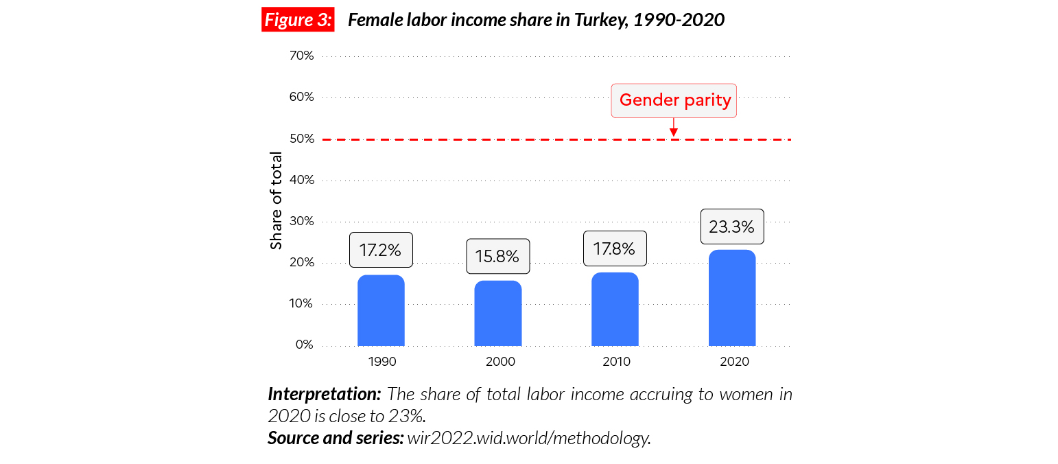
Gender inequality
The female labor income share in Turkey is equal to 23%. This is higher than in MENA countries (where women earn on average 15% of the total) but lower than neighboring European countries including Greece (37%) and Bulgaria (43%). After stagnating between 1990 and 2005, women’s earnings in the country have since gone up by six percentage points.
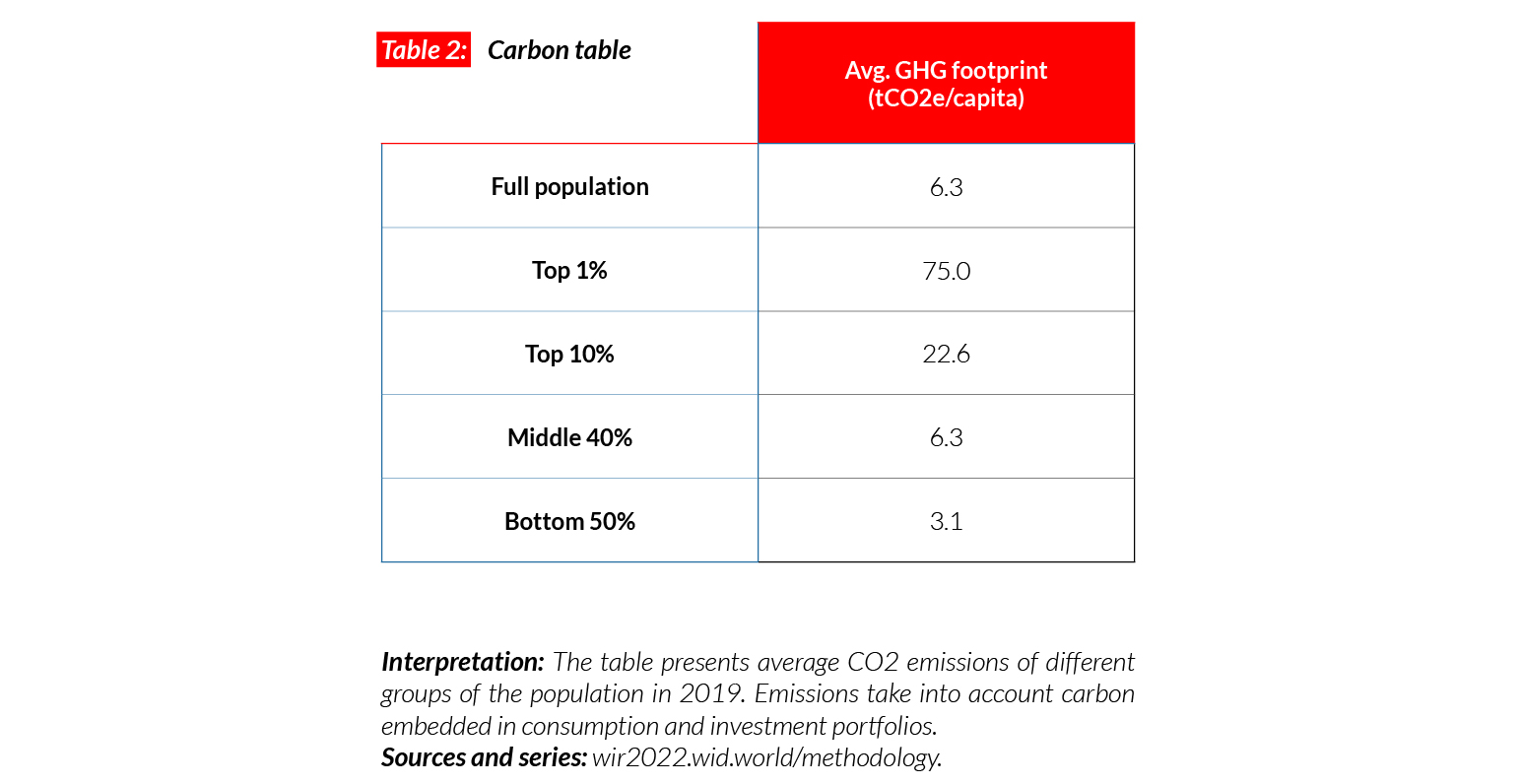
Carbon inequality
Average carbon emissions in Turkey are around 6 tCO2e/capita. While the bottom 50% of the population emit just under 3.1 tons, the top 10% emit seven times more (22.6 tCO2e/capita). With the general increase in living standards in the early 21st century, carbon emissions have slightly increased in Turkey (by around one tonne since 1990).
United Kingdom
Pop. 67,286,000 (2021)
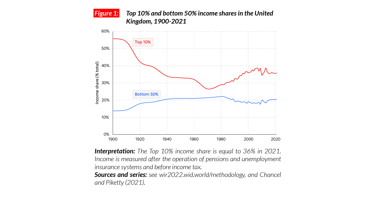
Income inequality in the UK
In the United Kingdom, the average national income is €PPP32,700 (or GBP32,720).* While the bottom 50% earns €PPP13,300, the top 10% earns on average nine times more (€PPP116,700). The top 10% captures over 36% of total income and the bottom 50% less than 20% of it. The gap between top 10% and bottom 50% incomes is smaller than in some European countries, including Germany and Poland (10) but higher than others, for example France (6) and Sweden (7). This gap is much smaller than in the US (21) and China (14).
*€1 PPP = $PPP 1.4 = GBP 1.0

Income inequality in the long run
The United Kingdom was one the most unequal countries on earth in the early 20th century, with a top 10% income share over 55%, close to levels recorded in Latin America in 2021. The military and economic shocks of the 1910-1940s and decolonization processes hit top incomes hard. In the 1950s, the development of the social state in the UK further reduced inequality in a context of high average income growth rates. The neoliberal turnaround of the early 1980s led to a significant increase in the top 10% share, by around 10 p.p. The financial crisis of 2008 slowed this increase but also depressed average incomes: these were lower in late 2019 than 10 years before.
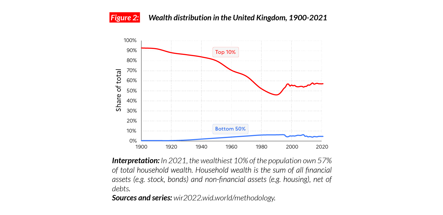
A strong decline in wealth inequality in the 20th century followed by a slow rise
In 2021, average household wealth stands at €PPP214,000. The bottom 50% owns 5% of household wealth and the top 10% owns 57% of it. In the early 1900s, the top 10% UK wealth share was extreme, i.e. above 90% of the total. Wealth inequalities strongly declined over the 20th century (1910-1980) and mostly during the 1950s-1970s. Since the mid-1980s, the declining trend has been reversed but so far, the rise in wealth has been slower than for income.
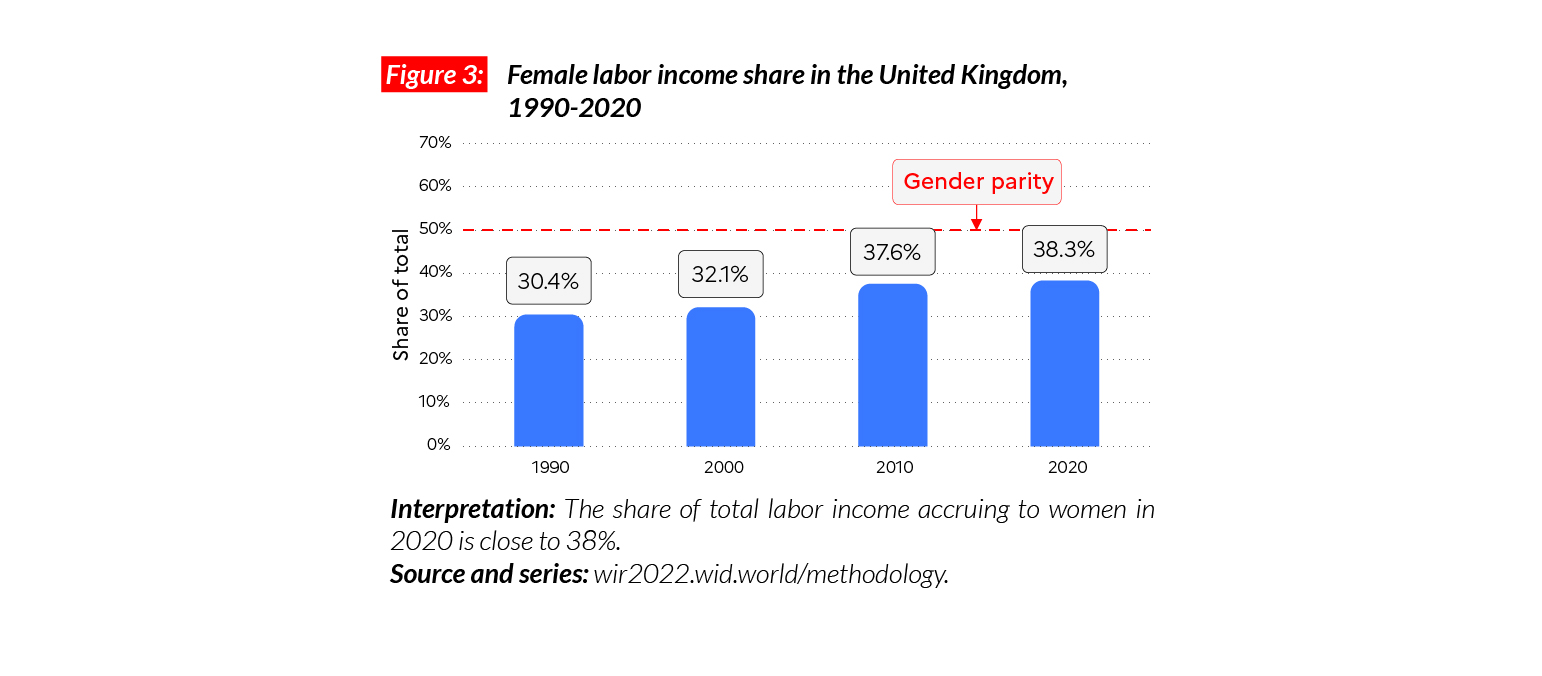
Gender inequality
In the UK, the female labor income share is equal to 38%. This is lower than France (41%) and equal to the Western European average (38%). It is higher than the average in Sub-Saharan Africa (28%), Asia (21%, excluding China) and comparable with North America (38%), but lower than in Eastern Europe (41%). Since 1990, we observe a significant increase in female labor income share, with a gain of eight points over 30 years.
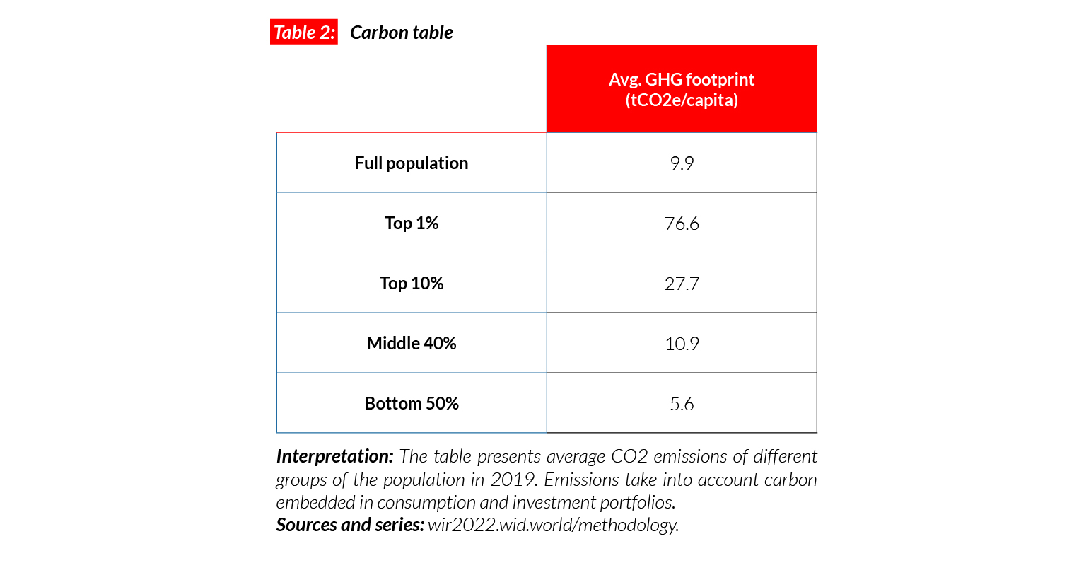
Carbon inequality
Starting from a very high level, the UK has had one of the most important decreases in GHG emissions since 1990 and has now reached average EU levels. In 1990, average emissions in the UK were around 15 tCO2e/capita. In 2020, they are fewer than 10 tons. The UK has set an ambitious carbon target to limit its emissions up to around 5.2 tonnes per capita by 2035.
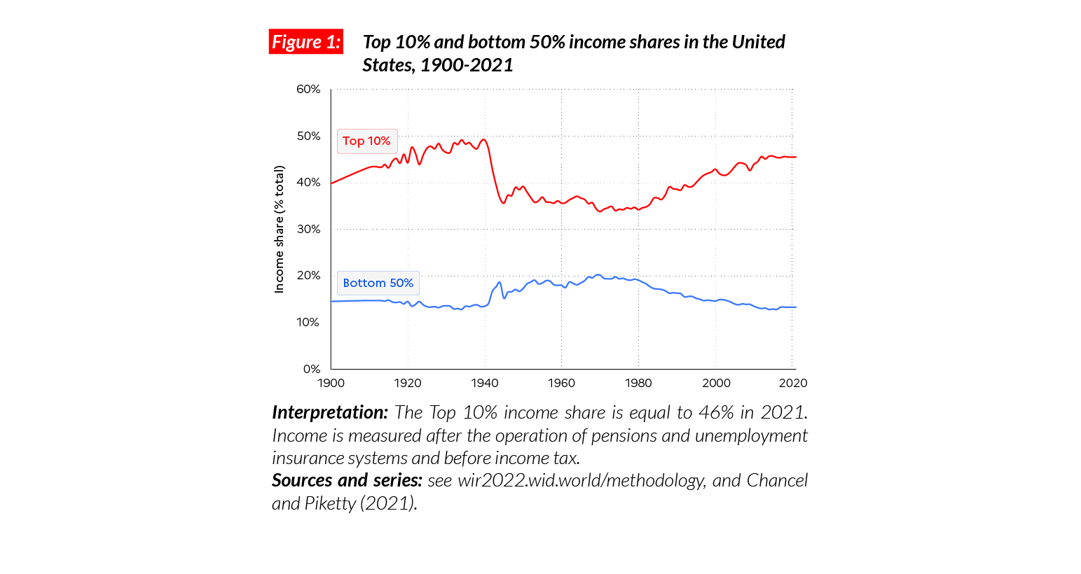
United States
Pop. 333,148,000 (2021)
Income inequality in the US is among the highest among rich countries
In the US, the average national income of the adult population is €PPP54,300 (or USD77,090).* While the bottom 50% earns €PPP14,500 (USD20,520) per person, the top 10% earns on average 17 times more (€PPP246,800 or USD350,440). The ratio of 17 between incomes of the top 10% and the bottom 50% is significantly higher than in European countries (ranging from 6 to 10) and in China (14). The top 10% captures 45.5% of total income while just 13.3% goes to the bottom 50%.
*€1 PPP = $PPP 1.4 = USD 1.4

Income inequality is back to historical highs
The top 10% income share in the US dropped significantly after the Second World War (from slightly below 50% in the 1930s to 35-40% in the 1950-1960s), under the effect of strong capital control policies and a rise in federal spending, accompanied by strongly progressive taxation. The 1950-1980s were also marked by rapidly rising average incomes. From the early 1980s onward, deregulation, privatizations, decreases in tax progressivity and a decline in union coverage all contributed to a formidable rise in the top 10% income share (from around 34% in 1980 to 45% in 2021) and a drop in the bottom 50% (from 19% to 13%).
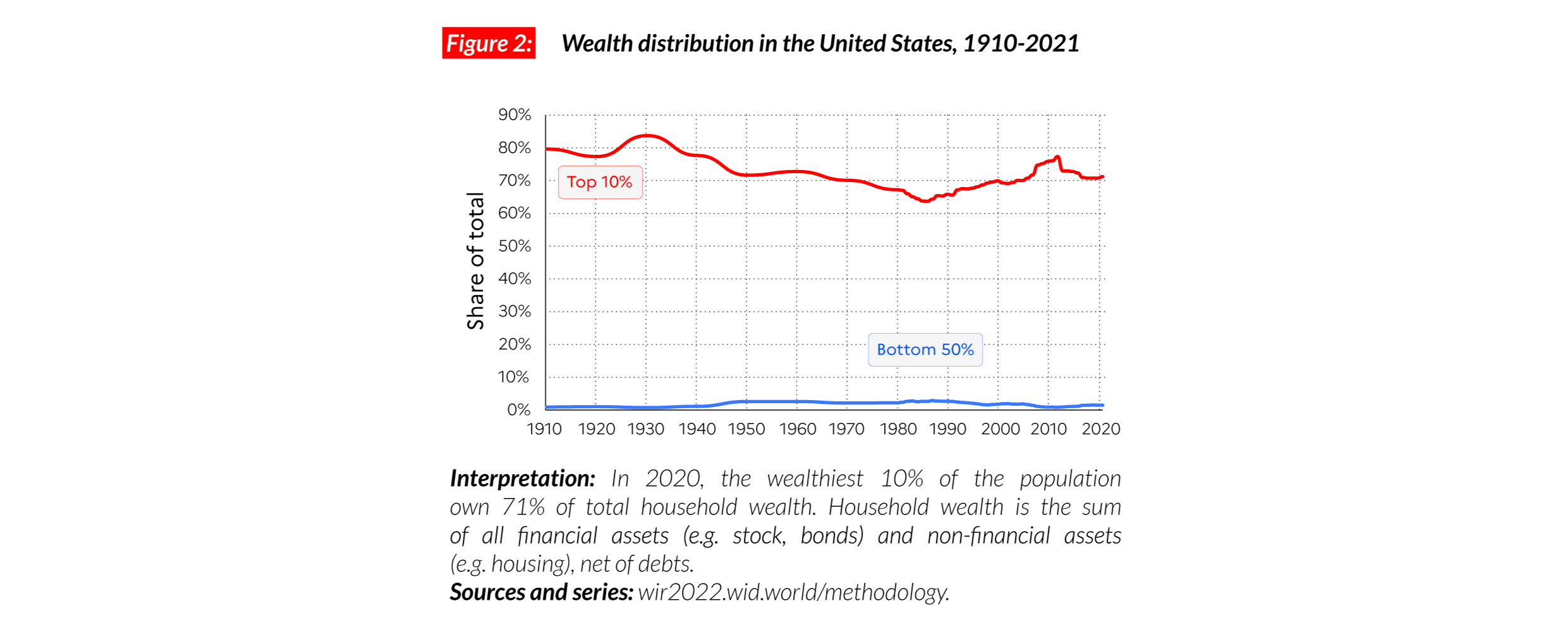
Wealth inequality
Wealth inequality levels in the contemporary US are close to those observed at the beginning of the 20th century, with a top 10% wealth share above 70%. Wealth inequality has followed similar dynamics as income over the past century. In 2021, average wealth for the top 10%, middle 40% and bottom 50% are respectively equal to €PPP2,004,400, €PPP197,300 and €PPP8,500 (USD2,846,360, USD280,150 and USD12,130). The share of total wealth owned by the poorest half of the US population is extremely small (1.5% of the total). While average household wealth in the US is 3.5 times higher than in China, the bottom 50% of the US population owns less wealth than the Chinese bottom 50%, in purchasing power parity terms.
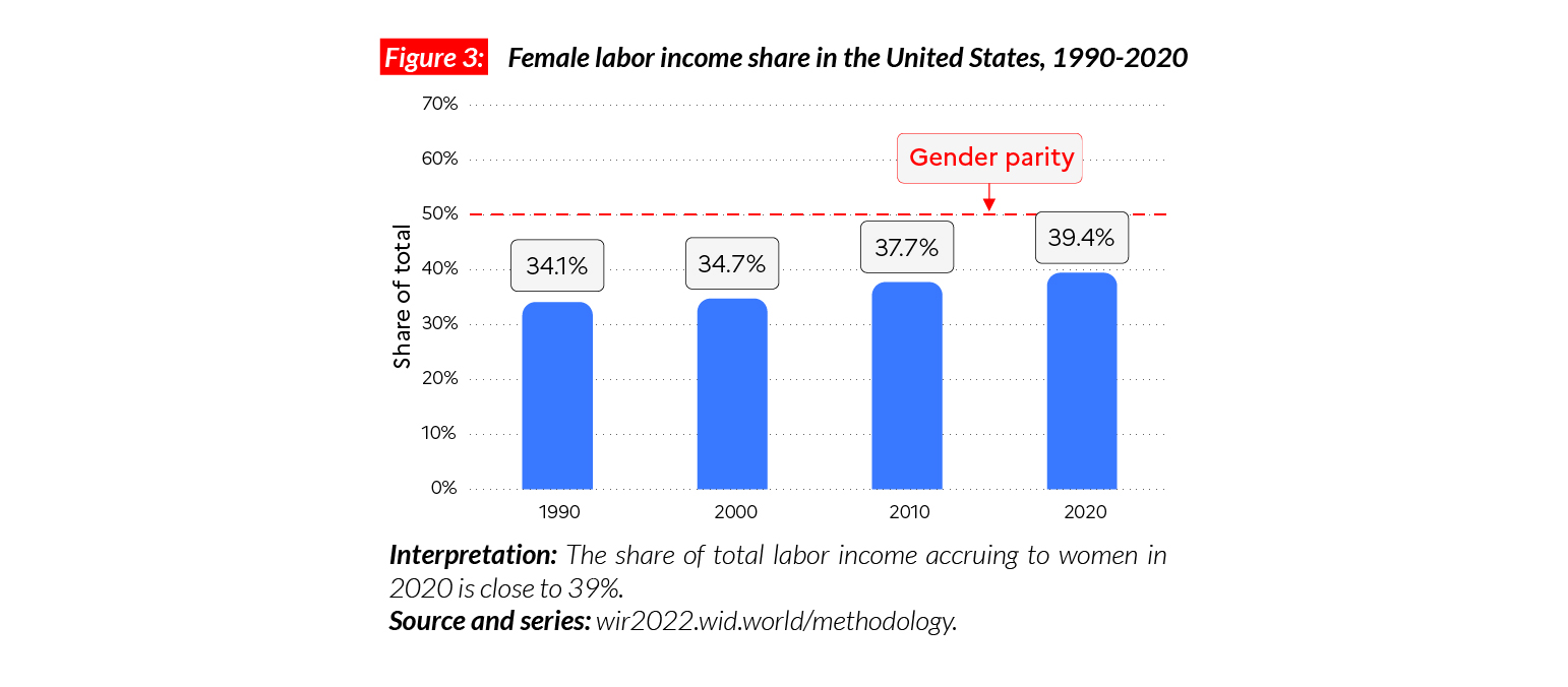
Gender inequality
In the US, the female labor income share is equal to 39%. This stands in between Canada (38%) and Russia (40%), and significantly above China (33%). While the share has risen in the US since 1990 (up from 34%), progress remains slow. Women’s representation among richest income groups is particularly low in 2021: among the top 1% of earners, women make up only 12% of earnings.
Carbon inequality
The US is one of the highest GHG emitters in the world. The average American is responsible for more than 21 tonnes of CO2e every year (twice as much as the average person in the EU). The bottom 50%, middle 40% and top 10% emit respectively 10, 22 and 75 tCO2e/capita. Since 1990, average per capita emissions have remained broadly stable among the top 10% and have decreased from 28 to 22 tCO2e/capita among the middle 40%. The US has pledged to cut, by 2030, half its emissions compared with 1990 levels, corresponding to emissions of around 10 tCO2e/capita.