
Per capita emissions across the world, 2019
“Addressing large inequalities in carbon emissions is necessary to tackle climate change”
Global income and wealth inequalities are tightly connected to ecological inequalities and to inequalities in contribution to climate change. On average humans emit 6.6 tonnes of carbon dioxide equivalent (CO2) per capita and per year. Our novel dataset on carbon emissions inequalities reveals important inequalities in CO2 emissions at the world level: the top 10% of emitters are responsible for close to 50% of all emissions, while the bottom 50% make 12% of the total.
These inequalities are not just a rich vs. poor country issue. There are high emitters in low and middle income countries and low emitters in rich countries. In Europe, the bottom 50% of the population emits around 5 tonnes per year and per person; the bottom 50% in East Asia emits around 3 tonnes and the bottom 50% in North America around 10 tonnes. This contrasts sharply with emission levels of the top 10% in these regions (27 in Europe, 34 in East Asia and 69 tonnes in North America).
This report also reveals that the poorest half of the population in rich countries is already at (or near) climate 2030 climate targets set by rich countries, when these targets are expressed on a per capita basis. This is not the case for the top half of the population. Large inequalities in emissions suggest that climate policies should target wealthy polluters more. So far, climate policies such as carbon taxes have often disproportionately impacted low and middle income groups, while leaving consumption habits of wealthiest groups unchanged.
This chapter is based on Chancel (2022) “Global carbon inequality, 1990-2019”, World Inequality Lab working paper 2021/22
The need for better monitoring of global ecological inequalities
The planet is entering its sixth mass extinction of species1. Global atmospheric carbon dioxide concentration is at its highest level in millions of years2. And the mass of anthropogenic plastic pollution in oceans has multiplied by more than 200 since the 1960s3. What do we currently know about the links between these global trends and income and wealth inequality? Not enough4.
In the previous chapters of this report, we have focused on the distribution of economic assets, i.e. inequalities that can be measured in monetary units: euros, dollars or yuan, earned and owned by different groups of individuals across the world (between and within countries, and between genders). The distribution of income and economic assets is tightly connected to many forms of social inequality, including inequality in access to health, to education and to power (see Chapter 10). It is because economic inequalities play a central role in the many social injustices that we initially developed the World Inequality Database (see Box 1.2), focusing on income and wealth.
As key advances have been made in our understanding of income and wealth dynamics, we believe that we can now make contributions in other dimensions of global inequality, and in particular, ecological inequalities. Global ecological inequality also takes many forms, including inequality of access to natural resources, inequality of exposure to pollution and to the catastrophes induced by unsustainable use of these resources, and inequality of contribution to environmental degradation. Each of these dimensions must be better understood if we are to develop sound and effective environmental policies. It goes beyond the scope of this report to treat all these dimensions, so our goal for this chapter is more modest: we focus on carbon emissions. Our objective is to gain a better understanding of how these emissions are distributed across the world’s population.
Bridging the gap between macro data on carbon emissions and individual perceptions
To study global carbon emissions, we start from the same general assumption as when we study income and wealth inequality: that looking at national averages and totals is important, but not sufficient. It is also necessary to navigate between different scales of analysis: the global level and the individual level. To do so we investigate in a systematic way the emissions levels of national and regional societies, as well as how emissions are distributed among different groups of individuals within these societies.
It can sometimes be difficult for anyone to make sense of the magnitude of the climate challenge and how figures about global pollution levels relate to their own lives. In other words, it is sometimes difficult for individuals to understand to what extent they themselves contribute to climate change, and how they can be part of the solution to it. By constructing new data on carbon emissions inequality, we wish to contribute to a better collective understanding of the drivers and dynamics of carbon pollution.
Global carbon inequality: initial insights
Carbon dioxide emissions are the result of the burning of fossil fuels, certain industrial processes (such as cement production), agricultural production (for example, cows emit a lot of greenhouse gases), waste management, and deforestation. These activities generate carbon dioxide (CO2), as well as other greenhouse gases such as methane (CH4), and nitrous oxides (NOx). Each of these gases contributes differently to global warming: one tonne of methane is equivalent to the release of 30 tonnes of CO2, and one tonne of nitrous oxide equivalent to 280 tonnes of CO2. The numbers presented below refer to CO2 equivalents, i.e. they take into account the different GHGs5.
In 2021, humans released nearly 50 billion tonnes of CO2 into the atmosphere, reversing most of the decline observed during the 2020
Covid pandemic. Of these 50 billion tonnes, about three quarters were produced in the burning of fossil fuels for energy purposes, 12% by the agricultural sector, 9% by industry (in cement production among other things) and 4% came from waste6. On average, each individual emits just over 6.5 tonnes of CO2 per annum (see Table 6.1). These averages mask considerable disparities between countries and within them, as we discuss below.
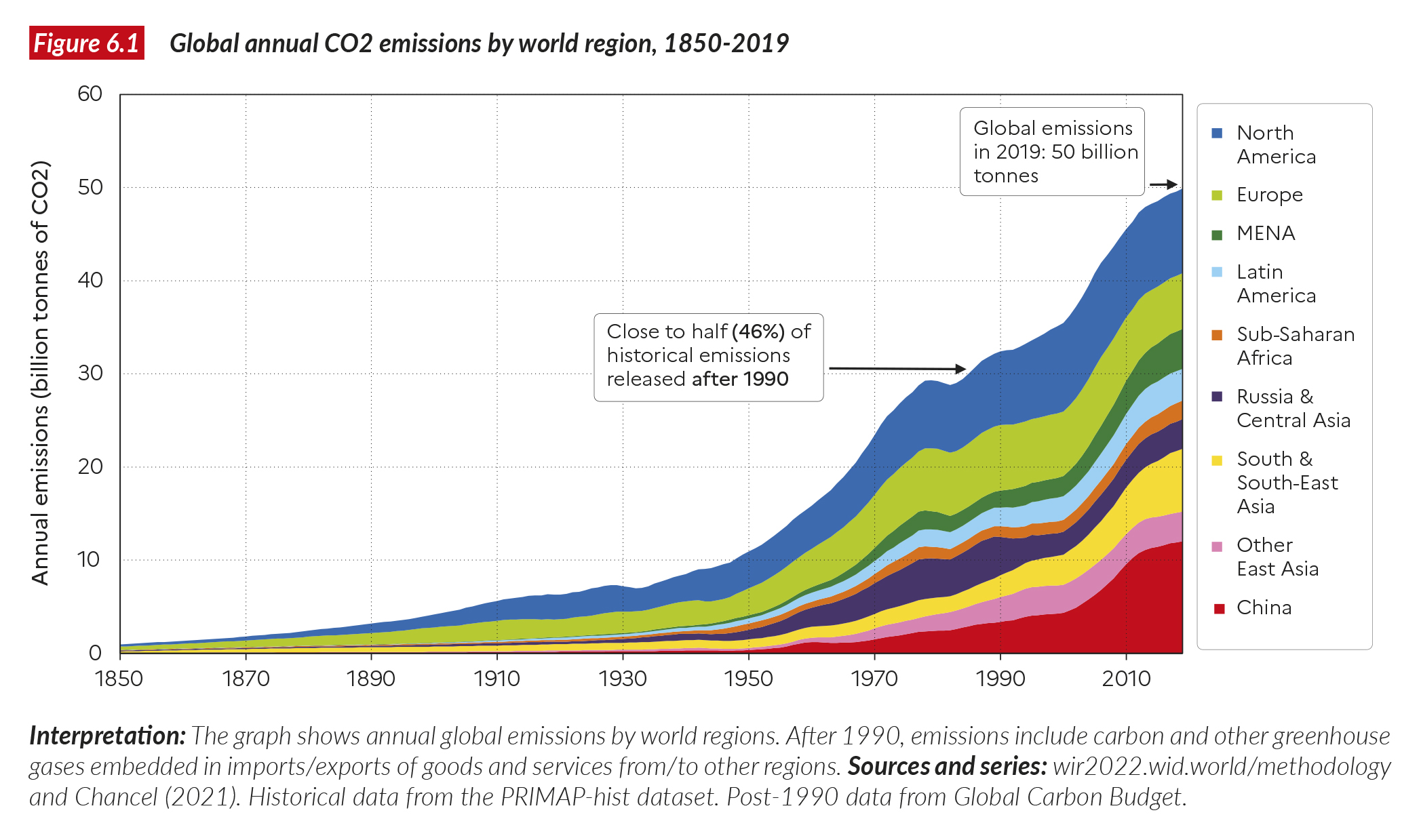
Global emissions have been rising almost continuously since the industrial revolution (Figure 6.1). In 1850, one billion tonnes of carbon dioxide equivalents were emitted overall7. By 1900, the number had risen to 4.2 billion tonnes, it reached 11 billion tonnes by 1950, 35 billion tonnes in 2000, and about 50 billion today. Close to half of all emissions since the industrial revolution have been produced since 1990, the year of the first report from the Intergovernmental Panel on Climate Change (IPCC).
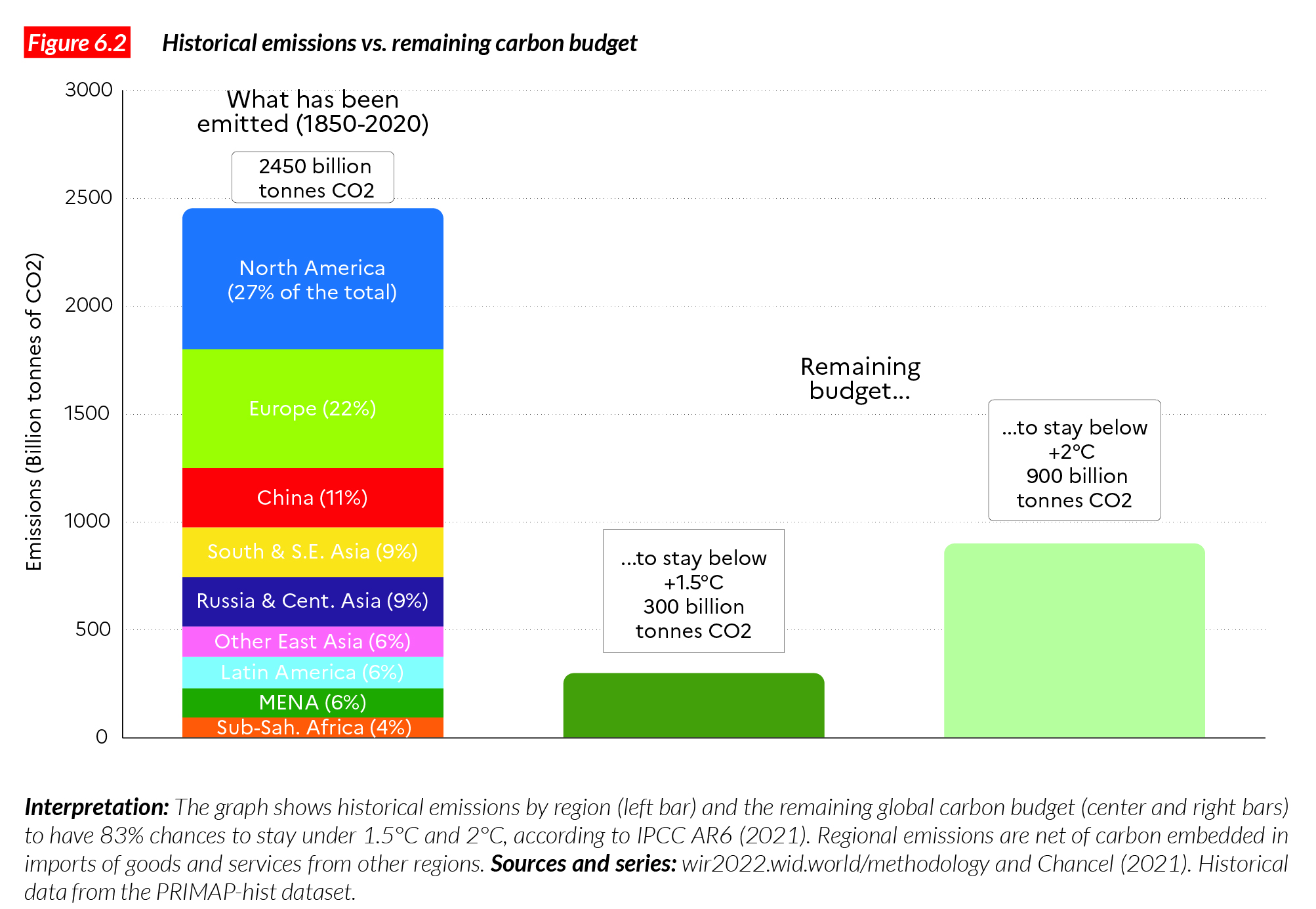
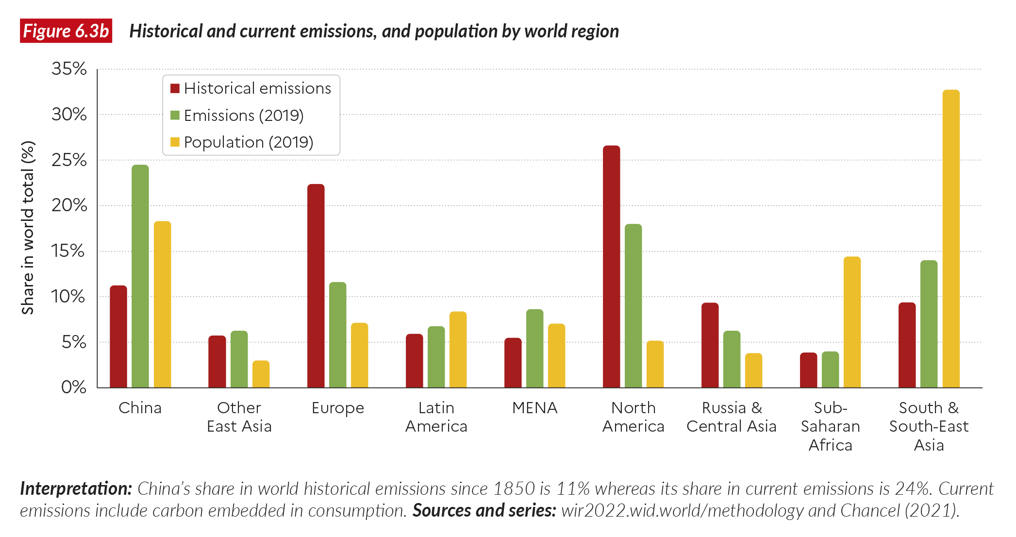
Of the total 2,450 billion tonnes of carbon released since 1850 (Figure 6.2), North America is responsible for 27%, Europe 22%, China 11%, South and South-East Asia 9%, Russia and Central Asia 9%, East Asia (including Japan) 6%, Latin America 6%, MENA 6%, and Sub-Saharan Africa 4%. Figure 6.2 compares historical emissions with available carbon budgets intended to limit climate change. According to the latest IPCC report, there are 300 billion tonnes of CO2 left to be emitted if we are to stay below 1.5°C (with an 83% confidence rating) and 900 billion tonnes of CO2 left to stay below 2°C (with the same level of confidence). At current global emissions rates, the 1.5°C budget will be depleted in six years and 2°C budget in 18 years.
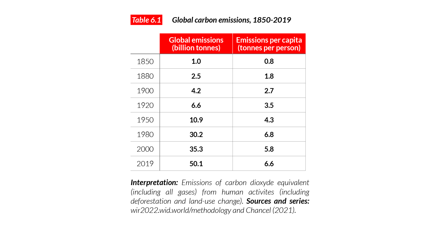
Global emissions per capita rose from 0.8 tonnes of CO2 per annum in 1850, 2.7 tonnes in 1900, 4.3 tonnes in 1950, and 6.8 tonnes in 1980s, before dropping to 5.8 in 2000 and rising again to 6.6 tonnes today (Table 6.1). The reduction observed between 1975 and 1980 was the result of a combination of factors, including global population growth (population increased faster in regions where emissions were below the global average), and some improvement in energy efficiency following the oil crises of the 1970s.
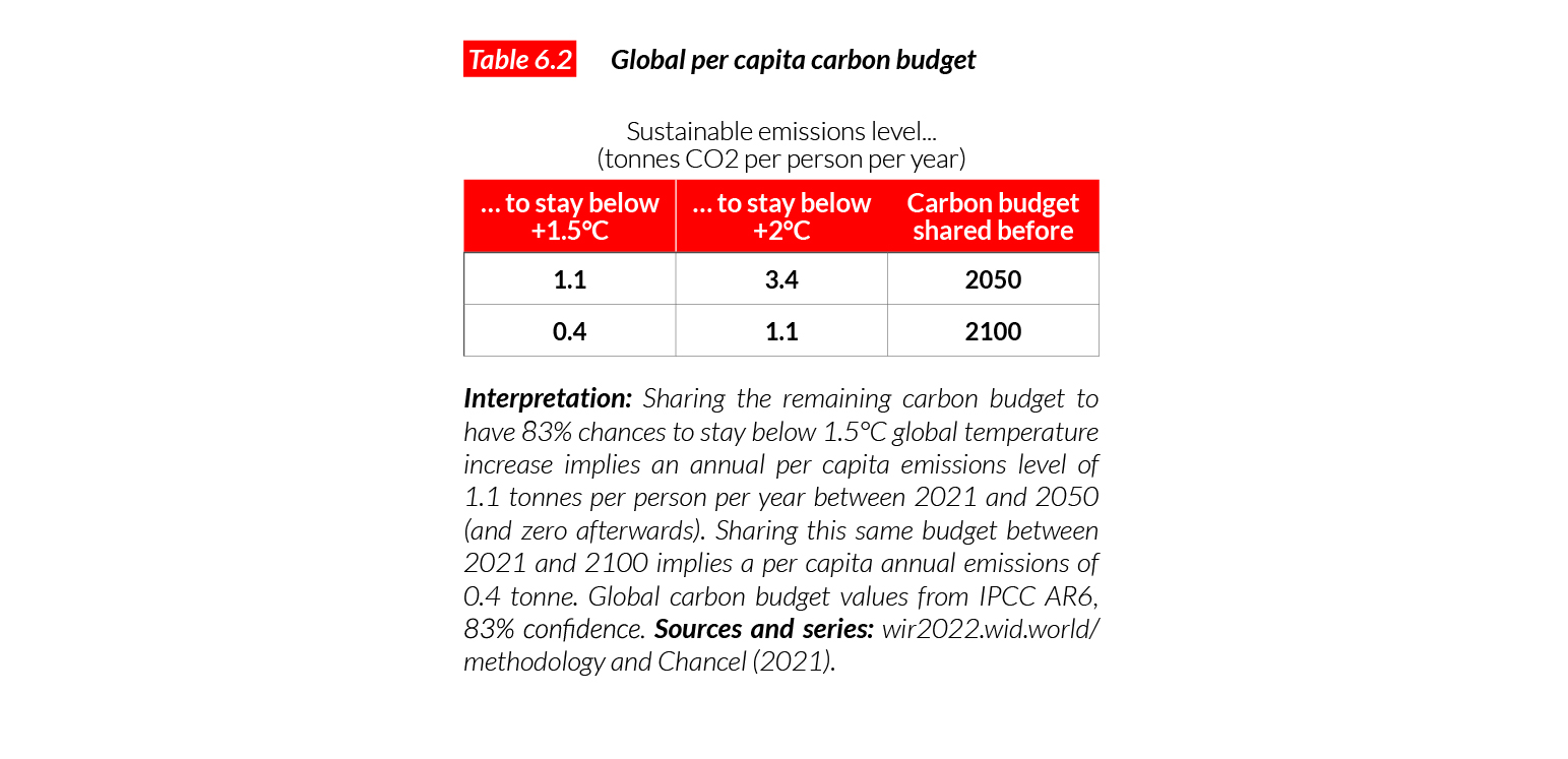
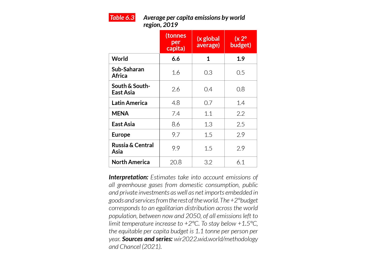
To understand better the size of the carbon mitigation challenge, we begin by comparing current emissions levels with level of emissions required to stay below an average global warming of 1.5°C and 2°C8. The Paris Climate Agreement seeks to stay at a level of warming well below 2°C. Table 6.2 presents the sustainable per capita global carbon budget, i.e. the volume of emissions per individual living between now and 2050 were all remaining CO2 emissions shared equally over the period.
To obtain these numbers, we simply divide the remaining carbon emissions budget by the cumulative global population that will be emitting it over the coming decades. According to the United Nations, there will be 265 billion individual-years between now and 2050. This implies a sustainable per capita budget, compatible with the +2°C temperature limit, of 3.4 tonnes per person per annum between now and 2050. This value is about half of the current global average. The per capita sustainable budget compatible with the 1.5°C limit is 1.1 tonne of CO2 per annum per person, i.e. about six times less than the current global average9. We stress at the onset that these numbers are derived for comparative purposes and should be interpreted with care. These values do not take into account historical responsibilities associated with climate change. Taking historical responsibilities into account implies that high-income nations have no carbon budget left10. Let us also note that scenarios consistent with the 2°C target show that overall emissions must decrease progressively to reach zero in 2050 – and cannot be maintained at a certain high level until this date then suddenly drop to zero.
Carbon inequalities between regions are large and persistent
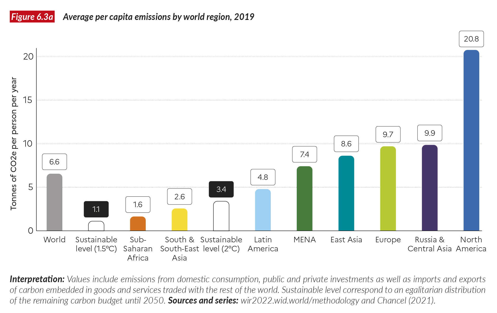
Figure 6.3a shows average emissions per capita for world regions, and Table 6.3 expresses these values as a percentage of the world average. Per capita emissions in Sub-Saharan Africa (1.6 tonnes per person per annum) represent just one quarter of the average global per capita emissions. Thus, average emissions in Sub-Saharan Africa are close to 50% above the 1.5°C sustainable level and about half of the 2°C budget. At the other end of the spectrum, per capita emissions in North America are 21 tonnes per capita (three times the world average and six times higher than the 2°C sustainable level). In between these two extremes stand South and South-East Asia, at 2.6 tonnes per capita (40% of the current world average and 80% of the 2°C budget) and Latin America at 4.8 tonnes (70% of world average, 1.4 times the 2°C budget), followed by MENA, East Asia, Europe, and Russia and Central Asia, whose averages fall in the 7.5-10 tonnes range (between one and 1.5 times the world average, and two to three times more than the 2°C sustainable level). Figure 6.3b compares historical emissions with current emissions of regional populations. The graph reveals that, while carbon inequalities between regions have declined recently (though China’s share in current global emissions is significantly higher than its historical share), inequalities persist and are even more striking when compared with the population share of each region.
Inequalities in average carbon emissions between regions are quite close to the inequality in average incomes between regions (see Figure 1.2a), but with notable differences: US average emissions are 3.2 times the world average, while its average income is three times the world average, and Europe’s emissions are less than 1.5 times the world average while the income figure is close to two. There is a close link between per capita income and emissions, but this link is not perfect: certain regions are more effective than others in limiting emissions associated with a given level of income.
Emissions embedded in goods and services increase carbon inequalities between regions
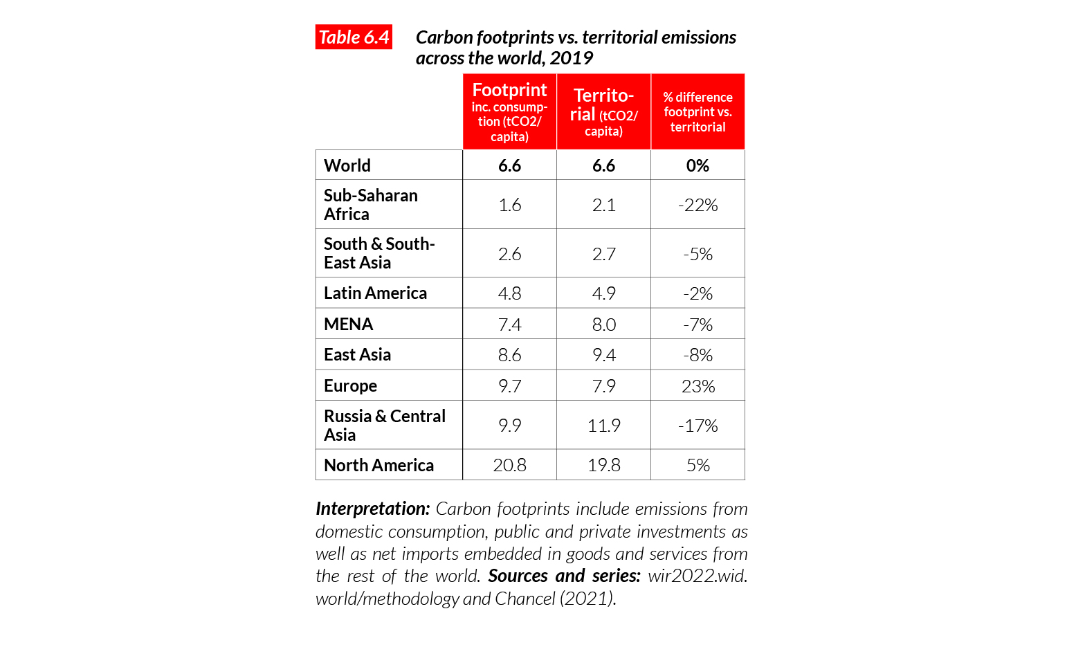
The emission levels cited above include emissions produced within a country as well as those associated with the import of goods and services from the rest of the world. Put differently, when North Americans import smartphones from East Asia, carbon emissions created in the production, transport and sale of those smartphones are attributed to North Americans and not to East Asians. This is the best way to measure emissions associated with the standard of living of individuals across the world. In this report, we refer to these emissions as “carbon footprints” rather than “territorial emissions”, which correspond only to carbon emissions within territorial boundaries, and do not take into account imports and exports of carbon embedded in goods and services. Territorial emissions continue to be used by authorities around the globe when they report progress on emissions reduction or when they discuss international climate agreements. But referring only to territorial emissions obviously presents many problems: high-income countries can reduce their territorial emissions and develop ecological dumping strategies to externalize their carbon-intensive industries to the rest of the world, then import back goods and services produced elsewhere. Factoring in the carbon embedded in goods and services adds the climate change mitigation efforts of high-income countries, in particular in Europe where imports represent a notable share of per capita emissions.
Table 6.4 shows the differences between carbon footprints and territorial emissions by region. In North America, the difference between footprints and territorial emissions expressed in percentage points is relatively low, because Americans import but also export carbon-intensive goods, and they consume very significant quantities of carbon at home. In Europe, the carbon footprint is about 25% higher than territorial emissions. Nearly two tonnes of carbon per person are imported from other regions of the world, largely China. In East Asia, carbon emissions are 8% lower than territorial emissions: nearly one tonne of carbon per person is produced in East Asia to satisfy the needs of individuals in other parts of the world. Factoring in the carbon that is embedded in the consumption of goods and services increases the inequality between high and middle to low income regions, compared with when we count territorial emissions only.
Carbon inequalities within regions are even larger than carbon inequalities between them
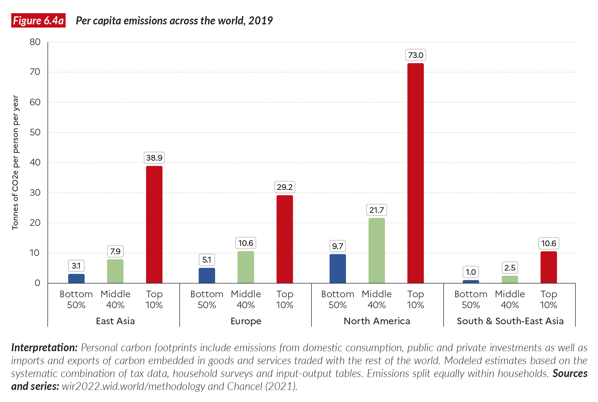
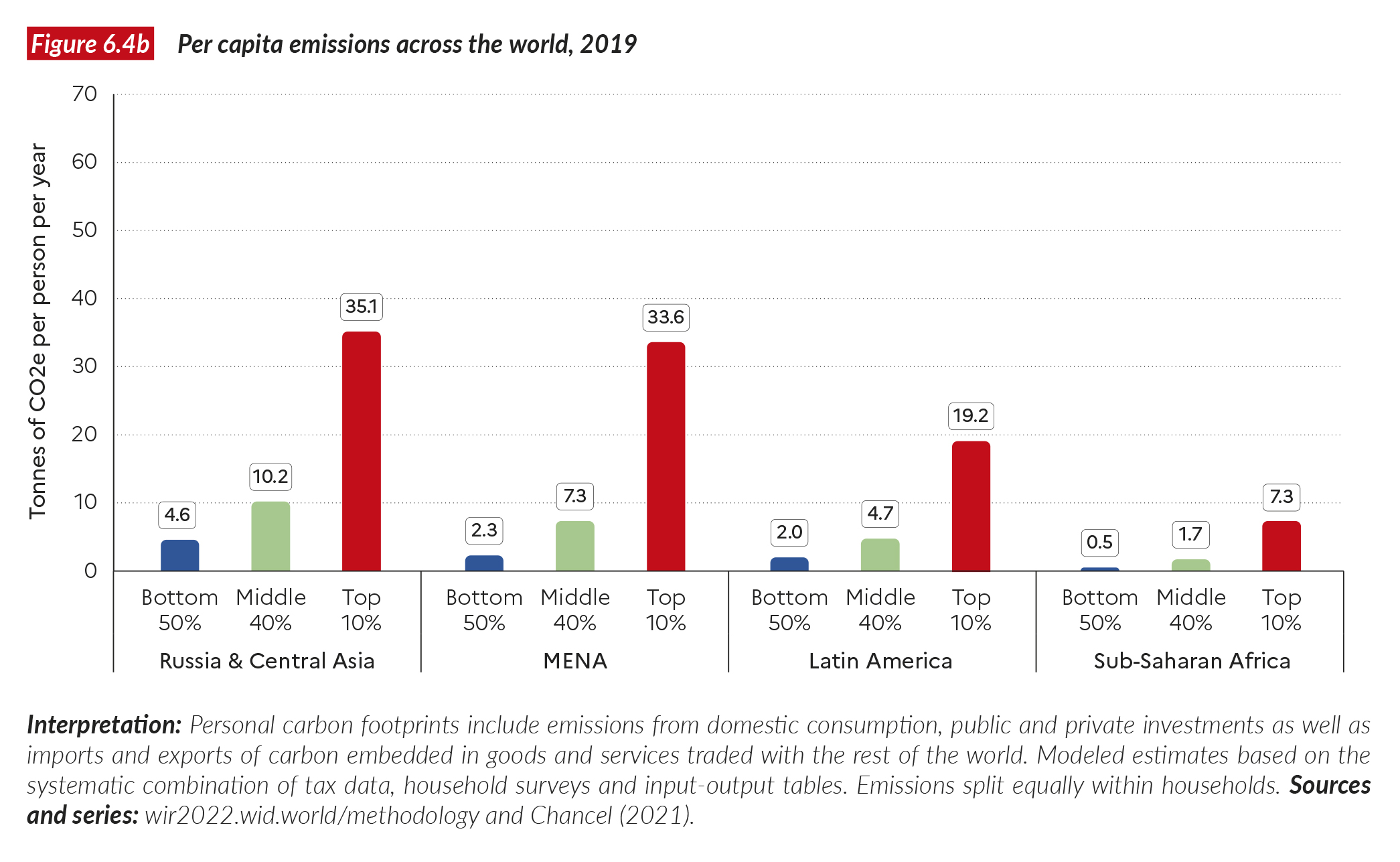
Significant inequalities in carbon footprints are observed in every region of the world. Figures 6.4a and 6.4b present the carbon footprints of the poorest 50%, the middle 40% and the richest 10% of the population across the regions. In East Asia, the poorest 50% emit on average around three tonnes per annum, while the middle 40% emit nearly eight tonnes, and the top 10% almost 40 tonnes. This contrasts sharply with North America, where the bottom 50% emit fewer than 10 tonnes, the middle 40% around 22 tonnes, and the top 10% over 70 tonnes of carbon dioxide equivalent. This in turn can be contrasted with the emissions in Europe, where the bottom 50% emit nearly five tonnes, the middle 40% around 10.5 tonnes, and the top 10% around 30 tonnes. Emissions levels in South and South-East Asia are significantly lower, from one tonne for the bottom 50% to fewer than 11 tonnes on average for the top 10%.
It is striking that the poorest half of the population in the US has emission levels comparable with the European middle 40%, despite being almost twice as poor11. This difference is largely due to the carbon-intensive energy mix in the US, where emissions from electricity are about twice as much as in the European Union. In the US, basic infrastructure consumes much more energy (because of the more widespread use of cars, for example), and devices tend to be less energy efficient (on average, cars are larger and less fuel efficient in the US than in Europe).
Nevertheless, European emissions remain very high by global standards. The European middle class emits significantly more than its counterparts in East Asia (around 10.5 tonnes compared with eight tonnes) and all other regions except North America. Yet it is also remarkable that the richest East Asians and the richest 10% in MENA emit more than the richest Europeans (39 tonnes, 34 tonnes, and 29 tonnes, respectively). This difference results from the higher income and wealth inequality levels in East Asia and the MENA region than in Europe, and to the fact that investments by wealthy Chinese are associated with significant volumes of emissions.
Turning to other regions, we find that Russia and Central Asia have an emissions profile close to that of Europe, but with higher top 10% emissions. Sub-Saharan Africa lags behind, with the bottom 50% emissions around 0.5 tonnes and top 10% emissions around 7 tonnes per person per annum. Overall, it stands out that only the poorest 50% of the population in Sub-Saharan Africa and South and South-East Asia come in under the 1.5°C per capita budget. Measuring levels against the 2°C per capita budget, we observe that the bottom half of the population in each region is below or close to the threshold. In fact, it is striking that the bottom 50% in high and middle income regions such as Europe, and Russia and Central Asia emit levels that fall within the 2°C budget. This shows that climate mitigation is largely a distributional issue, not only between countries but also within them.
Global carbon emissions inequality: one tenth of the population is responsible for close to half of all emissions
Figures 6.5a and 6.5b present the inequality of carbon emissions between individuals at the world level, in the same way as we have done in the previous chapters when looking at income or wealth. The global bottom 50% emit on average 1.6 tonnes per annum and contribute 12% of the total. The middle 40% emit 6.6 tonnes on average, making up 40.4% of the total. The top 10% emit 31 tonnes (47.6% of the total).
The top 1% emits 110 tonnes (16.8% of the total). Global carbon emissions inequality thus appears to be very great: close to half of all emissions are due to one tenth of the global population, and just one hundredth of the world population (77 million individuals) emits about 50% more than the entire bottom half of the population (3.8 billion individuals).
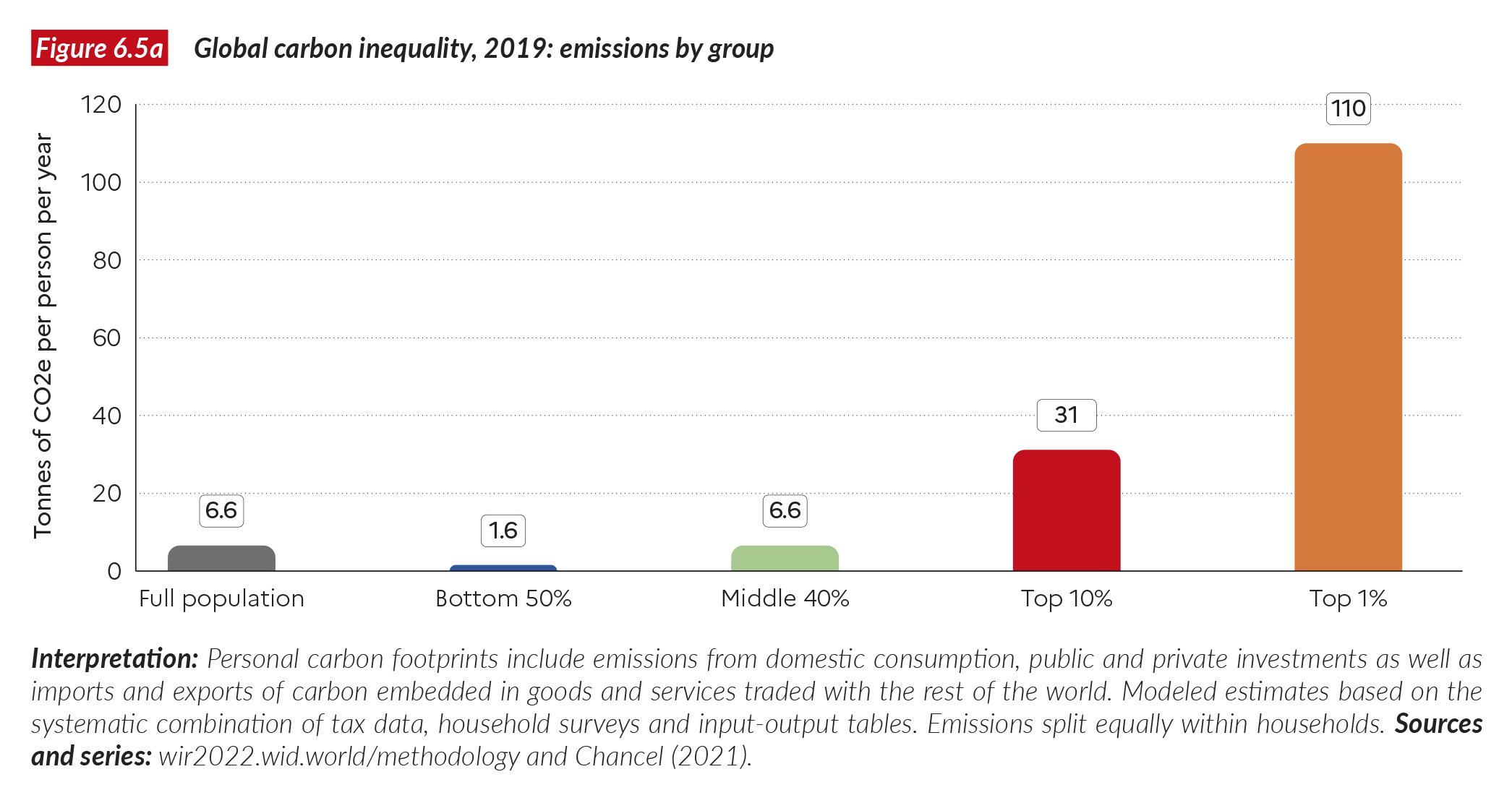
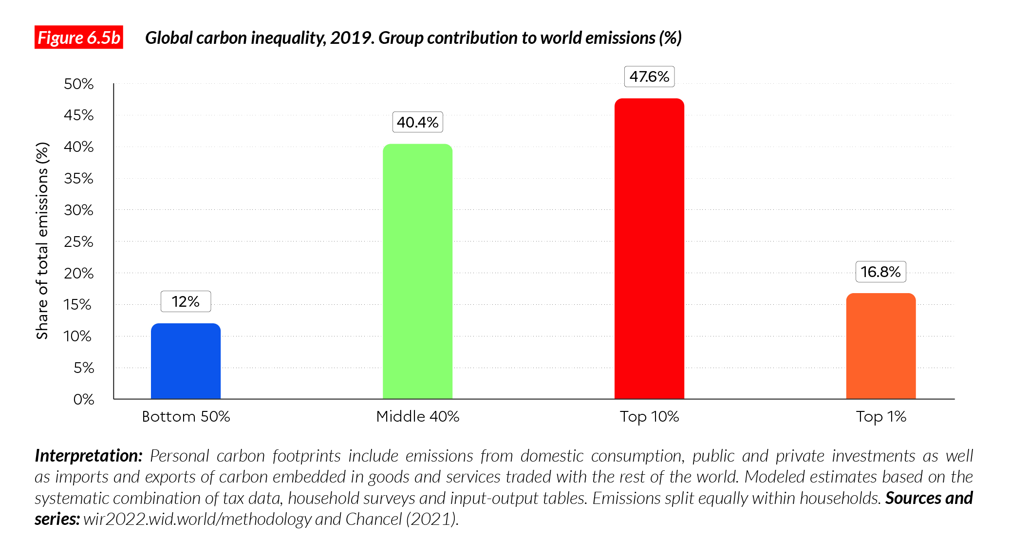
Table 6.5 presents more details on the global distribution of carbon emissions. The bottom 20% of the world population (1.5 billion individuals) emit fewer than 0.8 tonnes per capita per annum. In fact, about one billion individuals emit less than a tonne per capita.
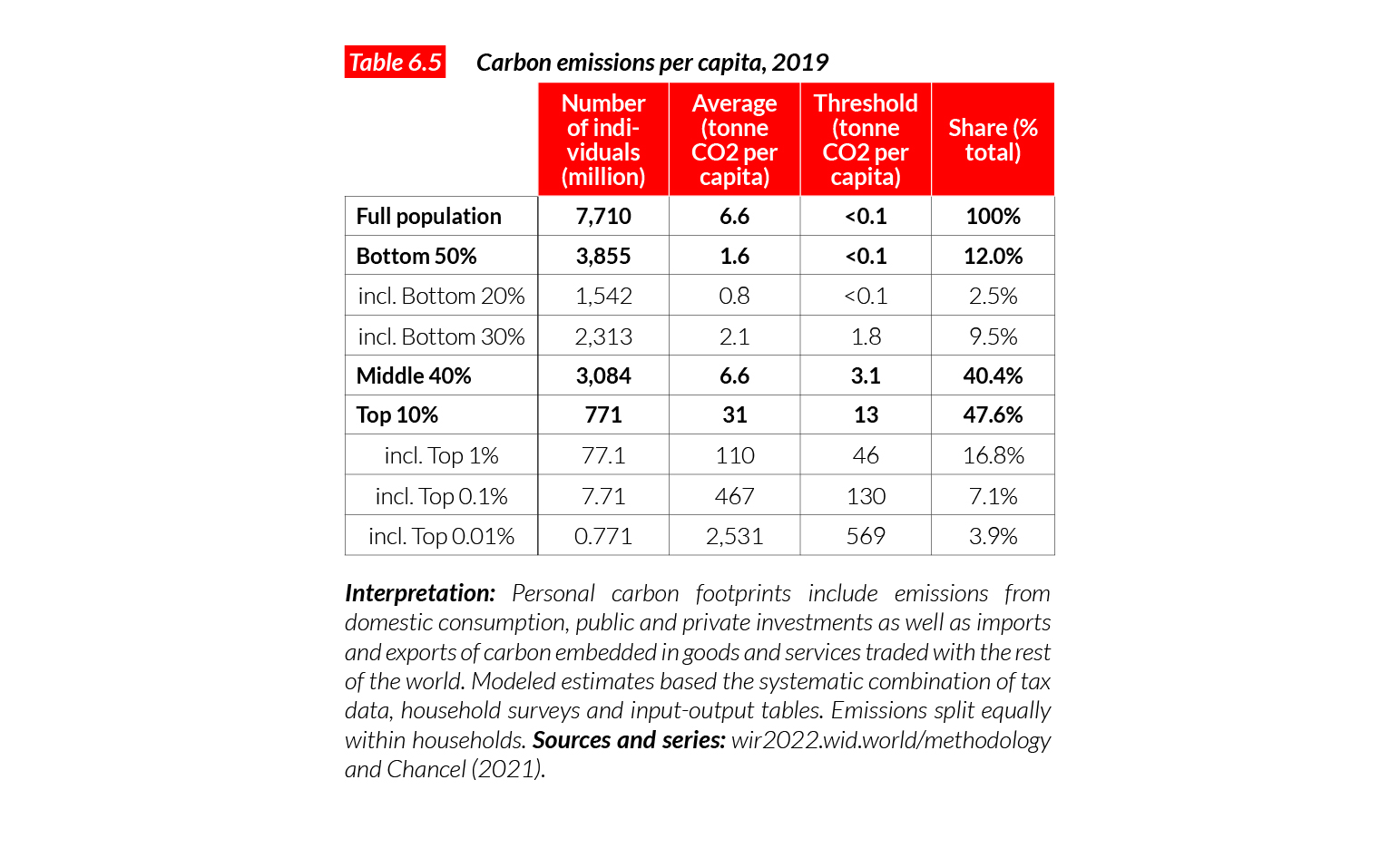
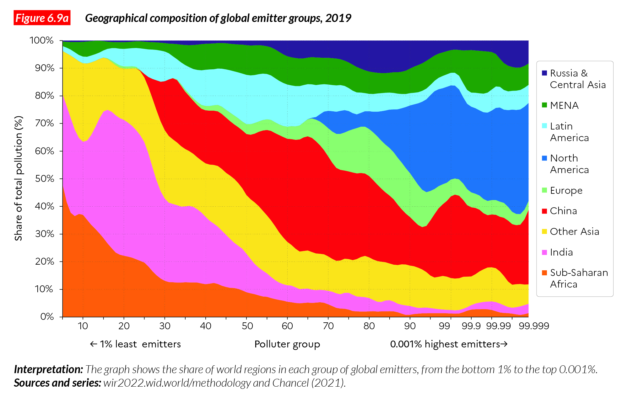
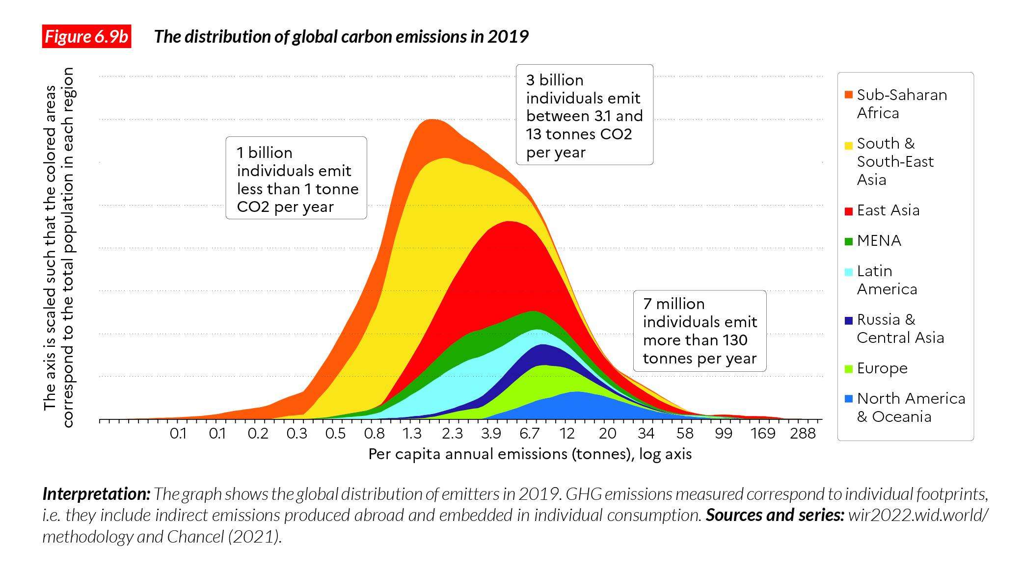
The entry threshold to get in the middle 40% is 3.1 tonnes, and it takes 13 tonnes per capita per annum to get in the top 10%. It takes 130 tonnes to break into the global top 0.1% group of emitters (7.7 million individuals). (Figures 6.9a and 6.9b, discussed below, show how each world region contributes to these different groups of emitters.)
Per capita emissions have risen substantially among the global top 1% since 1990 but decreased for poorer groups in rich countries
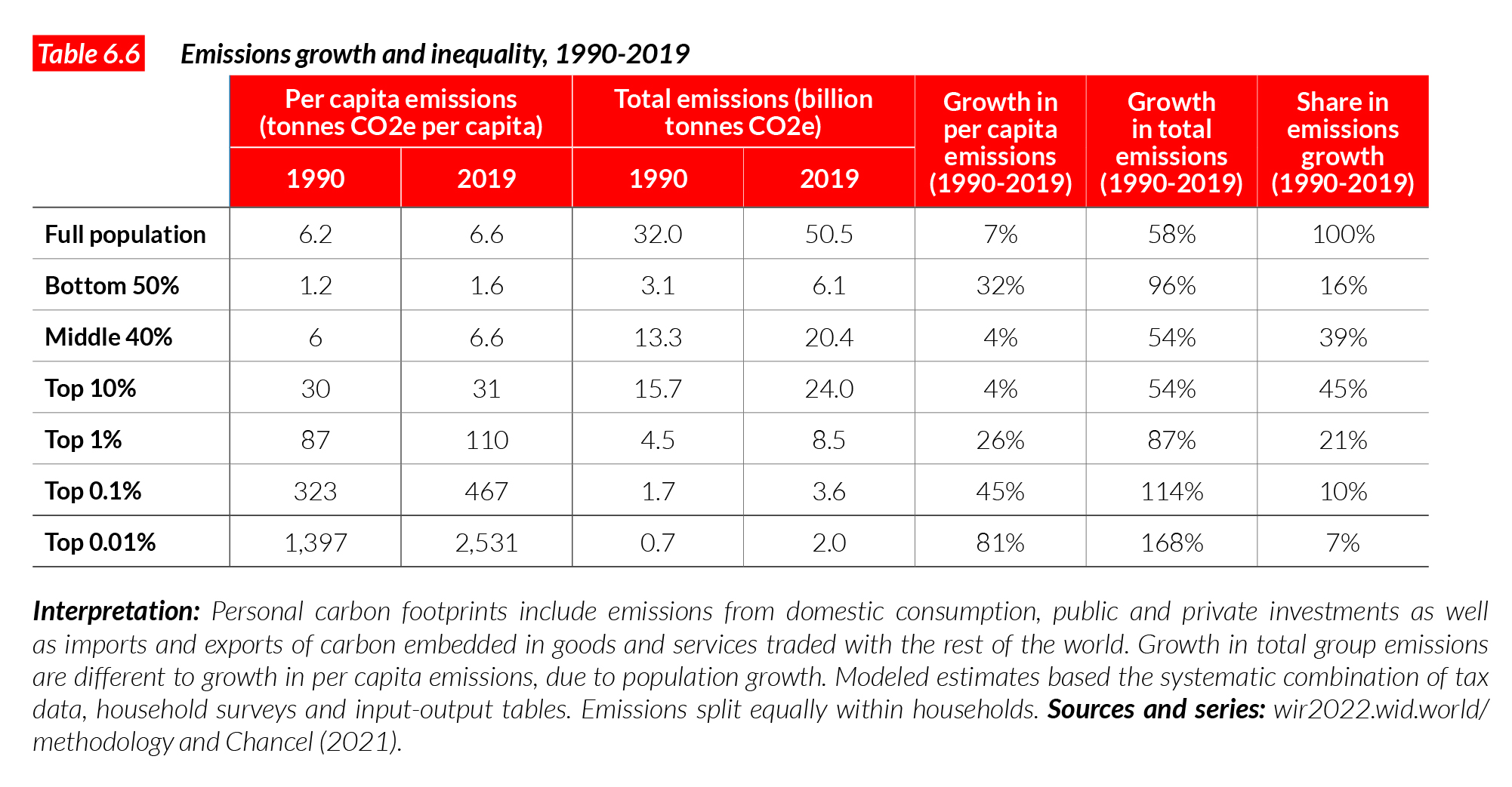
How has global emissions inequality changed over the past few decades? A simple way to represent the evolution of carbon emissions inequality is to plot average emissions growth rate by percentile of the global emissions distribution, in the same way as we did in Chapter 2. Global polluters earners are ranked from the least emitters to the highest emitters on the horizontal axis of Figure 6.6, and their per capita emissions growth rate is presented on the vertical axis. Since 1990, average global emissions per capita grew by about 7% (and overall emissions grew by 58%). The per capita emissions of the bottom 50% grew faster than the average (32%), while those of the middle 40% as a whole grew more slowly than the average (4%), and some percentiles of the distribution actually saw a reduction in their emissions of between five and 25%. Per capita emissions of the top 1% emissions grew by 26% and top 0.001% emissions by more than 110%.
Per capita emissions matter, but understanding the contribution of each group to the overall share of total emissions growth is critical. Groups starting with very low per capita emissions levels can increase their emissions substantially over a given period, yet still contribute very little to the overall growth in global emissions. This is in effect what has happened since 1990 (see Table 6.6, last column). The bottom half of the global population contributed only 16% of the growth in emissions observed since then, while the top 1% (77 million individuals) was responsible for 21% of emissions growth. These values are reported in the two boxes of Figure 6.6.
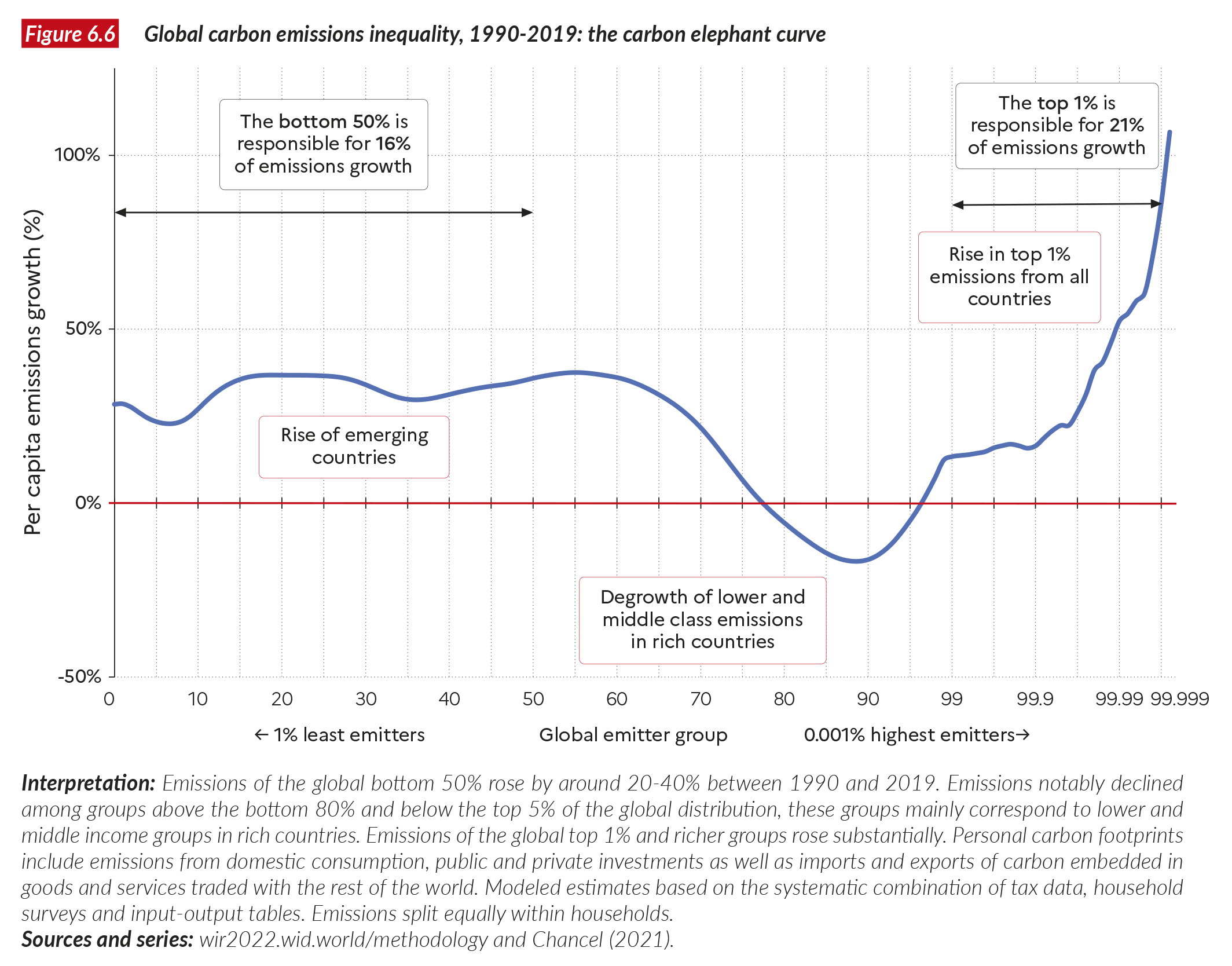
One of the most striking results shown in Figure 6.6 is the reduction in the emissions of about 15-20% of the world population, which largely corresponds to the lower and middle income groups of the rich countries. In these countries, the working and middle classes have reduced their emissions over the past 30 years. To be sure, these reductions are insufficient to meet the goals of the Paris Climate Agreement to limit global warming to 1.5°C or 2°C, but they contrast nevertheless with the emissions of the top 1% in these countries (and at the global level), which have significantly increased. Such a gap in carbon mitigation efforts between the rich and the less well-off in rich countries raises important questions about climate policies. In societies where the standards of living of the wealthy also shape the emissions of other social groups, this can have consequences for future emissions patterns. These dynamics also fuel criticisms of environmental policies such as carbon taxes, which have been shown to affect working and middle classes disproportionately in several countries (more on this below).
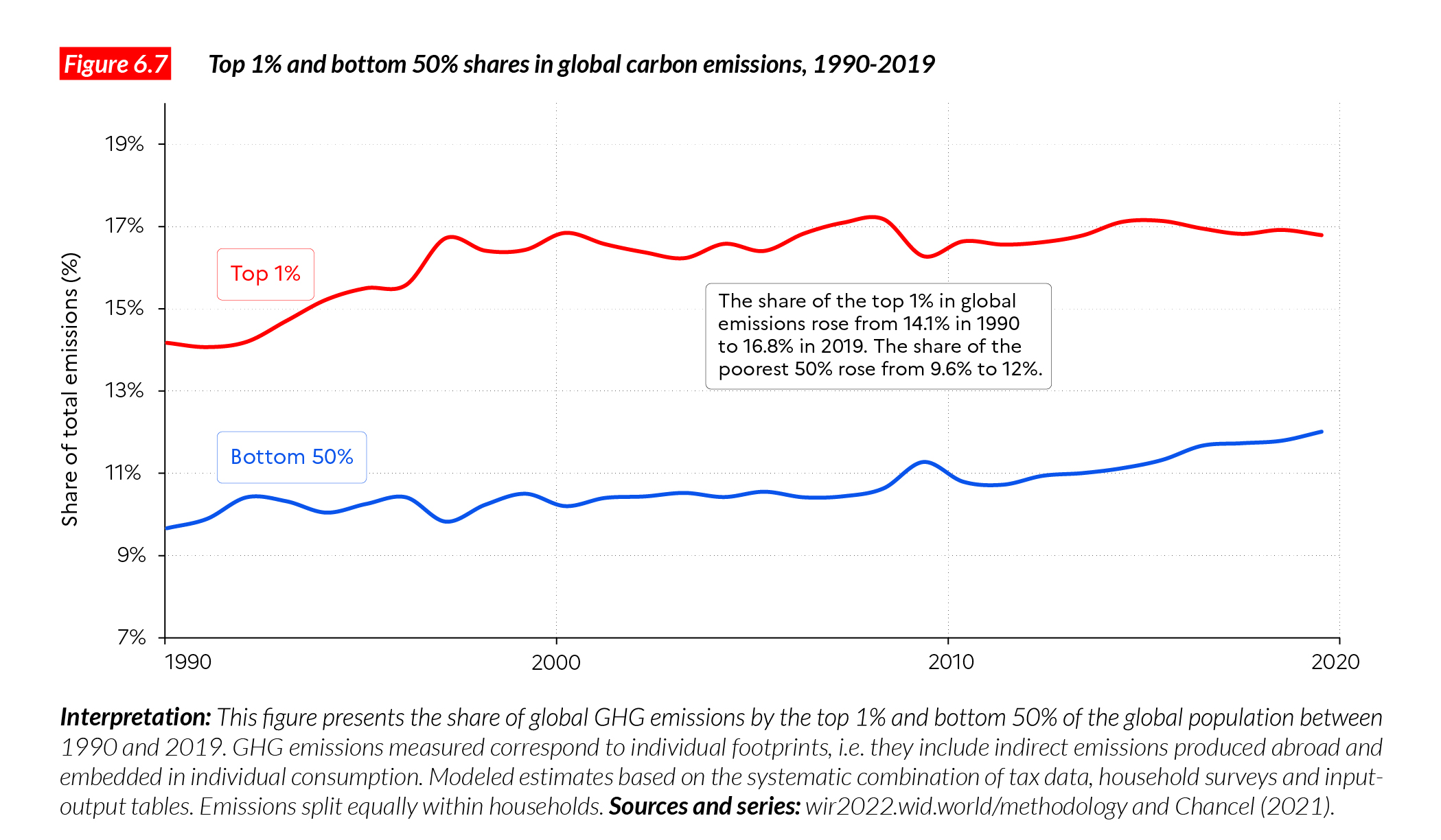
Figure 6.7 presents the evolution of the top 1% and the bottom 50% shares in total emissions between 1990 and 2019. Between 1990 and 2019, the global bottom 50% increased its share of the total, from around 9.5% to 12%, but at the same time, the top 1% share rose from 14% to close to 17%. Put differently, the gap in emissions between the top of the distribution and the bottom remained substantial over the entire period.
Inequalities within countries now represent the bulk of global emissions inequality
What has been driving the dynamics of global carbon inequality over the past decades: the average emission differential between countries, or within them?
Figure 6.8 compares the share of global emissions that is due to within-country differences with the between-country differences. In 1990, most global carbon inequality (63%) was due to differences between countries: then, the average citizen of a rich country polluted unequivocally more than the rest of the world’s citizens, and social inequalities within countries were on average lower across the globe than today. The situation has almost entirely reversed in 30 years. Within-country emissions inequalities now account for nearly two thirds of global emissions inequality. This does not mean that there do not remain significant (often huge) inequalities in emissions between countries and world regions (see Figure 6.3a), on the contrary. In fact, it means that on top of the great between-countries inequality in carbon emissions, there also exist even greater inequalities in emissions between individuals. This has major implications for global debate on climate policies.
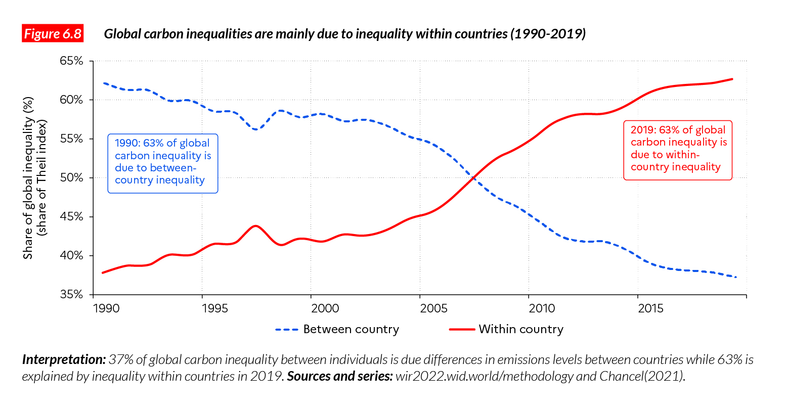
Figure 6.9a shows the geographical breakdown of each group of emitters. More precisely, the graph tells us about the share of population of each region in each percentile of the global carbon distribution. It shows, for example, that China, Latin America, and MENA are well represented among the low emitters as well as among the high emitter groups. This reflects the dual nature of these societies, where extreme polluters live close to very low polluters. Europe and North America are essentially represented in the top half of the global distribution (right hand side of the graph). The representation gap between Europe and North America among the very top of the distribution is clear in this graph, as is the large representation of Chinese among the highest polluters.
Figure 6.9b provides another representation of the global carbon distribution. Each color wedge is proportional to the population of a region, and the total colored area represents the global population. The graph summarizes the main insights into the global distribution of carbon emissions presented above.
Addressing the climate challenge in unequal societies
Social movements in rich and emerging countries in 2018-2019 (including waves of protests against hikes in fuel and transport prices in Ecuador or Chile in 2019, and the Yellow Vest movements in Europe one year earlier) showed that policy reforms which do not properly factor in the degree of inequality in a country, and the winners and losers of these reforms, are unlikely to be publicly supported and are likely to fail.
This is particularly so for environmental policies. A clear illustration of this is the so- called Yellow Vest movement in France. In 2018, the French government implemented a hike in the carbon tax (which projected about 4 billion euros in additional carbon tax revenues). While the tax was presented as a way of reducing carbon emissions, it was not accompanied by significant compensatory measures for low and middle income households.
The reform was introduced at the same time as a suppression of the progressive wealth tax on financial assets and capital incomes (which would create around 3-4 billion euros of tax cuts, essentially concentrated among the top 1-2% of the wealth distribution). This reform was immediately opposed by the majority of the population. Many low and middle income households had to pay the carbon tax every day in order to go to work, having no alternative to using their cars, while tax cuts were given to the very rich, living in cities, with low-carbon transport options, who also benefit from very low energy tax rates when they travel by plane. This situation triggered a wave of social protests (which eventually spread to other European countries) and eventually led to the abandonment of the carbon tax.
In principle, a carbon tax can be a powerful tool to reduce emissions. In some countries, it has been implemented successfully and has contributed to limiting carbon emissions. However, the French example shows that when carbon policies are improperly designed and do not consider the socio-economic context in which they are implemented, they can easily fail and generate mistrust, making environmental policies look unfair. Let us be clear: the scale of transformation required to cut greenhouse gas emissions drastically in rich countries cannot be attained if environmental and social inequalities are not integrated into the very design of environmental policies. We discuss options to properly address carbon inequalities within and between countries below.
The first way to address carbon inequality is to properly track individual emissions within countries. Most governments do not publish aggregate carbon footprint estimates (they publish territorial emissions but, as discussed earlier, this is not sufficient to assess the actual environmental impact of policies). Governments also fail to properly track and publish estimates of the inequality in carbon footprints, meaning they that cannot properly foresee the distributional consequences of their climate policies. The estimates presented in this chapter provide a sound basis for these discussions to take place. But let us be clear: a lot of progress still needs to be done by governments in order to properly account individual emissions levels, in a timely and systematic manner.
Figures 6.10abcd present our best estimates of the carbon emissions of different population groups in the US, India, China, and France. The figures also present countries’ climate targets for 2030. These countries are chosen as representatives of a wider set of countries (the US for Canada, Australia, and New Zealand, which have similar carbon inequality levels), France for European countries, and India and China for low income and emerging countries12.
The carbon emission commitments displayed in Figures 6.10abcd are the pledges that states made at the Paris Agreement (or have made since then)13. Pledges are typically expressed in aggregate emissions percentage reductions from a base year. Using population growth forecasts, these pledges can be expressed in terms of emissions per capita at a certain time, to make better sense of what they imply. In emerging countries (India and China, for example), targets are set on the basis of the carbon intensity of GDP. In these cases, it is possible to estimate the actual number of aggregate emissions implied by an estimated GDP level to be reached in 2030, and to express this number in per capita values, as is done in Figures 6.10abcd.
Note that these targets do not represent what should be done from a climate perspective in order to keep emissions below 1.5 or 2°C. So far, the official commitments do not add up to meeting the 2°C objective, much less to meeting the 1.5°C target. Rather, these numbers represent our best knowledge of what countries have pledged to achieve. In the US, we find that pledges amount to a 53% reduction by 2030 of the late 2019 per capita emissions (which are close to mid-2021 emissions levels). In France, the pledge amounts to a 45% reduction. In India, emissions per capita are projected to increase by 70% between now and 2030, and also in China, by 25%.
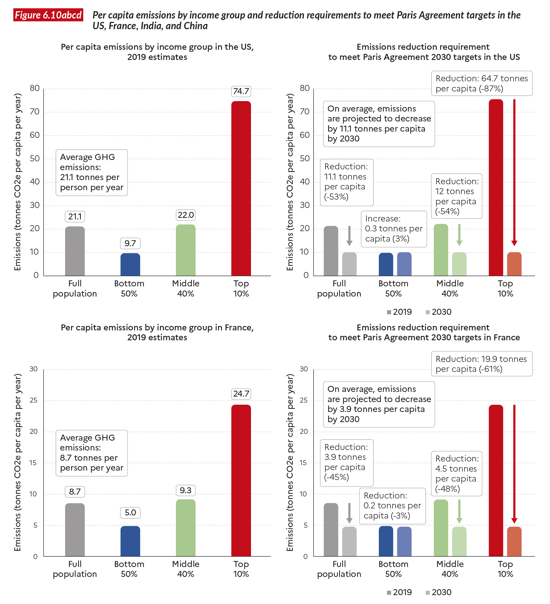
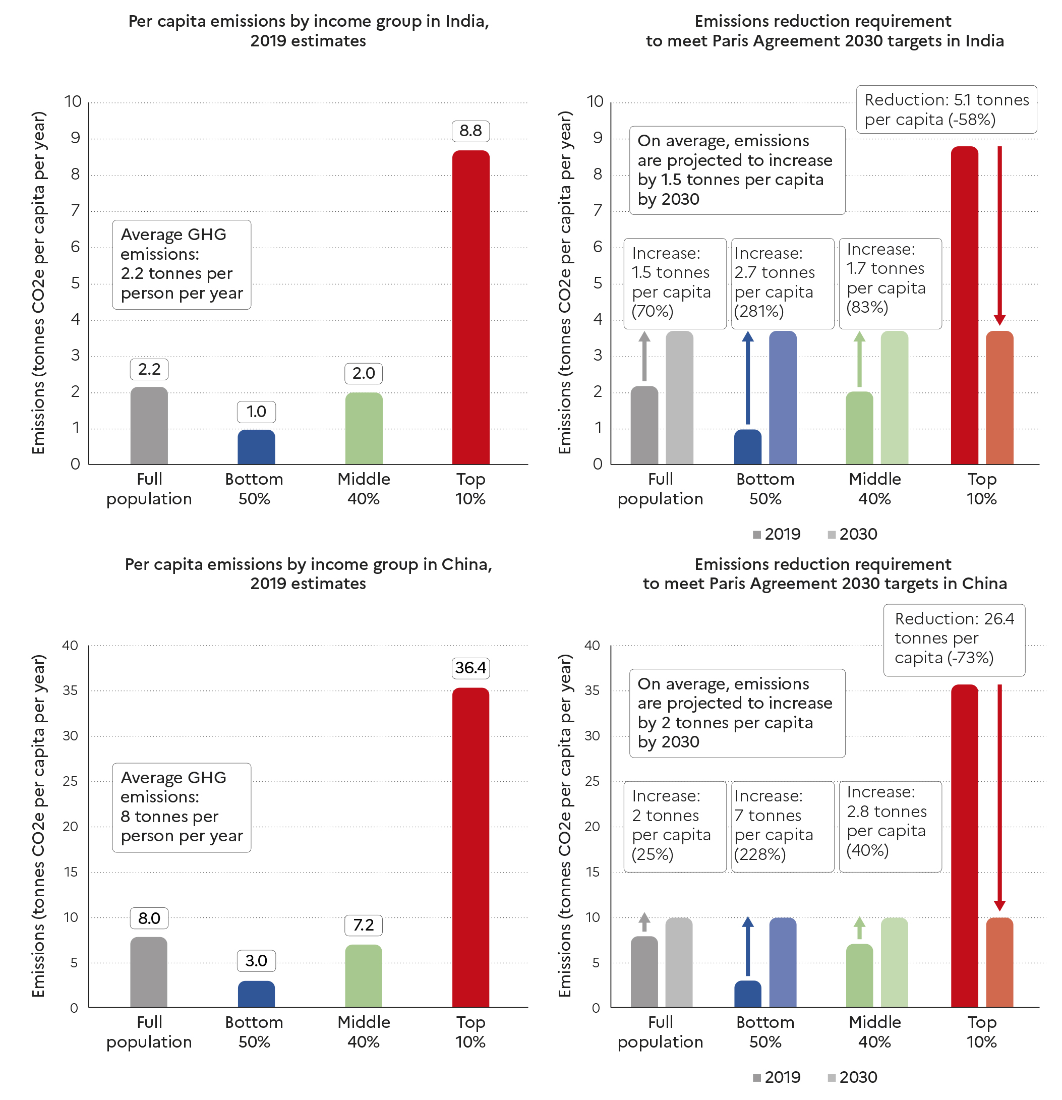
The bottom half of the population in rich countries already nears 2030 targets
Two main results stand out from these figures. First, in rich countries, the bottom 50% is already below the 2030 per capita target (in the US, for example), or very close to it (France). It follows that all emissions reductions efforts are to be made by the top half of the distribution. In the US, the top 10% must cut its emissions by close to 90% in order to reach the 2030 per capita target, and the middle 40% by around 50%. The degree of efforts required from the top 10% and middle 40% in France is similar.
Second, it appears that in emerging countries, not all groups should increase their emissions levels. While the bottom and middle of the distribution are currently below the 2030 target, the top 10% is significantly above it. Indeed, in China, the top 10% must cut its emissions by more than 70% to meet the sustainable target. The value is also significant in India (-58%).
A new approach to climate policymaking
There are many ways to meet the 2030 pledges and there is no single ready-made solution or magic formula to implement just carbon policies. What is paramount is to factor in the large levels of carbon inequalities in the design of climate policy. As a matter of fact, different types of policy instruments (whether regulations, taxes, incentives or investments) have different types of impacts on socio-economic groups.
One of the key conclusions of this chapter is that if countries wish to deviate from the egalitarian perspective presented above (e.g. by demanding relatively less emissions reduction efforts from richer groups), then this will inevitably mean demanding more reductions from low income groups, who have fewer resources to reduce their own carbon footprints. Such strategies raise the question of financial compensation mechanisms for low-income groups and of the just financing of these efforts.
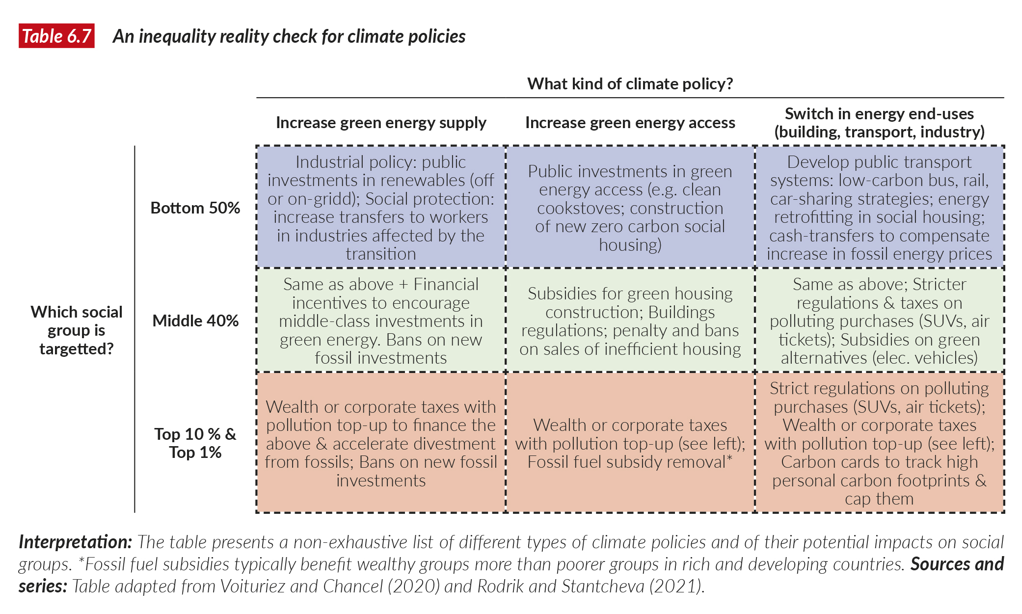
Table 6.7 presents a schematic framework of climate policies and their potential impacts on different types of the distribution of income (bottom, middle and top income groups)14. Climate policies are broken down into three categories: decarbonizing energy supply, decarbonizing energy access, decarbonizing existing energy end-uses (such as existing transport systems). The table is non-exhaustive and illustrates the variety of climate-energy policies available for policymakers and the set of possible impacts on different social groups. We argue that an inequality reality check of climate policies should become center stage of climate policy-making.
Examples of climate policies that effectively address inequality exist across the world. In British Columbia (Canada), a carbon tax was implemented along with a significant package of transfers to low- and middle- income households, which ensured the social viability of the reform15. In Indonesia, energy subsidies reforms were coupled with substantial investments in the public health system, largely financed by increased revenues from energy taxes. In Sweden, decades of large-scale public investments in low-carbon infrastructure made it possible for low-income groups to access affordable, clean energy sources. When a carbon tax was eventually introduced, low-income groups had the choice between greener and fossil options16.
One dimension which has been largely left aside by climate policies around the globe is addressing the large carbon footprints of the very wealthy. Given the huge responsibility of wealthy groups in overall emissions levels (within countries and at the global level), this lack of focus is questionable. So far, the standard way to think about carbon taxationhasbeeninthecontextofuniform tax rate across individuals, i.e. whether rich or poor, individuals should pay the same carbon tax rate. In unequal societies, this de facto means giving more polluting rights to wealthy individuals, who are less affected by an increase in carbon prices than low- income individuals. To accelerate carbon emissions reductions among the wealthiest, progressive carbon taxes can become a useful instrument. Progressive carbon taxation means that the rate of a carbon tax increases with the level of emissions or the level of wealth of individuals. Chancel and Piketty made proposals along these lines, and also proposed specific taxes on luxury carbon-intensive consumption items17. These can include business class tickets, yachts, etc. Indeed, progressive carbon taxes cannot suffice: stricter regulations (i.e. bans) on the consumption of expensive carbon goods or services should also be implemented: for example on the purchase of SUVs.
Shifting the focus from consumers to asset owners
Finally, we argue that climate policy instruments focusing on the regulation and taxation of asset portfolio (rather than on the consumption of goods and services) should deserve more attention. Carbon consumers, especially from low and middle income groups are often constrained in their energy choices, because they are locked-in carbon intensive infrastructures systems. On the contrary, investors who opt for investments in fossil industries do so while they have many alternative options to invest their wealth in. Therefore, the purchase of stock in fossil companies which continue to develop new extraction projects, should be highly regulated. Such moves can be accompanied, for a short period of time (before effective bans), by steeply progressive tax rates on polluting stock ownership.
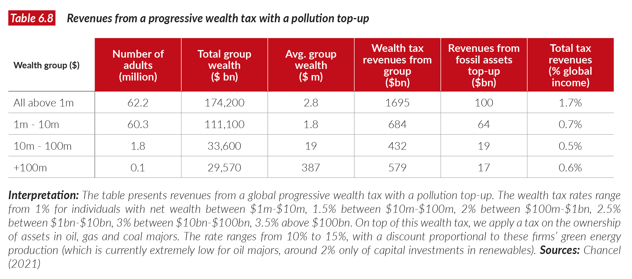
In Table 6.8, we provide estimates of a global progressive wealth tax on global multimillionaires, including a pollution top- up. Revenue estimates are based on those presented in Chapter 7, and include an additional tax component, based on the ownership of stock in the world’s leading oil and gas majors. A discount is applied when fossil fuel companies invest in renewable energy. If companies shifted all their operations to renewable energy supply, then their shareholders would not face the pollution wealth tax top-up anymore. Currently, though, this is far from being the case: only 2% of oil major investments are made in renewable energy activities18. Radical investment decision changes would therefore need to be made in order to avoid the wealth tax pollution top-up.
Applying a 10% tax rate on the value of carbon assets owned by global multimillionaires would generate at least $100bn in a year. This value is non-negligeable: it represents about 1.5 times the current estimated annual costs of adaptation to global warming in developing countries (about $70bn per year in 2020). Yet, compared to current additional investment requirement sin energy systems globally,this value remains small. It is estimated that 2% of GDP in additional annual investments are required (i.e. about $2,000bn). As a matter of fact, the very large additional investments in infrastructures required to meet the energy transition challenge needs considerable new sources of financing and these will hardly be met by taxes on highly polluting assets alone. Progressive taxes based on both carbon and non-carbon assets will be essential instruments to ensure that sufficient amounts of investments are made, in a timely manner by governments. In Chapter 7, we present different progressive wealth tax strategies to raise several percentage points of global GDP from global multimillionaires.
Box 6.1 Measuring carbon inequality between individuals
Measuring carbon inequality between individuals across the globe is an even more challenging task than measuring it for income and wealth. In this report, our emissions estimates are based on observed national carbon footprints across different sectors of the economy, inequalities in private consumption, wealth inequality, and levels of government spending. The novelty of our approach is to combine systematically the new data sets on global income and wealth inequality produced by the WID. world project with international carbon data series, known as environment input–output tables19.
Environmental input–output (IO) tables are based on the pioneering work of Nobel prize winner Wassily Leontief, who systematized the work of one of the first economists of the 18th century, François Quesnay, and extended it, to study the relationship between production and the consumption of environmental inputs20. Environmental IO tables make it possible to measure the carbon content associated with the production of an economic sector, taking into account all the emissions used in the intermediary production process of the goods produced by this sector. Intermediary emissions include both those made on a territory and those made abroad by foreign suppliers. This is particularly useful for measuring carbon footprints rather than only territorial emissions (see above). The strength of Environmental IO methodology is also its systematicity: it ensures that one tonne of carbon used in the production of a good is never counted twice. The problem of double counting arises in other methods of measuring carbon footprints, known as Life Cycle Analyses, which allow more detailed estimates for a specific product, but cannot provide systematic and coherent macro-level statistics. The two approaches are complementary, but when we are investigating global emissions inequality, we prefer the IO approach.
From Environmental IO tables, we can reconstruct, country by country, and sector by sector, the volume of emissions associated with household consumption, the government sector, and private investments in an economy. With this information, we can distribute each component to income groups within countries. We distribute emissions to private consumption on the basis of observed regularities in the relationship between individual (carbon) consumption and income. Typically, micro- level household surveys find that carbon emissions increase with income, but less than proportionally21. We then add emissions associated with government spending. Our assumption is both simple and conservative (i.e. it uses a low limit to emission inequality), as we assume that emissions associated with government spending are distributed as a lump sum to individuals. We also take into account emissions associated with investments, based on the distribution of assets across the population. For instance, if a group is responsible for 25% of all private investments, then this group is attributed 25% of the emissions associated with those investments. Our method is adaptable: it will be refined as more elaborate data sources on carbon emissions associated with private consumption and wealth are developed22. While it is urgent to improve the quality of the public monitoring of carbon inequalities, we believe that we can already produce reliable statistics that are consistent with carbon inequality levels produced by more detailed micro-level studies.
Box 6.2 Carbon footprints of the very wealthy
How much CO2 do the wealthiest individuals on earth emit? Our estimates show that emissions can reach extreme levels: the global top 1% of individuals emits around 110 tonnes on average, the top 0.1% 467 tonnes, the top 0.01% 2,530 tonnes per person per annum. These emissions stem both from individual consumption and from the investments they make. There are variations within each group: certain very wealthy individuals invest in less carbon-intensive activities than others and consume fewer carbon-intensive goods. On average, however, the answer is quite clear: extreme wealth comes with extreme pollution23. Our estimates should be interpreted with care, given the difficulty of properly assessing the carbon content of wealth and the carbon embedded in consumption, but our approach is rather conservative: we tend to underestimate the carbon footprint associated with extreme wealth rather than overestimate it.
Perhaps the most conspicuous illustration of extreme pollution associated with wealth inequality in recent years is the development of space travel. Space travel is expected to cost from several thousand dollars to several dozen million dollars per trip. An 11-minute flight emits no fewer than 75 tonnes of carbon per passenger once indirect emissions are taken into account (and more likely, in the 250-1,000 tonnes range)24. At the other end of the distribution, about one billion individuals emit less than one tonne per person per year. Over their lifetime, this group of one billion individuals does not emit more than 75 tonnes of carbon per person. It therefore takes a few minutes in space travel to emit at least as much carbon as an individual from the bottom billion will emit in her entire lifetime25. This example shows that there is scarcely any limit to the carbon emissions of the ultra-wealthy.
1 The rate of extinction of species is 100 times the “normal rate” of extinction of our geological times. See Ceballos and Ehrlich (2018) The misunderstood sixth mass extinction, Science 360(6393).
2 Global atmospheric CO2 concentration is at its highest level in 14 million years.
3 Lebreton, L., M. Egger, and B. Slat. 2019. “A Global Mass Budget for Positively Buoyant Macroplastic Debris in the Ocean.” Sci Rep 9, 12922. https://doi.org/10.1038/s41598-019-49413-5.
4 This chapter is based on Lucas Chancel. 2021. “Global Carbon Inequality,1990-2019.” WID.world working paper 2021/21.
5 In that sense, the term CO2 is interchangeable with the use of “CO2-equivalent” or “CO2e”. We prefer to use CO2 in this chapter for simplicity and readability.
6 It is estimated than an additional 5–7 billion tonnes are associated with deforestation and land-use, land-use change, and forestry (LULUCF). Because these emissions are harder to take into account country by country, we do not include them in the national and regional figures presented in this chapter. Including deforestation, per capita emissions could reach around seven tonnes CO2 per capita.
7 Estimates of deforestation indicate an additional 1.5 billion tonnes due to deforestation in 1850; see PRIMAP historical data set: https://www.pik-potsdam.de/paris-reality-check/primap-hist/.
8 We should also note that the Paris Climate Agreement seeks to stay below 2°C.
9 Logically, these budgets would decrease should we decide to split them between now and 2100 (rather than between now and 2050). Doing so would reduce the 2°C sustainable level to 1.1 tonnes per person per annum. The equivalent figure for the 1.5°C compatible budget drops to 0.4 tonne per person per annum.
10 For discussions on climate justice principles and applications to different carbon budget sharing strategies, see Grasso, M. & Roberts, T. (2014). A compromise to break the climate impasse. Nat. Clim. Change 4, 543–549; Fuglestvedt, J. S. & Kallbekken, S. (2015) Climate responsibility: Fair shares? Nat. Clim. Change; Matthews, H. D. (2015) Quantifying historical carbon and climate debts among nations. Nat. Clim. Change; Raupach, M. R. et al. (2014) Sharing a quota on cumulative carbon emissions. Nat. Clim. Change 4, 873–879; Landis, F. & Bernauer, T. (2012) Transfer payments in global climate policy. Nat. Clim. Change 2, 628–633.
11 The middle 40% of Europeans earn on average €38,500 per annum and per adult after all taxes and transfers, whereas the bottom 50% the US distribution earn €20,000 per annum and per adult after all taxes and transfers are taken into account.
12 There are variations in carbon emissions levels across European countries (France has a slightly lower carbon footprint than many of its neighbors), but these differences are minor compared with differences with the US on the one hand, and China and India on the other.
13 We report pledges announced up to the last semester 2020.
14 The table is adapted from Voituriez and Chancel (2020) “How do governments’ responses to the coronavirus crisis address inequality and the environment?”, in Human Development Report 2020, United Nations Development Programme, Human Development Report 2020. For a version focusing on redistribution and predistribution policies, see Rodrik and Stantcheva (2021) “A policy-matrix for inclusive prosperity”NBER Working Paper No. 28736, April 2021.
15 See Chancel (2020), Unsustainable inequalities: social justice and the environment. Harvard University Press.
16 See Chancel (2020).
17 See Chancel and Piketty (2015) Carbon and inequality: from Kyoto to Paris. Paris School of Economics Study.
18 See Financial Times, https://www.ft.com/content/95efca74-4299-11ea-a43a-c4b328d9061c.
19 For more details, see Chancel (2021) “Global Carbon Inequality, 1990-2019”, World Inequality Lab working paper. See also Chancel and Piketty (2015) and Kartha et al. (2020) The Carbon Inequality Era, Joint Research Report, SEI and Oxfam, September 2020.
20 Leontief, W. 1966. Input–Output Economics. Oxford: Oxford University Press and Leontief, W. 1970.
21 Using country-level micro studies, we assume a central elasticity of 0.6 between income and emissions from private consumption, meaning that when income increases by 10%, emissions rise by 6%.
22 See Rehm, Y. (2021). Measuring and Taxing the Carbon Content of Wealth, PSE dissertation.
23 See also [DOI: 10.1038/s41558-019-0402-3, Gössling (2019), Celebrities, air travel, and social norms, Annals of Tourism Research vol. 79.
24 See Chancel (2021).
25 One billion people emitting less than one tonne per annum and whose life expectancy is less than 75 years.
