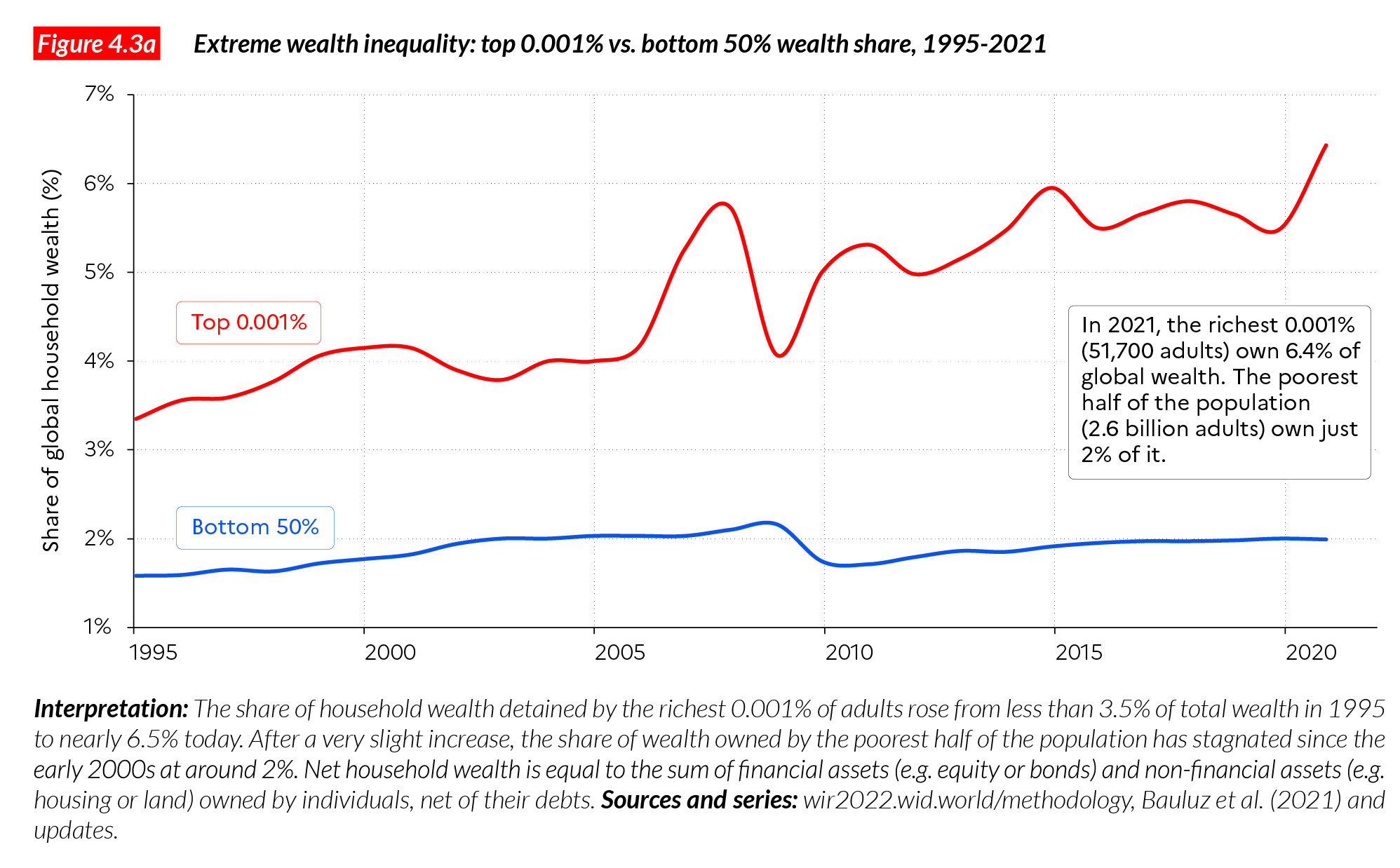
Extreme wealth inequality: top 0.001% vs. bottom 50% wealth share, 1995-2021
“Wealth inequalities have increased at the very top of the global distribution”
The rise in private wealth has also been unequal within countries and at the level of the world. Global multimillionaires have captured a disproportionate share of global wealth growth over the past decades: the top 1% captured 38% of all additional wealth accumulated since the mid-1990s, whereas the bottom 50% captured just 2% of it. This inequality stems from a large inequality in growth rataes between the top and the bottom of the wealth distribution.
The wealth of richest individuals on earth has grown at 6 to 9% per year since 1995, whereas average wealth has grown at 3.2% per year. Since 1995, the share of global wealth possessed by billionaires has risen from 1% to over 3%. This increase has been exacerbated during the COVID pandemic. In fact, 2020 marked the largest increase in the share of global billionaires wealth available on record.
From a historical perspective, wealth inequality was significantly reduced in Western countries between the early 20th century and the 1980s but the poorest half of the population in these country has always owned very little, i.e. between 2-7% of the total. In other world regions, the share of the bottom 50% is even lower. These results show that much remains to be done, in every region of the world to reduce extreme wealth inequalities.
Global wealth data remain opaque
The global financial system remains distinctly opaque in the 21st century, despite recent announcements about the end of tax evasion and financial secrecy. In practice, researchers, journalists, citizens, and public servants still encounter serious difficulties in tracking income and wealth flows across the world. Let us say at the onset that this situation is the consequence of policy choices and is not inevitable. In the digital age, inequality is omnipresent, but often missing from public statistics. It is paradoxical, for instance, that tax administrations and the general public across the world often learn about the extent of wealth inequality through fortune magazines. In principle, tax authorities should collect and publish information on how different wealth groups fare in the global and national economies, from the very poorest to the very richest1.
Without such information, it is impossible fully to understand the impacts of monetary, budget and tax policies on the economy, and impossible to make governments accountable for their choices. Certain magazines (Forbes, Bloomberg), and a handful of financial institutions (for instance, Credit Suisse) have been producing billionaire wealth estimates for several years. These studies find that the wealth of top wealth holders have been increasing at very high speed in recent decades—substantially faster than the size of the world economy—and we agree with this general conclusion. However, the methods used by these institutions often lack transparency; in particular, they do not release their raw data sources or detailed methodologies, so it is impossible to reconstruct their statistical results. This is not merely a technical question; methodological choices can have a significant impact on the measured changes in wealth inequality, and transparency of methods and sources is crucial if we want to reach better agreement about the facts of inequality.
Moreover, while billionaire data is important, it is not sufficient for a full grasp of the dynamics of wealth inequality in a given country and around the world. It is equally important to understand the dynamics of wealth at the bottom of the distribution (say, the poorest half of the population), among the middle class, and among the very wealthy non-billionaires. In particular, we stress the importance of millionaires and multi-millionaires, i.e. individuals with a few million or sometime a few dozen or hundreds of millions—but not billions—of dollars in assets, and who collectively possess much more wealth than the billionaires, as we see below.
The WID.world project seeks to address these issues of scope and methodology by providing estimates on the entire distribution of wealth, from the poorest groups to the richest. We also make very clear what we know and do not know about wealth inequality, and we publish all our assumptions and methodology online so that anyone interested in contributing to this work can do so. In recent years, we have partnered with several statistical institutions, tax administrations, and international organizations to improve our common understanding of wealth inequality. A lot of work remains to be done before we fully understand the dynamics and drivers of wealth concentration worldwide, but we are starting to get a good picture of many important facts and trends about global wealth inequality, which we present below.
How large is global wealth and where is it held?
In Chapters 1 and 3, we presented some insights into global wealth inequality. In this chapter, we focus on the distribution of global household wealth, i.e. the inequality of private wealth among individuals. We also look at how wealth inequality levels have changed in the past several decades, and more recently during the Covid-19 pandemic.
The total market value of household wealth possessed by individuals around the globe amounts to €377 trillion (or USD535 trillion), a value roughly equal to 4.4 times global income (factoring in the wealth of public actors and private foundations raises this value to €510 trillion, i.e. 5.9 times global income, see Chapter 1)2. Figure 4.1 shows the amount of household wealth owned by the global top 10% of wealth owners, the middle 40% and the bottom 50%. The top 10% owns collectively €285 trillion (76% of the world total), the middle 40% owns €85 trillion (22% of the total) and the bottom 50% owns €8 trillion (2% of the total)3. As discussed in Chapter 1, wealth concentration levels are particularly extreme: half of the world’s population is almost entirely deprived of wealth, while the top 10% owns nearly three quarters of it.
These statistics are based on wealth levels expressed at Purchasing Power Parity (PPP), in order to reflect differences in purchasing power across the world. Purchasing Power Parity definitely gives a more accurate picture of global inequality from the point of view of individuals who do not travel across the world and who essentially spend their incomes in their own countries. However, Market Exchange Rates (MER) are perhaps better to inform about inequality in a world where individuals can easily spend their incomes where they want. At Market Exchange Rates, the bottom 50% of the population owns just 1% of global wealth and the top 10% captures over three quarters of global wealth. While using PPP is standard practice when looking at global income inequality, it is less often used when discussing wealth inequality. But for talking about wealth, both PPP and MER can be relevant, depending on the question asked. When focusing on the bottom of the distribution of global wealth owners, using PPP values makes sense: €3,000 (at market exchange rates) in Ghana is a non-negligible amount of money, whereas €3,000 (at market exchange rates) in Germany is not very much. Using PPP helps us to grasp these differences: €3,000 in Ghana is worth the equivalent of a little more than €9,000 in Germany, given differences in the costs of goods and services in the two countries.
For the cases of global multimillionaires and billionaires, PPP is less suited, and Market Exchange Rates are more informative. Individuals possessing one billion dollars, whether in Ghana or Germany, typically spend large portions of their incomes and wealth globally rather than only in their home country. It therefore makes more sense to use Market Exchange Rates to study the wealth of the very rich and its implications in terms of taxation and redistribution, for instance. In this chapter, numbers are expressed in PPP because we focus both on the bottom and top of the global wealth distribution. In Chapter 7, where we focus more specifically on global multimillionaires and billionaires, and taxation issues, we use Market Exchange Rates. The World Inequality Database allows anybody to check wealth inequality levels in all countries, both at PPP and at MER.
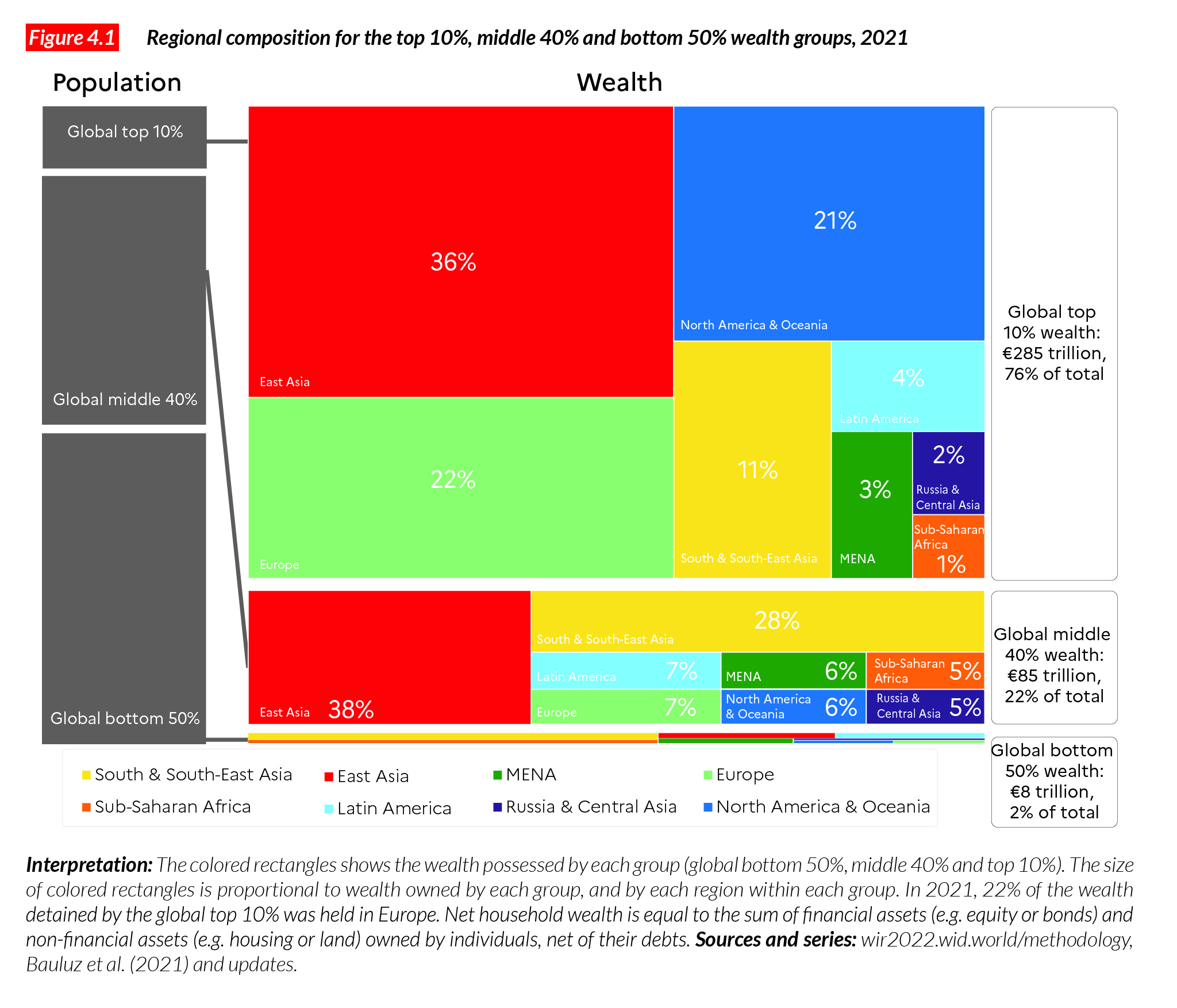
To return to Figure 4.1, the rectangles inform about the geographical composition of each global wealth group. Colored rectangles show the relative wealth share of each region within wealth groups. For instance, the East Asia rectangle tells us about the amount of wealth owned by East Asians relative to other regions. It appears that East Asians, North Americans and Europeans make up the bulk of the global top 10%. More precisely, East Asians own 36% of the wealth of the global top 10%, North Americans and those from Oceania own about 21% of it and Europeans 22%. If there were no wealth inequalities, then these shares would be equal to each region’s share of the global population: about a third for East Asians, 15% for Europeans, and 21% for North Americans.
The uneven increase in wealth since the 1990s
At this stage, our data allows us to produce wealth estimates since 1995. As discussed above, wealth inequality data remain more opaque and scarcer than income inequality data. Therefore, we cannot produce global wealth inequality estimates starting in 1980 or earlier. We have series on the evolution of wealth starting in the early 20th century (and even late 18th century) in some countries, which we also discuss below to complement the analysis of global trends.
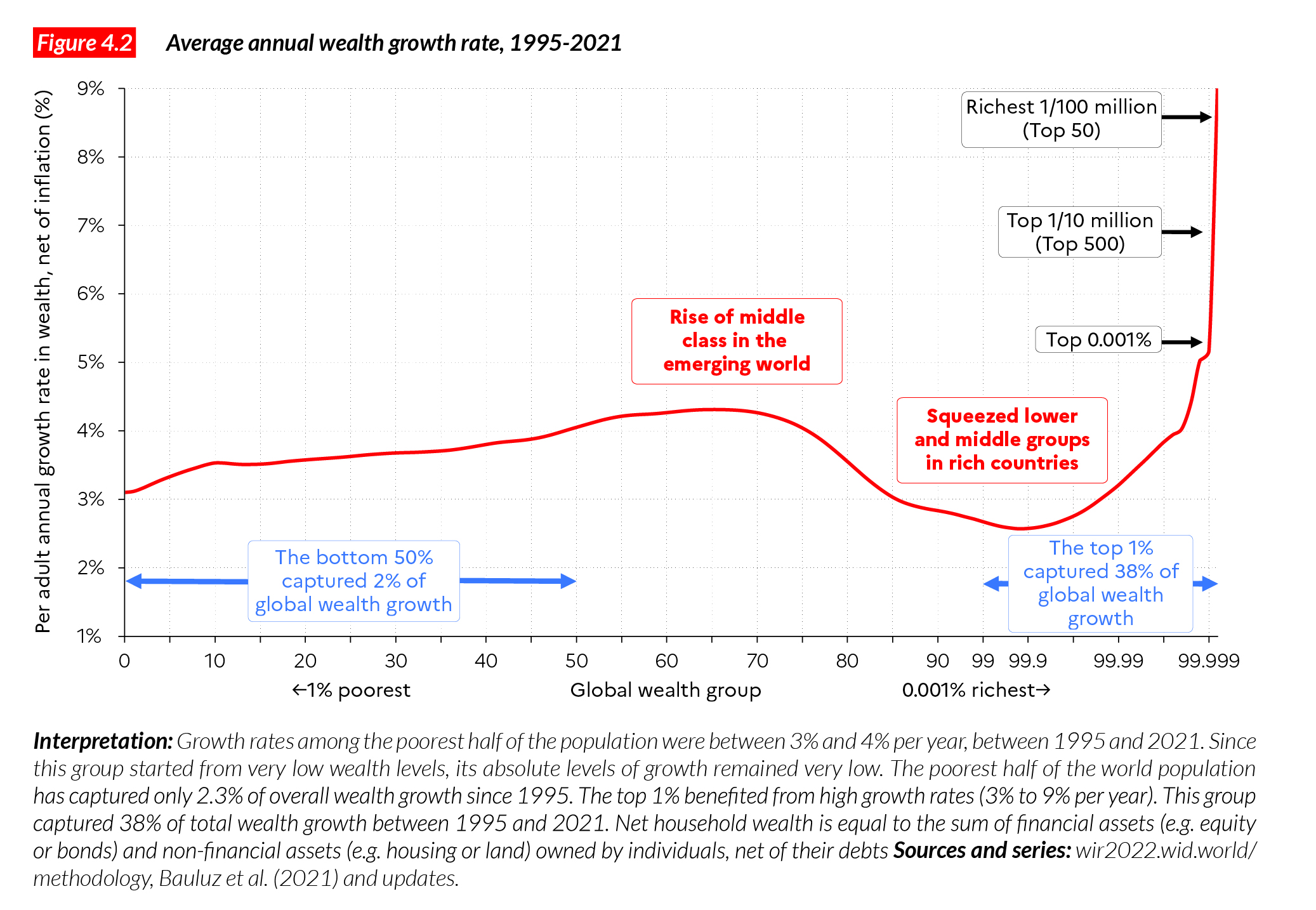
Since 1995, global wealth per adult has grown around 3.2% per year, but global groups of wealth holders have not all grown at the same speed. Average wealth among the bottom 50% grew 3.7%, the middle 40% grew 3.8% and the top 10% 3.0%, while growth was much higher at the very top of the distribution (over 5% for the top 0.01%) (Table 4.1). The global bottom 50% (essentially composed of the lower and middle classes of emerging countries) recorded relatively high growth rates, but the levels are very low. This group started with just PPP €1,000 on average at the beginning of the period and ends with €2,908€. The wealth of the middle 40% grew at a relatively low rate, as did its income (see Chapter 2): this corresponds to squeezed lower and middle classes in industrialized nations, which have been largely cut off from economic growth in their own countries in the past few decades. In some countries, including the US, the poorest 50% (in terms of wealth) had barely recovered from the financial crisis of 2008-9 in 2020, when the Covid shock hit (more on this later). The wealth of the US bottom 50% has in fact recorded a very slow increase since the 1990s (see also below). Sluggish wealth growth rates at the bottom and at the middle of the distribution are also observed in most industrialized countries over the past two or three decades.
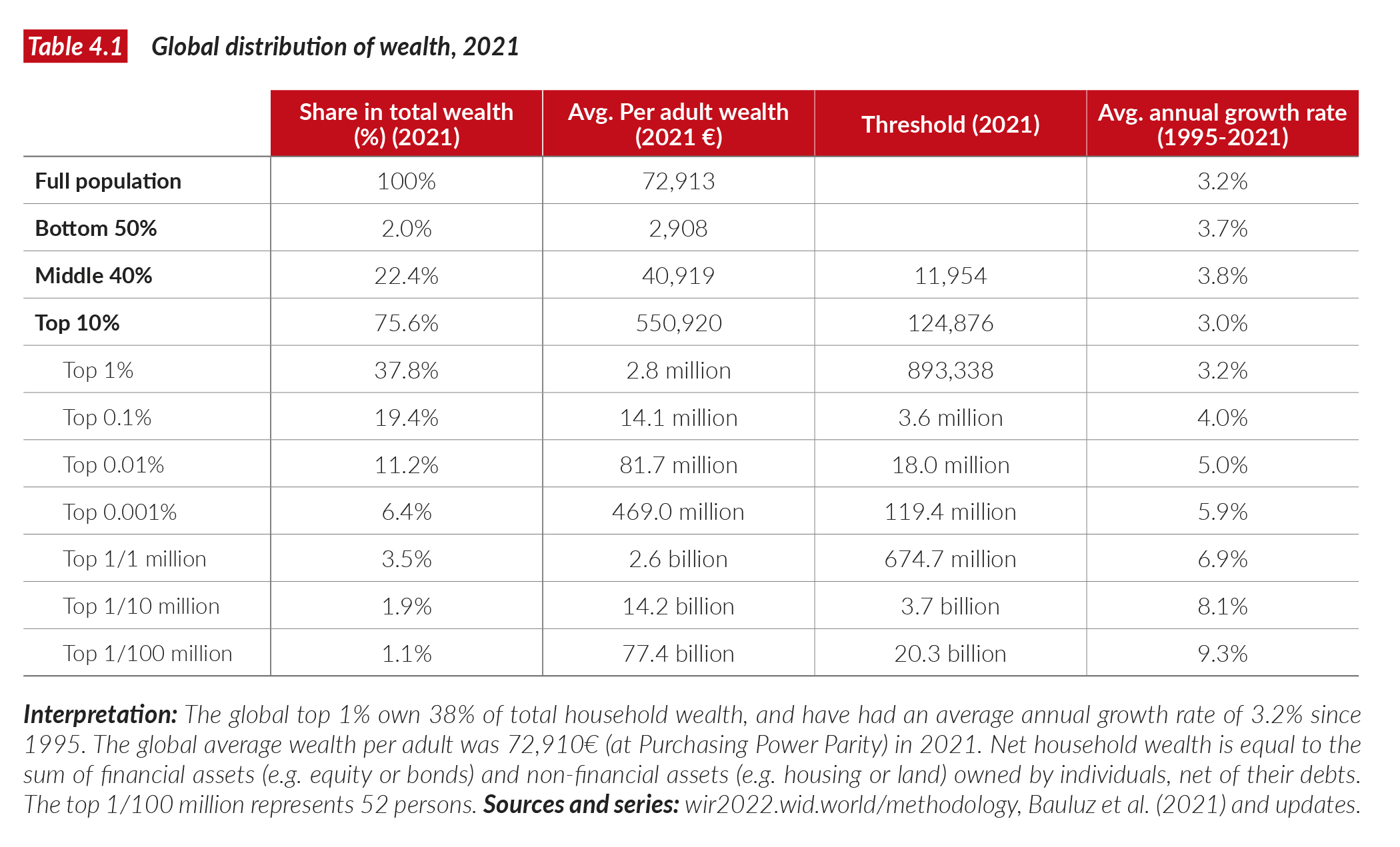
At the top of the global distribution, the global top 1% grew by 3.2%. Note that it takes PPP €893,000 today (USD1.3 million) to be part of the top 1%. What we see further up in the distribution confirms this general pattern: the wealthier the individuals, the higher the increase in their wealth. At the extreme end of the distribution, the wealth of the global top 0.01% grew 5% per year over 25 years, the top 0.001% at 5.9%, and the top 0.00001% (one person in 10 million, 520 adults in 2021) saw their wealth grow by an average 8.1% per year. The top 0.000001% (one person in 100 million, that is, the top 52 billionaires in 2021) saw their wealth increase by 9.3% per year over the period. Another way to present these findings is to show the average wealth growth of each group over the 1995 and 2021 period. This is shown in Figure 4.2.
Extreme growth at the very top
When the growth rate of a group is faster than the growth rate of the average, this group’s share of total wealth increases. This is what happened among the wealthiest groups. Figure 4.3a presents the evolution of the global top 0.001% wealth share between 1995 and 2021. This group represents about 51 700 adults in 2021 and to enter it, you need to have amassed wealth of PPP €119 million. If this group owned 100 times the average wealth on earth, then their share in total wealth would be exactly equal to 0.1%. It turns out that their share is just over 6% of global wealth, meaning that their wealth is over 6,000 times higher than the average.
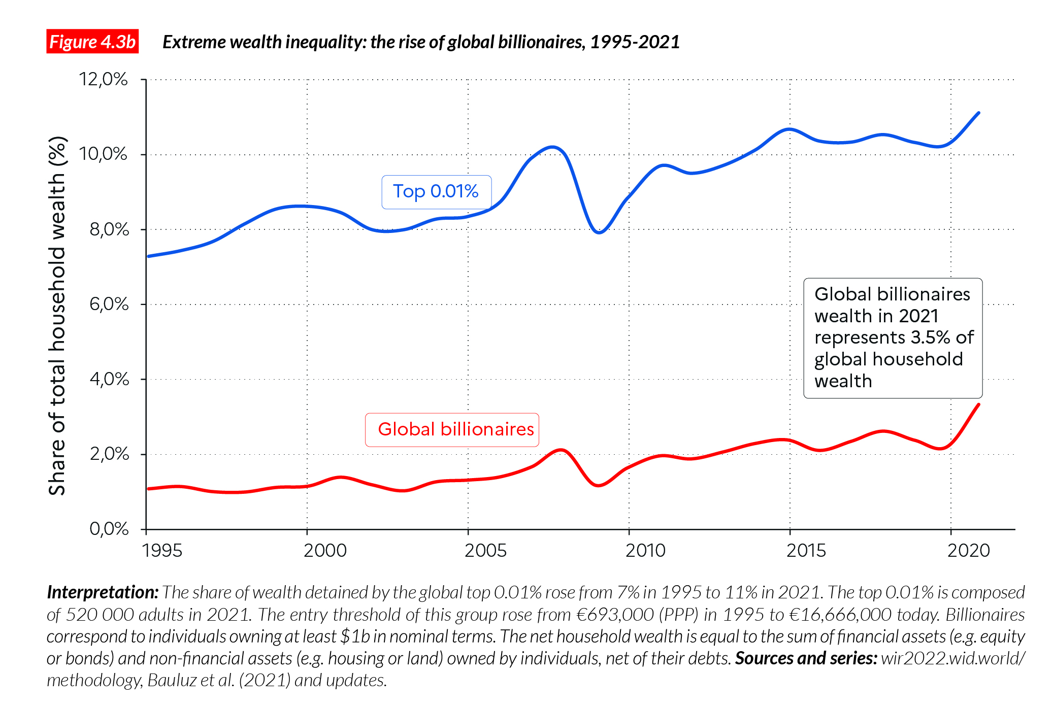
Twenty-five years ago, their wealth was very high compared with the average but not as high as that: it was 3,000 times higher than the average, and their share in total wealth was 3%. This represents a substantial increase in extreme wealth inequality over the period. To put this in perspective, the total wealth of the global bottom 50%, a group that is 50,000 more populous than the top 0.001%, is three times smaller. The bottom 50% experienced some growth over several decades (see above), but that growth was much more modest than among the top 0.001%. Figure 4.3b presents the evolution of the wealth of global billionaires since 1995, as a share of total household wealth.
The evolution of wealth inequality in rich countries
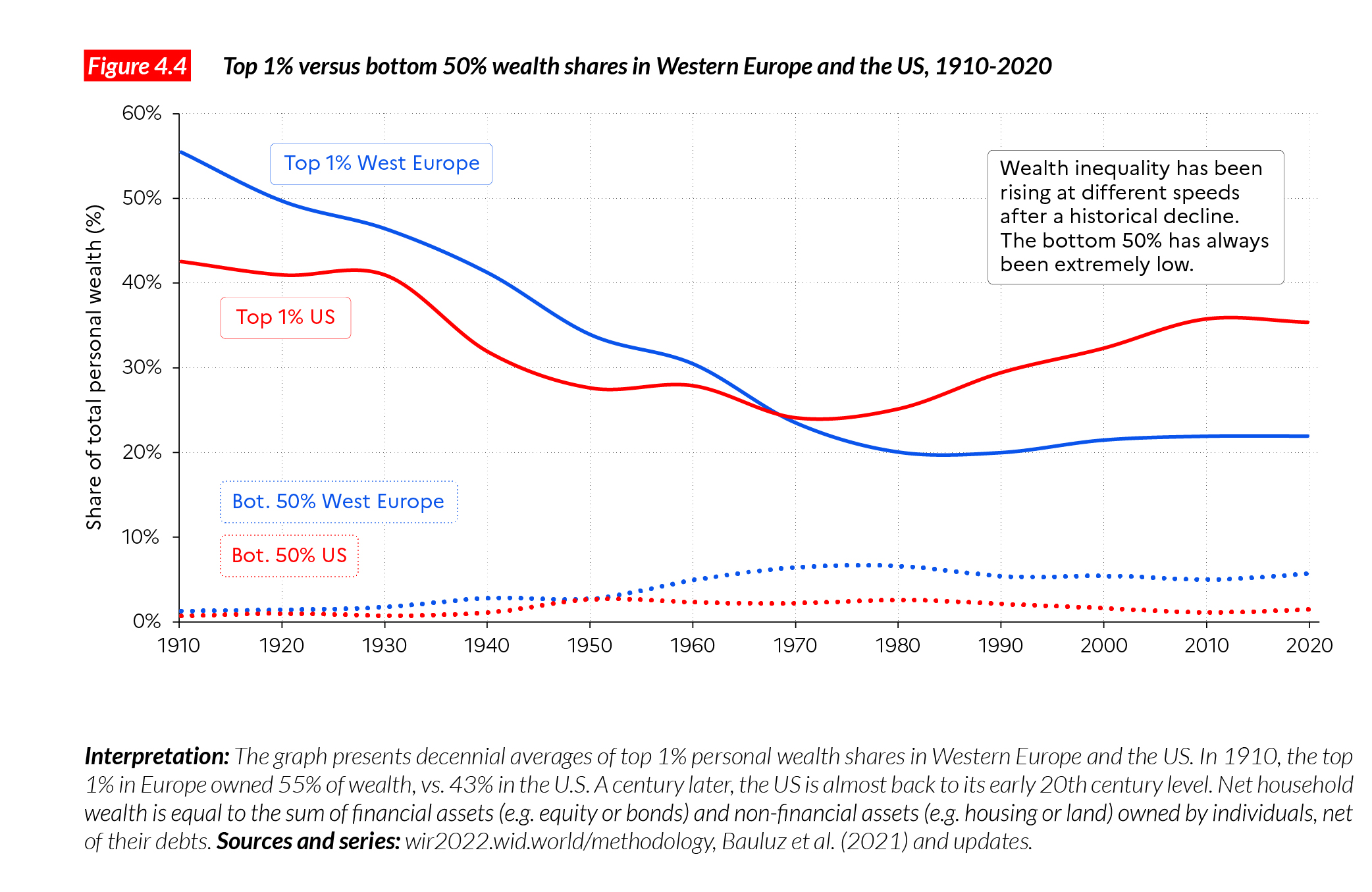
Since the 1980s, rich countries have experienced an increase in wealth inequality after a period of secular decline in top wealth shares. Top 1% wealth shares were very high in Europe and the US at the end of the 19th century, before falling sharply after the military, political and economic shocks of the first half of the 20th century, and it is going back up again today (although generally not to quite as high as in the late 19th century). It is important to note that a series of policies contributed to further reducing top 1% wealth shares and kept wealth inequality in check during the mixed-economy regimes of the 1950s to the 1980s: wars and economic crises do not explain all the reduction of wealth inequality in the 20th century, peace time policies played a crucial role as well4.
Deregulation, privatization and lower progressive taxation contributed to boosting top wealth shares in rich countries after the economic policy turn-around of the 1980s, marked by the election of Margaret Thatcher in the UK in 1979, Ronald Reagan in the US in 1980, and the policies implemented by French President François Mitterrand after 1983.
The economic policy mixes implemented in Europe and the US since the 1980s have favored wealth concentration and were successful enough to invert the secular trend observed since the 1910s in rich countries.
Figure 4.4 shows the evolution of the top 1% wealth shares in the US and Western Europe over a century. There are two major take-aways from this graph. First, wealth inequality was very high in the US and Western Europe in the early 20th century. The top 1% wealth owners possessed 43% of all private wealth in the US, and 55% in Western Europe. Early 20th century inequality levels were similar to those observed during the 19th century in the two regions5. This reveals that despite the development of liberal democracies on both sides of the Atlantic, wealth inequality remained high (see our discussion of long-term income inequality in Chapter 2). Indeed, while access to education progressed, there were little or no reforms to spread wealth to lower- and middle-income groups. The development of voting rights was also very limited. First, half of the population—women—was entirely deprived of the vote. It is only in the 1920- 40s that women obtained the right to vote in major Western democracies. Second, even among men, voting rights remained unequal at the beginning of the 20th century in several Western countries. In Sweden, for instance, until 1910 only the top 20% of male wealth owners could vote, with significant inequalities within this group as well. In the US, it was only after the 1965 Voting Rights Act that African-Americans obtained the right to vote in southern states. The persistence of large political inequalities drastically limited the power of working and middle classes to implement reforms.
The financial crisis of 1929, the military shocks of the First and Second World Wars, as well as independence for Western colonies, significantly affected the wealth positions of the richest. In addition, the development of inheritance taxes, and highly progressive income taxes, as well as series of nationalizations and capital control policies in the Western world, starting in the 1920s and continuing after WWII, further reduced wealth inequality. By 1970, the top 1% wealth shares in Europe and the US had dropped to less than 25%. This reduction of wealth inequality enabled the rise of a patrimonial middle class (whose wealth is largely composed of housing and retirement savings) on both sides of the Atlantic.
In more recent years, however, top 1% wealth shares have risen again in Europe and especially the US. In the US, the return of top wealth inequality has been particularly dramatic, with the top 1% share nearing 35% in 2020, approaching its Gilded Age level. In Europe, top wealth inequality has also been on the rise since 1980, though significantly less so than in the US. One of the main differences between the two regions is that Europe has so far been able to maintain a relatively strong middle class, while in the US this group has been squeezed by an explosion of debt (particularly housing debt, which triggered the 2008 financial crisis). The middle 40% wealth share in the US dropped from around 34% in 1980 to 28% today, while it remained at around 40% over the period in France. As a result, while Europe was significantly more unequal than the US in the late 19th and early 20th centuries, the reverse is true today. It is impossible to say, however, whether this situation will hold in the coming decades. Significant inequalities in the growth rates of wealth between the top and the middle of the distribution have been observed in Europe in recent decades, which could magnify wealth inequality in the future.
Wealth inequality in emerging countries
We know less about the long-term dynamics of wealth inequality in emerging countries than we know about those in rich ones: most of our series for BRICS (Brazil, Russia, India, China, South Africa) start in the 1990s (Figure 4.5). It is clear, however, that the past three decades have also been marked by an increase in wealth inequality in the emerging world. In some countries (i.e. Russia and China, and to a lesser extent, India) this increase has been particularly strong. These countries were socialist or highly regulated economies until the early 1980s or 1990s, when they went through liberalization and privatization reforms. What is striking when comparing these countries is that the trajectories they followed were very different. In Russia, the rise of the top 1% wealth share was both fast and great. In less than a decade, the top 1% wealth share had doubled, to reach 40%. In India and China, the top 1% wealth share increased very significantly, but is barely over 30% today. This shows that deregulation and privatization can be introduced in many different ways. The path followed by Russia, known as “shock therapy” (characterized by the large-scale sale of public assets, bought at low cost by a handful of wealth-holders), is an extreme case of liberalization. In contrast, liberalization6 in China was much more contained, and while the housing sector was mostly privatized, the state kept control of large public companies.
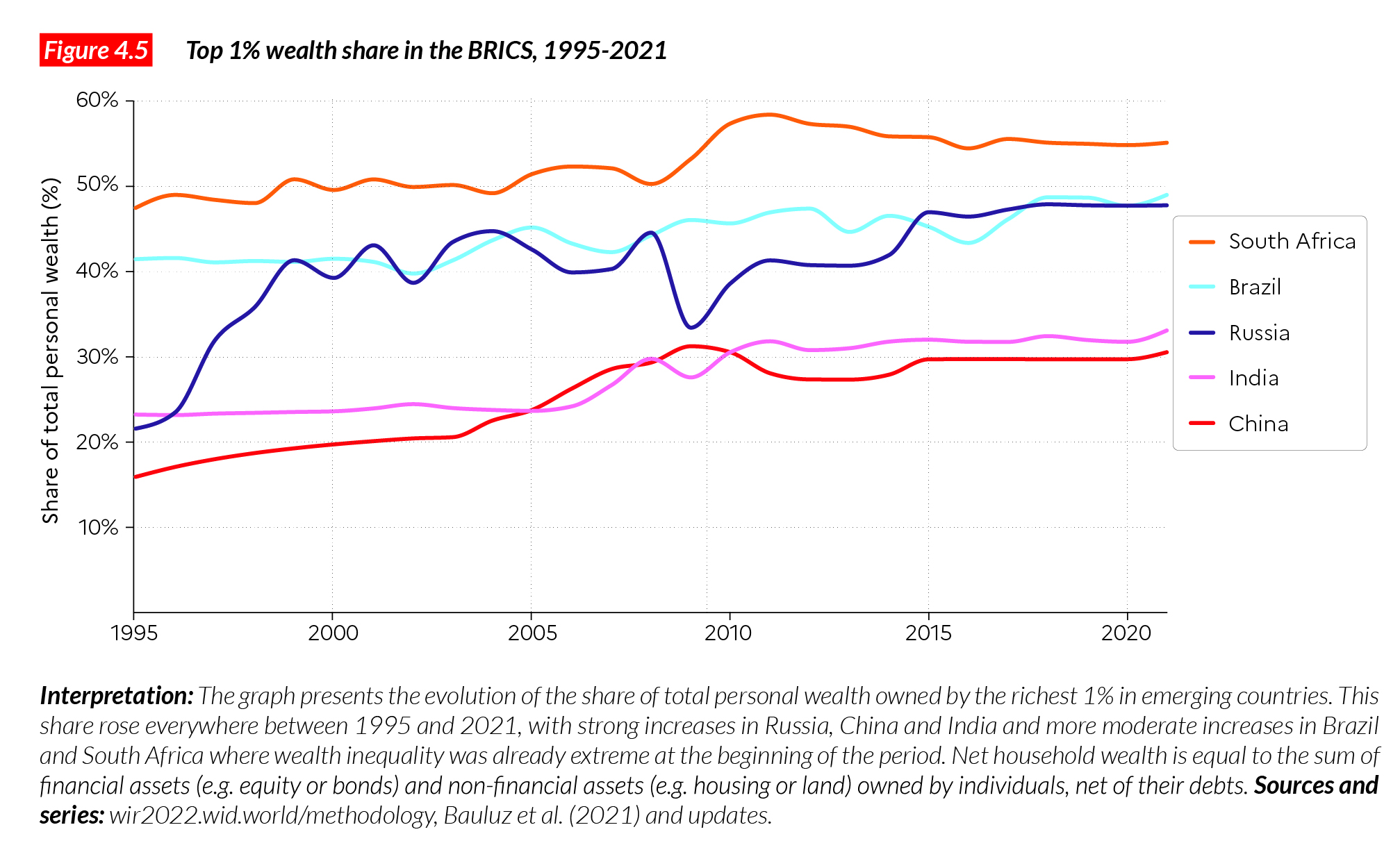
In Brazil and South Africa, the top 1% wealth share was extreme in the 1990s, and is still extreme today. Wealth inequality has slightly risen in these countries. This highlights the persistence of extremely hierarchical economic and social systems that are the modern result of colonial or apartheid societies. While voting rights have been extended to all, the ownership system remains dual. Descendants of slave owners continue to own most of the wealth.
In South Africa, for instance, the top 10% wealth group is composed of 60% White South Africans, who represent only 10% or less of the total population7. In Brazil, the emergence of the Republic in 1985, after two decades of military dictatorship, enabled the expansion of voting rights. The Workers’ Party implemented large-scale transfers to the disadvantaged, and invested in education and healthcare through programs such as the Bolsa Familia. These policy reforms were not sufficient, however, to change substantially the structure of ownership in the country.
What is driving global wealth inequality?
As we discussed in Chapter 2, global income dynamics are driven by both inter- and intra- country forces. Wealth inequality involves inter- and intra-country drivers as well. The rise of private wealth has been faster in large emerging economies than in rich countries, a trend driven by high economic growth and large-scale privatization in transition economies. This tends to reduce global wealth inequality between the emerging world and wealthiest nations. The effect was countered, however, by the rise of wealth inequality within countries. Increasing wealth inequality within countries is due to several factors, including rising income inequality amplified by inequality of savings rates and of rates of return between different wealth groups. Across the world, we typically observe that the wealthy save more than the poor, and also that they benefit from higher rates of return on their investments. This is also known as the snowballing effect of capital accumulation: the more one possesses today, the more one can accumulate tomorrow. However, policies also play a determining role in the evolution of wealth inequality. Public policies such as rent control and regulation contribute to the reduction of rates of returns and limit capital accumulation. Redistribution policies such as wealth taxes and taxes on capital income, limit capital accumulation and generate public resources that can help spread wealth to the worse-off.
How will these forces play out in the future? It is impossible to say which driver will govern wealth dynamics in coming decades. We do know, however, that there was nothing inevitable about the fact that the very top of the global wealth distribution rose so much faster than average world wealth over the past three or four decades. Indeed, the large transfers from public to private wealth that occurred in many countries contributed to this increase. Privatization disproportionately benefited small groups of the population— for example, Russian oligarchs. This helps to explain why top wealth holders’ shares rose so fast. It is difficult, however, with the data currently at our disposal, to estimate the precise impact of this factor. There are also cases where privatization has benefited mostly the middle class (for example, of housing in the UK)8. Whether this channel is likely to be important for the future (in emerging countries, for instance) is another important but uncertain issue.
Another decisive factor behind rising wealth inequality at the top is the financial deregulation and innovation that increased the inequality in rates of return for different sizes of financial portfolios. Some of the most convincing evidence for this effect comes from the observed rates of return on university endowments (such as for Ivy League universities in the United States), which since the 1980s has varied from 4–5% per year for the smallest endowments to as much as 7–9% per year for the largest ones (after deduction of inflation and management costs). The size advantage on rates of returns has persisted for decades and shows no signs of disappearing. It is plausible to think that rates of returns for individuals are also growing even among the very wealthy. Billionaires often use very sophisticated wealth management strategies that resemble those of the large endowments of non-profit institutions.
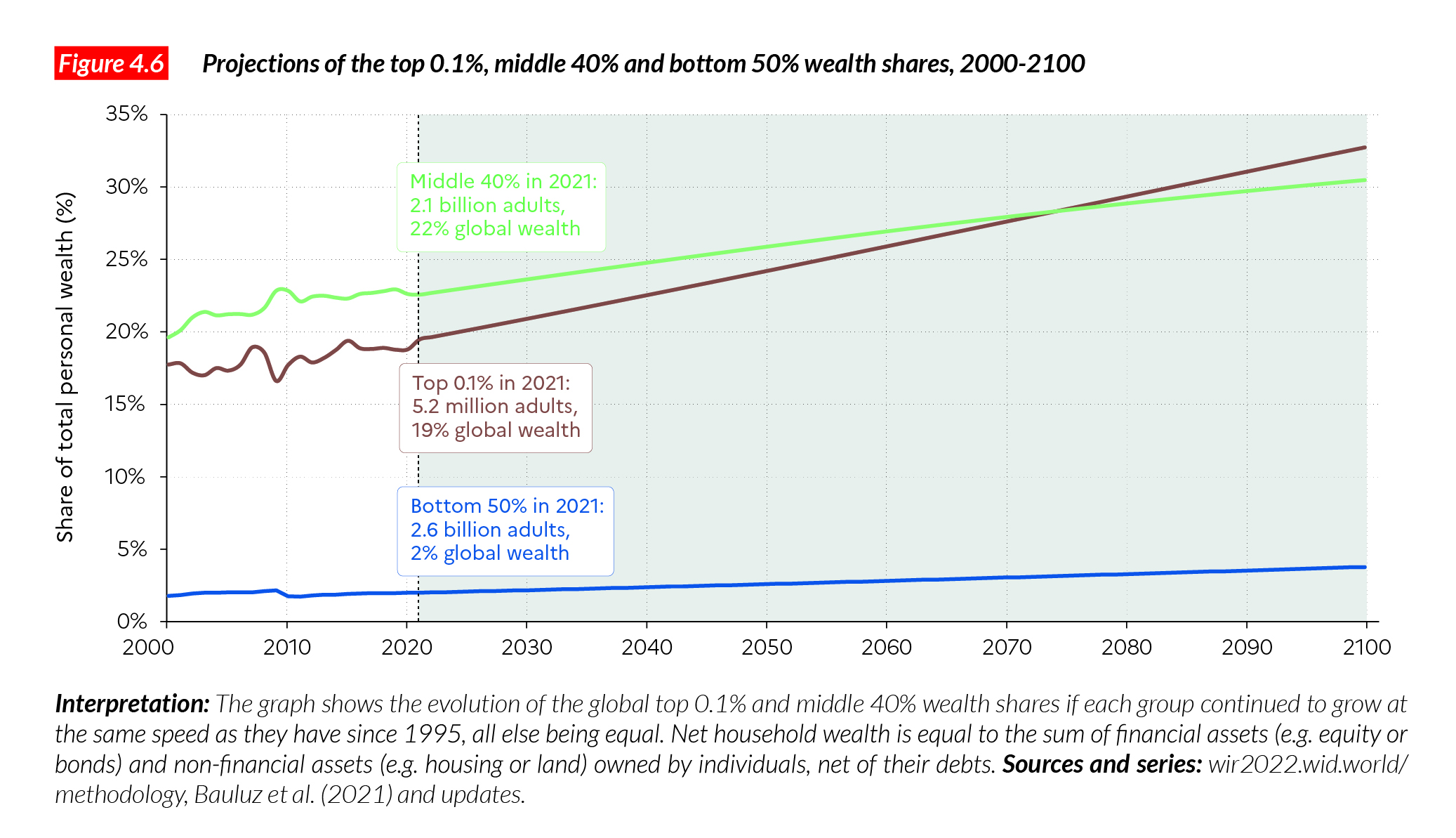
One thing is certain: if the rates of inequality observed between wealth groups over the past several decades continues into the future, then global wealth inequality will continue to increase and will eventually reach enormous levels. Figure 4.6 presents the evolution of the top 0.1% and middle 40% wealth shares, assuming that each group grows over the coming decades at the same speed as it has done since 1995. Under this hypothetical scenario, by 2070, the global top 0.1% will capture over a fourth of global wealth. By the end of the century, it will own more than the global middle 40% (30%). Without major economic policy changes or shocks (environmental catastrophes, wars, economic crises), the future is bright for global multimillionaires.
Box 4.1 Who owns what? Breaking down asset ownership by wealth group
Asset portfolios (i.e. the different types of wealth possessed by individuals) vary
substantially across the wealth distribution: rich and poor have very different wealth levels, but they also own very different types of wealth. While there can be significant variations across countries, depending on institutions, policies, and level of economic development, there are also relatively strong similarities in asset ownership.
The main form of wealth owned by the very poor (when they have positive net wealth) is cash or bank deposits. Individuals at the bottom of the wealth distribution may own houses and land, but the market value of these assets is typically very small. Middle classes typically own bank deposits as well as real estate, which represent the bulk of their assets. They also own equity and bonds, often in the form of retirement savings, but these represent a relatively small share of their wealth. In the top wealth decile of rich countries, individuals own a non-negligible share of business assets (5-10%), housing assets (30-40%) and financial assets (40-60%). The richer individuals are, the higher the share of financial assets in their wealth. In the very top groups, these can represent 90-95% of all wealth in countries like France or the US. This does not mean that the very wealthy do not own real estate, it means rather
that they own very substantial amounts of financial assets.
Box 4.2 How do we measure wealth inequality?
The measurement of wealth inequality is a challenging enterprise given the opacity of the global financial system. In order to measure wealth inequality properly, researchers, the media, and the general public should have access to public information about the number of individuals in different wealth brackets (see Chapter 7). Without such information, inequality scholars have to use imperfect information to track wealth. This includes household surveys, administrative records, national accounts, and rich lists. Household surveys (such as the Household Finance and Consumption Survey in Europe, and the Survey of Consumer Finance in the US) provide essential pieces of the puzzle. However, it is difficult for surveys to capture the top distribution well (the US Survey of Consumer Finances uses income tax data to find its high wealth sample, and is the most sophisticated attempt to capture the very rich in surveys). National accounts provide the value of overall wealth in an economy, and hence help us understand the mismatch between what is reported in surveys and the reality. In order to understand better how wealth is distributed across the population, it is essential to use administrative data, typically obtained from tax departments, which can give a more precise picture of wealth levels among the very top groups. Wealth inequality can be estimated from estate tax data (the so- called estate multiplier method). It can also be estimated using individual income tax data from which we can infer the stock of wealth from the flow of capital income (the capitalization method).
The aim of the WID.world projects is to mobilize all available sources on wealth inequality and to combine them in a systematic and transparent manner, so that anyone can reproduce the different steps of the method and contribute to a better understanding of wealth inequality with more recent raw data or alternative assumptions.
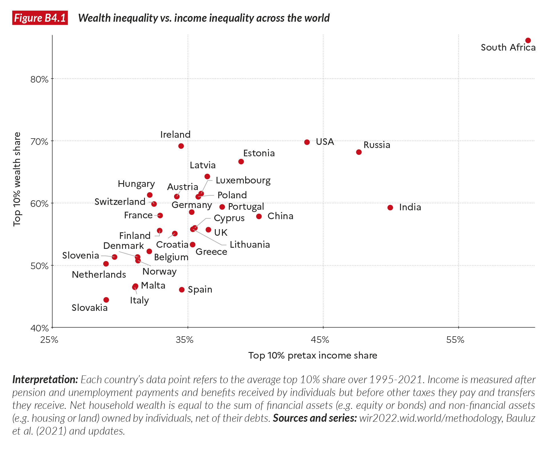
In the case of wealth inequality estimates, our coverage for North America, European countries and the BRICS (Brazil, Russia, India, China, South Africa) is relatively good but our coverage for low-income countries remains poor. For low-income countries with no wealth inequality data, we estimate the level of wealth inequality from the levels of aggregate wealth and income inequality9. We discuss issues associated with the measurement of aggregate wealth across the world in Chapter 3. We observe a strong regularity between income inequality levels and wealth inequality levels in countries where we observe both dimensions (Figure FB4.1). This relationship is then used to infer wealth inequality levels in countries that have no wealth inequality data at all. Estimates for these countries should be seen as preliminary, but they already offer a plausible level of wealth inequality. The quality of estimates for each country, as well as the complete set of sources used, and methodological documents, are available online on WID.world.
Wealth inequality estimates produced by the systematic combination of surveys, administrative data and national accounts are not supposed to reproduce exactly the number of billionaires observed country by country in rich lists such as those published by Forbes and Bloomberg. Indeed, our aim is to provide wealth levels for the entire distribution, from bottom to top, and to do so, the best way is to start with survey and administrative data, not with rich lists, which cover only a tiny fraction of the distribution. It should be noted too that Forbes’ and Bloomberg’s methodologies are not perfect: they can miss high net worth individuals in certain countries, and over or under evaluate their true wealth in others. We should also recognize, however, that surveys and administrative data, even properly combined, are not perfect either, especially at the top of the top. We therefore also mobilize Forbes data country by country, to provide series that are closer to theirs. More precisely, top wealth levels observed in WID. world series are corrected to ensure that the billionaire wealth reported for a country is at least as much as is reported in rich lists10.
1 This chapter is based on data from Blanchet, T., L. Bauluz, A. Sodano C. Toledano. (2021). “Estimation of Global Wealth Aggregates in WID.world: Methodology.” WID.world working paper 2021/22; and from Félix Bajard, Lucas Chancel, Rowaida Moshrif, Thomas Piketty, « Global Wealth Inequality on WID.world: Estimates and Imputations », WID.world Technical Note, 2021/16.
2 2021 values are based on estimations.
3 See Chapter 1 of the Report, Figure 1.1. Numbers may not add up due to rounding
4 See Alvaredo, F., L. Chancel, T. Piketty, E. Saez, G. Zucman. 2018. World Inequality Report 2018, Harvard University Press. See also Piketty T. 2020. Capital and Ideology, Cambridge: Harvard University Press.
5 See Roine J. and D. Waldenstrom (2014), Long-Run Trends in the Distribution of Income and Wealth. IZA Working Paper; Piketty T. 2014. Capital in the 21st century. Cambridge: Harvard University Press; Alvaredo et al. World Inequality Report 2018.
6 See Alvaredo et al. World Inequality Report 2018, Section 4.
7 See Chatterjee, A., L. Czajka, L. and A. Gethin 2020. “Estimating the distribution of household wealth in South Africa” (No. 2020/45). WIDER Working Paper. In South Africa, strong racial inequalities coexist with strong inequalities within ethnic groups. For instance, the Gini index for wealth among Whites is equal to 0.74, compared to 0.98 among Blacks according to the National Income Dynamics Survey.
8 Alvaredo et al. World Inequality Report.
9 See Blanchet et al. “Estimation of Global Wealth Aggregates”.
10 See Félix Bajard, Lucas Chancel, Rowaida Moshrif, Thomas Piketty, « Global Wealth Inequality on WID.world: Estimates and Imputations », WID.world Technical Note, 2021/16
